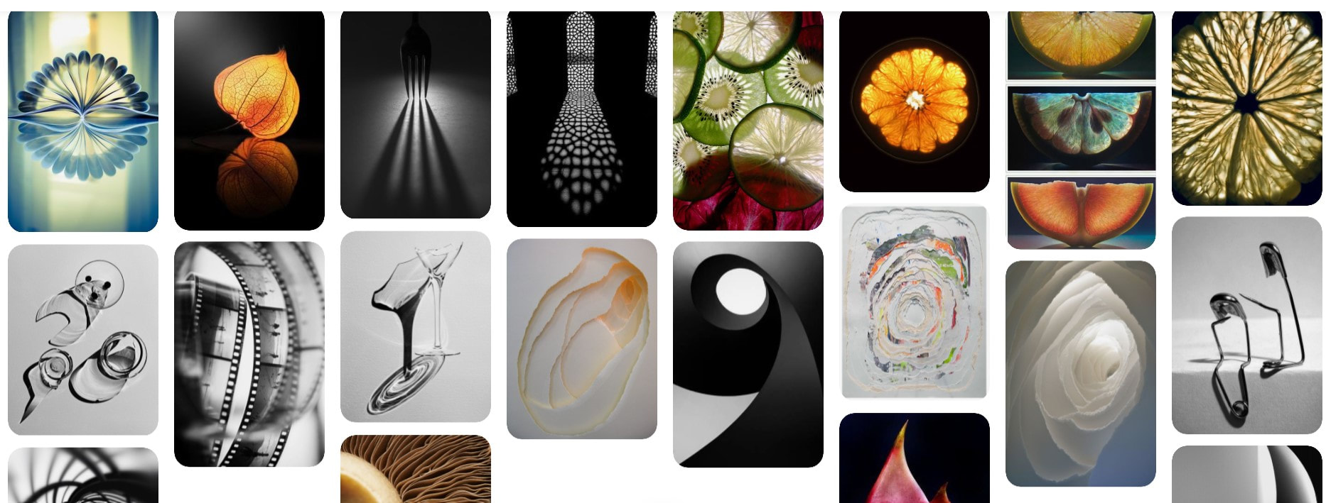
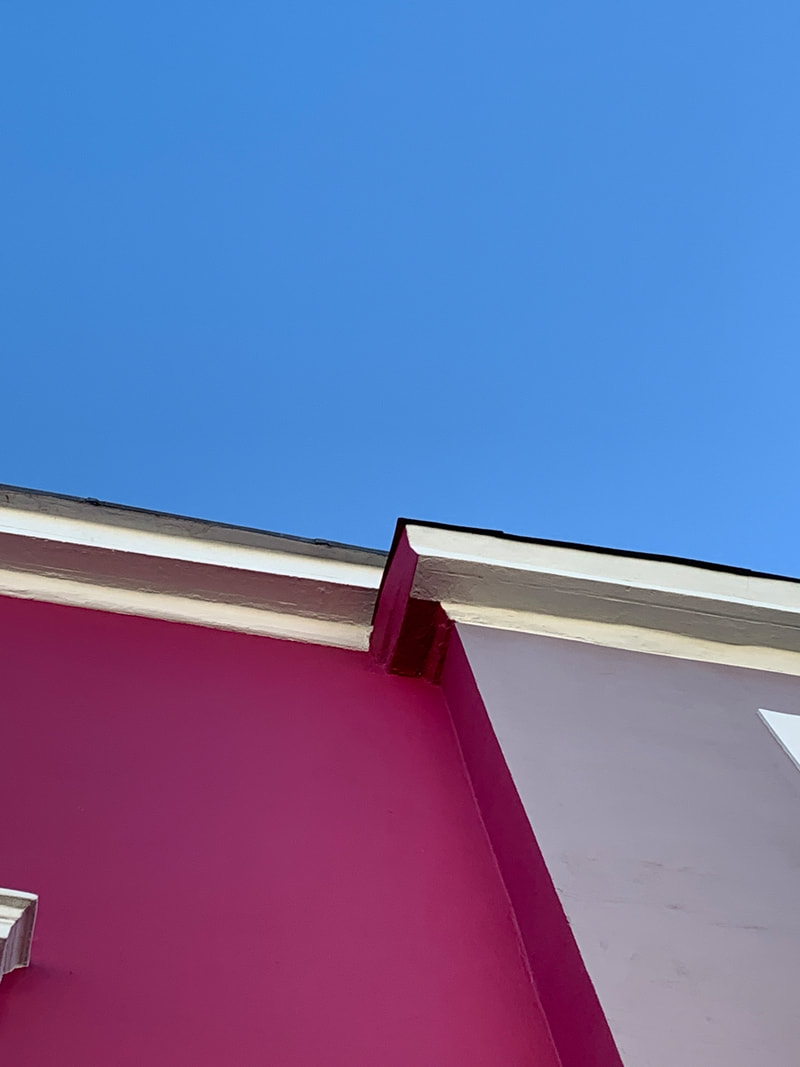
WHAT IS ABSTRACTION?
Documenting the DSLR
What is the DSLR camera?
- The DSLR camera is a digital, single lenses camera that light passes through the lenses and is reflected onto a triangle shaped glass that asks that a camera obscura to take a photo of what we see through the viewfinder.
- The mode dial is the big circle that sits on top on the camera, it controls things such as the manual exposure, shutter speed and auto focus. The main dial is used to change the cameras mode, it is used to adjust shutter speed and setting a aperture.

|

|
Shutter speed priority
For this shoot to show different shutter speeds we needed to set the mode dial onto shutter speed priority, ( TV) and take multiple photos of falling pieces of cup up paper against a white background. Then capture this in the fasted shutter speed our camera could before flashing with a orange light. It will flash when the exposure it to low and the image will be dark and grainy.
ISO
This is is a measurement that shows how sensitive the camera is to light, the higher the ISO then the higher the sensitivity to light it will be. ISO on a digital camera is measured in numbers, the lower the number them your image will be darker and the higher the numbers the brighter the image will be.
Aperture
This is the small hole where the view finder can be adjusted to let in more or less light depending on the exposure of your image. It also controls your depth of field, if the aperture is high then the depth of field will be small and vies versa. In photography aperture is called the 'F' stop in numbers.
Fast shutter speed

SLOW SHUTTER SPEED

|


|


|


|
Aperture priority
This is used in photography and automatic cameras where the photographer selects the aperture and the shutter speed is set to match it.

|

|
White paper test
For this task we were given a piece of white paper and asked to create 20 or more unique photographs. We could re-shape it, bend, fold, crumple and curve it to manipulate its shape and form. Then we had the options to shoot against a white background or black with a studio light. I also used a torch to create more light coming from multiple angles. There were also different colours of opaque plastic, that with a light shining through reflected these colours onto the paper. I started on my bending the paper as we only had one piece, and once creasing it you could not reverse it. The challenge was to see how many shadows and shapes you could photography with that one piece of white paper. I used a selection of coloured plastic to hold over the light to create glowing hues of blues, reds, that I found to be most effective. The colours can make the paper appear to be curve or bent where it is not, I like how you can trick the camera in different ways to create illusions in the photos.
Contact Sheets-
|
|
|


Best images from shoot:

|

|

|

|

|
Overall analysis-
WWW:I think I managed to capture lots of different ways that the paper could be manipulated and seen as something else, I also liked that I used a range of colours and lighting to create shadows and highlights the dominant lines in the paper.
EBI: To take these photos a step further I could have experimented with more shapes and curved the paper more before it got bent, when looking over the images most of them are blurry so I could have used a tripod to steady the focus more.
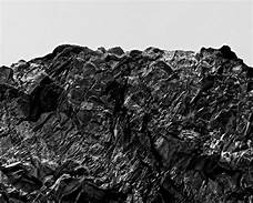
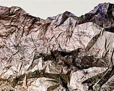
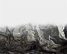
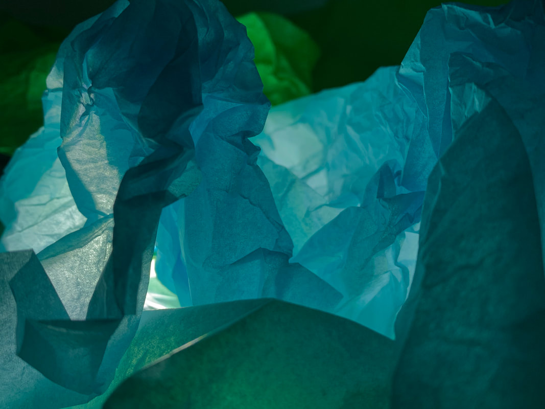
Link Artist- Brendan Austin
Brendan Austin is an American photographer who creates photos of imaginary landscapes and mountains from martials like tissue paper and crumpled card. He was inspired to replicate these mountains from a walk he did in New Mexico. These were called 'paper mountains' as Austin showed what he saw as the human impact on nature. He wanted to explore the ideas that provoke the questioning of truth in photographic reproduction, blurring the lines between fiction and non-fiction. They are situated on the border of reality and nature. Each mountain is said to be a printed photography of a mountain, worked and crumpled to replicate the peaks and shadows of the American coast. With his images she wanted to question reality. The vast empty space around the mountains reflect his unease and the creases make us question the ties between reality and humans.
|
|
|
I choose to develop my photos in the style of Austin as I really liked all the layers and textures in his images. The caverns in the mountains really stood out as it looked so realistic and makes you question if they are real mountains or not. The way the paper can be positioned completely differently in each photo makes each landscape original and tricks the eyes into seeing real nature. Alone with this having the images in black and white mimics the real colours of mountains.
Contact Sheets-
For my response I chose to use crumpled up tissue paper to create a mountainous like scene. Once you crumpled the paper up it creates so many big and small defined lines just like real rocks, in my first shoot I focused too much on making them look lie mountains when the aim was to leave lots of negative space just like his, to capture this again I did a smaller second shoot to try and photography this method.
|
|
|


Best images from shoot:

|

|

|

|

|
Overall Analysis-
WWW: I really like these images, the different colours of tissue paper make them more exciting and we placed them over a torch to emit light from a different angles, allowing the lighting to be more dark bringing out the lines and crimples of the paper.
EBI: To improve these images I would edit them into black and whit like Austin did to make them look more than mountains, and use the studio lights to experiment with brighter lighting to changes the composition and get more shadows.
For a further development to improve my images even better my aim would be to produce images more likable to Austin's work. I noticed he left more negative space at the top to the images as it gives more of a mountainous effect, I further edited half of my best photos into black and white to show what the images would look like more in his style, I also think it gives a more effect look as mountains because it really highlights the crevasse and lines. With this shoot instead of just using tissue paper I tested out different materials, firstly I experimented with the tinfoil paper. I think this gave a really good effect as with the added light shining on it it makes more lines and reflections creating a more in depth photo.
Link artist two- Francis Bruguiere
Francis Bruguiere was born in San Francisco, California. He studies painting in Europe and after befriending a fellow painter they both set up a studio in San Francisco, here they recorded pictorialism styles of images of the city after the earthquakes and fires. He later moved to New York where he made a living by photographing for Vanity fair, vouge. Throughout his life he photographed with multiple exposures, solarisation, original processes and abstracts. Bruguiere created unnatural worlds in his pictures by photographing cut paper twisted into relief and lit by a single lamp or phone torch. He bent, cut and twisted them into all different shapes and experimented with lights effect and the creation of shadows. His first exhibition of these was held at the Der Sturm gallery in Berlin, 1928.

|

|

|
I chose to look at Brugurere as I thought her work is really interesting, I love how each cut and bend in the paper creates something different each time, I also like how the manipulation of the light and creating shadows from all the lines makes a really detailed image.
Contact Sheets-
|
|
|


Best images from shoot:

|

|

|
Overall analysis-
WWW: I tried to make as many slits in the paper as possible without it being to overwhelming as I felt this gave the most reflective look like her work. I really like how where I reflected the lights, because of all the cuts and folds, it made so many shadows of many different shapes.
EBI: To make these images even better, I would try cutting them in different directions and more curved shapes just to get a mixtures of shapes and reflections as I like all the different styles and how they look.
EBI: To make these images even better, I would try cutting them in different directions and more curved shapes just to get a mixtures of shapes and reflections as I like all the different styles and how they look.
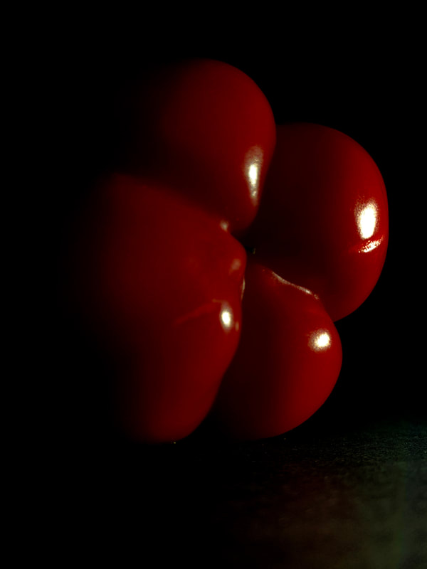
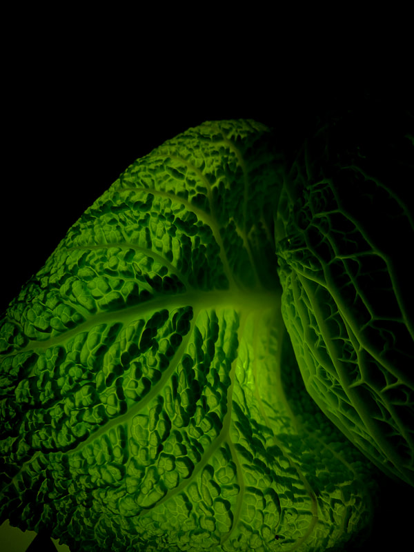
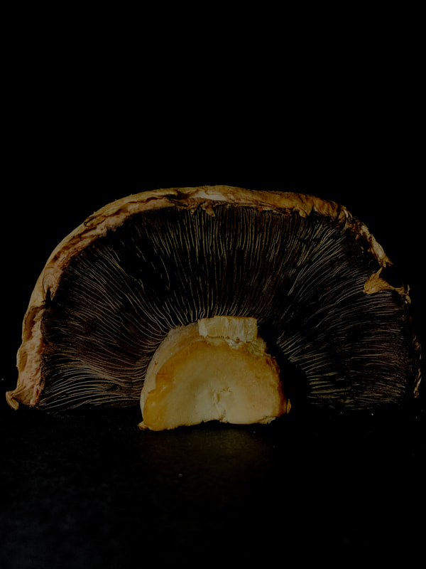
Edward Weston- Ordinary to Extraordinary
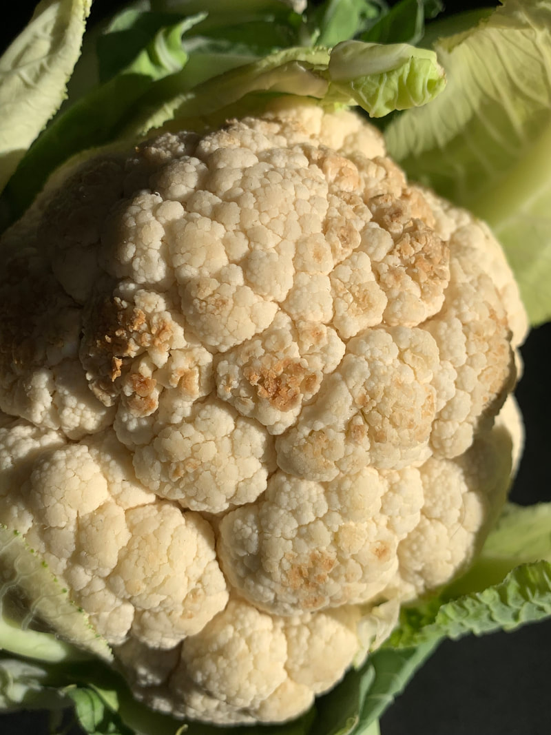
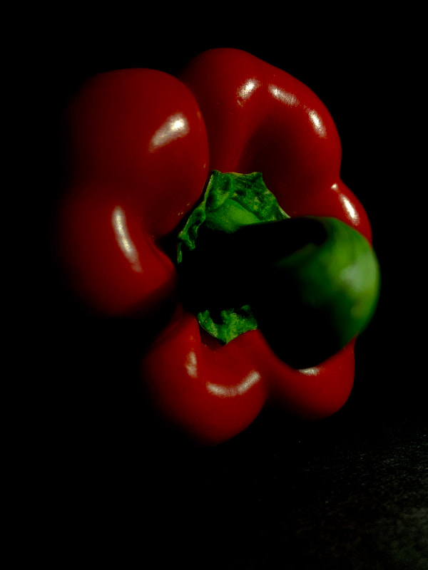
Edward Weston was a 20th century photographer, his photos transformed everyday objects into abstract shapes, shadows and patters. He was most well known for his photo called f30. When creating these photos he used a aperture of f/240. Weston was best known for his carefully composed and focused images of natural objects and landscapes. To create these images, Weston used a 2.5 by 3.5 negative Graflex camera. This special type of camera allows him to see his subject matter when he was photographing. To produce shutter speed fast enough to appear to stop fast motions, previously these cameras employed a cloth shutter with a narrow slit that quickly moved across the film plane this exposed only one small strip and a time. Some of Westons most famous work is close ups of different vegetables and fruits, his aim was to capture their essence by taking out of there typical setting and context and adding lights and shadows to make them appear more abstract and usual.

|

|

|
Above is a self-portrait of Weston himself along with two photos of him that I think are really interesting, I love how they both are so abstract that it is hard to tell at first glance what objects they really are. This is helped by the use of lighting and the darker background to help highlight all the curves and features of the shell and pepper. I also included his most famous photo called:
|
PEPPER NO.30
This was his most most recognisable photo by Weston, it explores the usage of natural lights and shadows all in a black and white photograph. We can see that the pepper is isolate surrounded by a black background, there are all these odd shadows from all angles that light up the pepper and make us question how he took this photo. Weston was able to capture this look by using the Garaflex camera that allowed him to shoot for hours while the circle of daylight is passing creating shadows from all angles. This photo challenges what you would normally expect from a pepper's appearance.
|

|
NATURAL LIGHT
Contact sheets-
|
|
|


|
|
|


Edited in colour:
WWW: I wanted to edit these photos to look natural but in order to do this I used photoshop to enhance the reds and greens in the veg and fruit. I think I did this well as they still look crisp and natural. In Weston's style he usually has the background pretty dark the isolate the object and I think I did that well.
EBI: To improve I would want to make the colours more bold and vibrant to stand out without loosing any shadows from the natural light.
EBI: To improve I would want to make the colours more bold and vibrant to stand out without loosing any shadows from the natural light.

|

|

|

|
Edited in black and white:
WWW: My aim for this edit was to gradually enhance the finer details of the leaves, lines and bumps in the objects. I liked how these ended up as it is quite unlike the style of Weston, however it still has the darker background and closeups like he does.
EBI: To improve I would zoom in onto key parts of the objects that have the most details and interesting bits to look at and make the background more darker to make the focus more on the object.
EBI: To improve I would zoom in onto key parts of the objects that have the most details and interesting bits to look at and make the background more darker to make the focus more on the object.

|

|

|

|
MANIPLUATED LIGHT
Contact sheets-
For this shoot we shot against a black piece of card and pulled all the curtains shut to make the surroundings darker. The idea of this was to experiment with manipulated light as if we were using the Graflex camera as Weston did. I used the torch on my phone or a light to change the angles and directions of light to create different shadows.
|
|
|


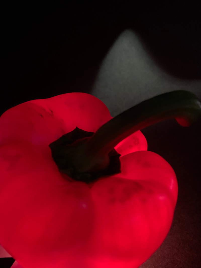


Edited in colour:
WWW: I edited these images so the contrast was really start, exaggerating the bright colours of the reds and greens. Also when using the torch it highlights the curves and dips that Weston liked, furthermore I made the backgrounds really dark to make the objects more dramatic and stand out against the mysterious background, this was also in the style of Edward Weston.
EBI: To improve these images I would focus more on how the light affects the images so crop and frame my photos more zoomed into the fruit to further abstract the fruit.
EBI: To improve these images I would focus more on how the light affects the images so crop and frame my photos more zoomed into the fruit to further abstract the fruit.
|
|
|

|

|
|
Edited in black and white:
WWW:
EBI:
EBI:
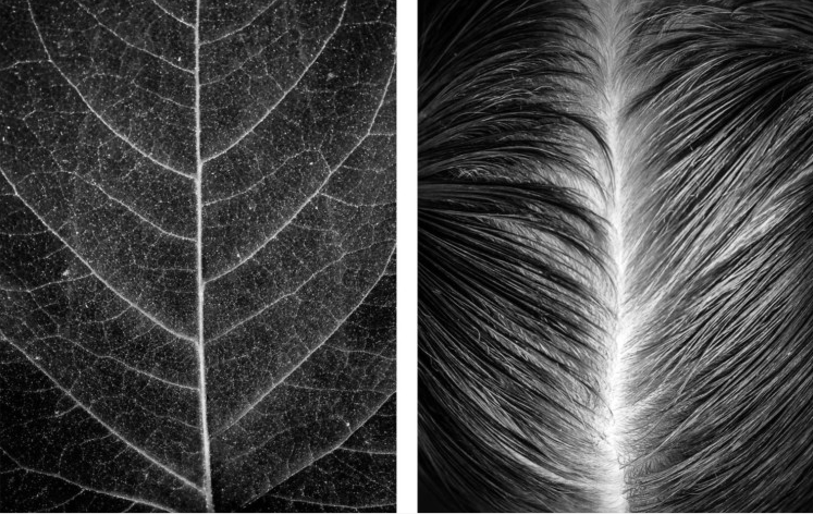
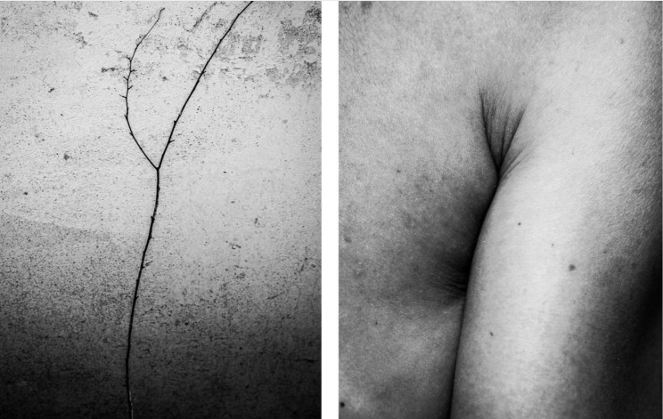
Abstract Comparisons- Body and Nature
Alicja Brodowicz
Alicia Brodowicz is a Polish photographer who project called 'Visual exercises' focused on combining two elements of the human body and nature. To create these photos she photographed nature to attempt to fins similarities between them and a body part. She focused in on different levels, textures and composition. The photos are then edited together to show the lines between body and nature in unity, her images are presented in black and white to emphases the detail of veins and lines and to further highlight the contrast between dark areas and brighter ones, finally it zooms in on what we are looking at rather than getting distracted by all the colours.
|
|
|
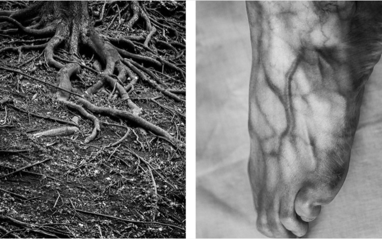
Agnieszka Lepka - Human Vs Nature
Another key artist who focused in on the blend between nature and humans was Agnieszka Lepka, he series called ' Human vs nature' is displaying her work where she highlights more similarities between the body and nature. She photographs the finer details that make up us humans, for example finger prints, skin, and veins that all represent smaller parts of our bodies. Her photos are more in colour compared to Bridiwicz who's were in black and white, i like this as it creates a different view points and highlights different parts while not distracting from the overall photo.

|

|

|
Contact sheet-
|
|
|


My edits:


|

|
Overall analysis:
WWW: I liked my final images as they are creative, abstract and finely detailed. I managed to find and capture similarities between nature and humans and I edited them in black and white to enhance the small details in each photograph2.
EBI: I found this task slightly difficult, as I needed to find components that were similar in both features and compose them in a way that complement each other, it was also hard to visualise a humanistic body part to match the one in nature however I think I successfully chose more unusual features.
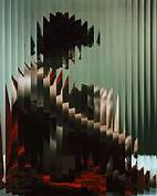
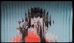
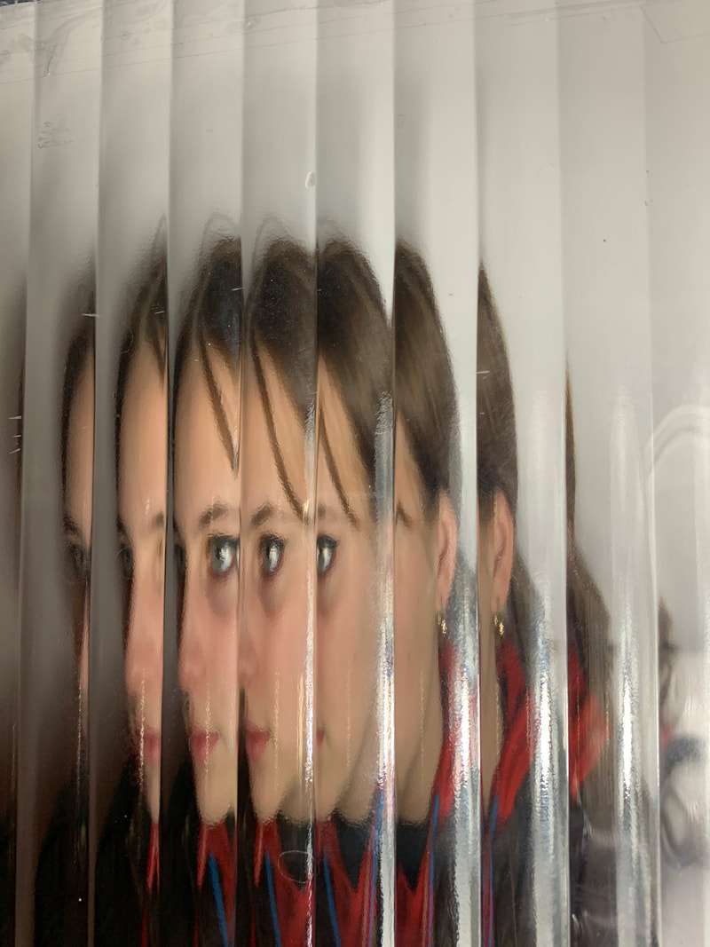
Abstract portraits
Erwin Blumenfeld
Erwin Blumenfeld was born in Berlin, 1997 and is regarded as the most influential photographer of the 20th century. He worked as a armature photographer during his younger years, following World War 1 Blumenfeld began working professionally and gathered international respect for the series of photos of artists Henri Matisse and Grorge Rouault. During this time he also photographed black and white portraits, nudes and celebrity portraits. He took inspiration from the Dadaists, and incorporated techniques like solarisation, multiple exposures and photomontage into his darkroom practice.
|
|

|
Contact sheets-
|
|
|


Overall analysis-
WWW: This shoot went well because I captured the likeliness to Bulmfelds work, Its really interesting to see how the lines can distort a face and make it look so different. I like most of my composition within the frame as they are central and in focus making the features clear in contrast to the Bill Jacobson style.
EBI: Some of my images came out not how I wanted, the glass was a bit awkward to work with as it was hard to hold steady so some of my images are blurry, and next time I would experiment with using different types of glass to create different styles and textures and depth to the photos. And the glass was very small so I could use a larger piece next time to have better images that were less cropped.
Best images from this shoot:


|


|
Task Two:
Bill Jacobson
Bill Jacobson was born in 1955 and was widely known for his focus on photographs that show both a figure and a landscape. Jacobson began to create these types of images in 1989 and has since then been displaying his photography in galleries all over the US and Europe. These pieces of work were called ' internal portraits' and featured pale, shadowy and blurred figures that were displaying expressions that evoke loss felt by many in the worst of the AIDS epidemic. He wanted his work to touch people who are scared or silenced from showing emotions to be empowered through these images.

|

|

|
Contact sheet-
|
|
|


Overall analysis-
WWW: I like how I incorporated a mix of colours to create different glows that light up different angles of the models face giving the photo more depth, I also love the blurred effect that the paper give and that the closer to it you go the clear it becomes. This gives you lots of room to experiment with angles and textures, however I found that being closer to the paper worked better in producing clearer photos. I also really love the effect that shadows from the torch have in distorting facial features.
EBI: To improve I would have the model do different positions and hand movements to get a vast range of photos, we also found that the only way to clearly see the darker bits of the face or hand was to press them against the paper, this was harder to do as it left marks of the paper that later effect other images.
Best images from this shoot:


|


|
Task Three; Individual development
For my independent homework task I wanted to carry on with the work of Bill Jacobson, as I really was interested in the blurred faces along with he exaggerated facial expressions to highlight different emotions. I took more photos of hands as well has the face because they came out really well whereas it was harder to focus on the face as a whole. The hands also adds dimension to the set of photos as they are also a way of expressing yourself.


Overall annalysis-
WWW: I used a sheer curtain and a shower rain curtain for this shoot as they were both thin enough to allow light through while still shadowing the main features of the face and hands. My aim was to keep the finger tips, hair, eyes and nose in focus and the other be more hidden. I was able to do this my pressing them more against the curtains creating a mysterious look.
EBI: To improve I would take more photos at different time of day or with a torch to get more types of lighting and shadows to distort the face and give the photo more depth, I could also crop the photos to zoom in on a certain future that I think looks very impressive like the ones above where the expressions are very clear.
EBI: To improve I would take more photos at different time of day or with a torch to get more types of lighting and shadows to distort the face and give the photo more depth, I could also crop the photos to zoom in on a certain future that I think looks very impressive like the ones above where the expressions are very clear.
Artist and Me
I think this piece of my work is very likable to Jacobson's work, I aimed to recreate the mysterious facial expressions, I used a white curtain to create this foggy looking effect across the whole photo I like this as it blurs the faces making them less recognisable. Finally when turning the image to black and white it highlighted the darker shadows just the Jacob did.

|

|
Ambiguity
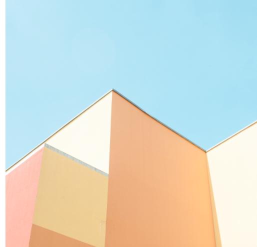
Johnny Kerr
Johnny Kerr is a fine art photography from the west Valley of Arizona, Phoenix, America. He is best known for his pieces that capture and portray architecture in a way that makes it appear abstract and featuring strong pastel colours, sharp lines to cut in half images and help with composition, and shapes. To create these images he observes building from morning to afternoon and watched how light and shadows effect the look and shape of the buildings, he payed specific attention to the way they composition the building and cut the photo in half. Some of the like join up the other corners of the building making it look like it joins where it does not, this use of manipulation makes the viewer question what is really there. His use of negative spacing at the top of the photos exaggerate the bright colours and shows how he explores the abstract qualities of a building.

|

|

|
I find these images really interesting because he takes what we are so familiar with and photographs it in a way that makes us stop and think about the composition and bright colours. His photos include very sharp lines sand neatness that makes them more appealing tot he eye as it gives them a cartoony and geometric appearance that is hard to find with a building. The stark contrast of neon colours against the more toned down and simple background creates a unrealistic look that brings out all the shadows and like.
Matthieu Venot
Matthieu Venot is a contemporary artist who is based in France. In his work he likes to focus on specific architectural details that often get looked over. With this he takes creates abstract and geometric images, the bright blue skies is a key aspect in his work as it creates a colourful barrier between nature and buildings, it is so subtle that it doesn't compromise the other colours of the buildings and the rest of the photo perfectly blends in together, the colours then also appear bright and more absorbent. Overall colours and space is the most important aspect in Venots photography as it tricks the eyes into believing the photos are taken somewhere tropical and abroad.
|

|

|
I find these photos very interesting as the pale colours blend in perfectly together to create a calm atmosphere. The lines that separate the urban buildings against the blue sky almost meet at different points even if they are behind each other in real life, this give the images so much depth and diversity.
Contact sheet-
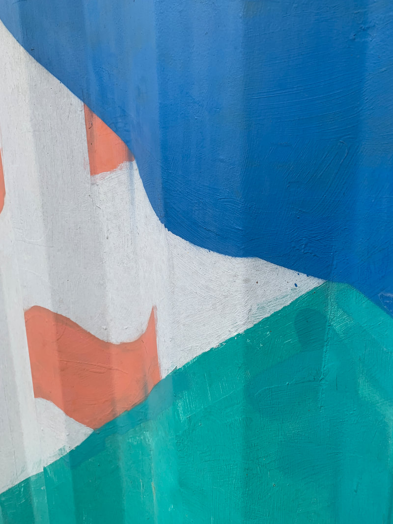
For this shoot in school we went around and photographed drastic lines, colours and splits shown that cut through shapes and parts of the walls that resembles the work of Kerr and Venot. I photographed lines, corners and the wider view of the buildings leaving negative space of the blue sky behind it and then edited them in Photoshop to turn them into the more carton look that they had. My aim was also to photograph walls that had hints of colour to make it pop, l found some blues and greens however there was not many so when it came to simplify them in photoshop some are quite bland. Overall this task made me observe finer details and lines that I might not have noticed before.
|
|
|


How I edited these photos
|
|
This slide show are snippets of how I edited these photos to their original colours to the finished product. First I used the polygonal lasso tool to select the area I wanted to colour ( to make it more detailed select smaller areas of different shades) then I went to Filter<blur<average to find and select the average colour in the selected area. This them fills in the area of that colour, I repeated this process for each section. It creates a cartoon like look to the photos of the block colours, like the Kerr style.
|


|


|


|
WWW: While editing these images I zoomed in on key details to make the final image clear and smooth, this payed of as a whole the image looks like a real cartoon style instead of a edited version. I like the simplistic look to these as it highlights the shadows and sharp lines.
EBI: To improve the edits of these images I would have changes the colour slightly myself to enhance the brightness like they were in the original images.
EBI: To improve the edits of these images I would have changes the colour slightly myself to enhance the brightness like they were in the original images.
In colour

|
I used this colour wheel to determine what colours work well together to create these photos.
similar shades- Pinks, Blues, Greens, Oranges, Yellows opposing colours- Yellow & Purple, Orange & Blue, Red & Green Harmonious colours- Orange, Yellow-Green, Blue- Violet |
SIMILAR SHADES- similar shades of pinks

|

|
OPPOSING COLOURS- opposite like olive greens/yellows and purples

HARMONIOUS COLOURS- close together on the colour wheel, green and blue

|


|
WWW: The best one in my option is the opposing colours as they match each other really well and I went into detail when editing it as the shadows and balance each other out. I found that having a brighter colour as the background allows the other colour to standout and highlights all the shadows.
EBI: I found it quite difficult to match the colours that I thought looked well together and complimented each other to creates these images, however I tried to choose colours all around the scale to show the diversity in them.
EBI: I found it quite difficult to match the colours that I thought looked well together and complimented each other to creates these images, however I tried to choose colours all around the scale to show the diversity in them.
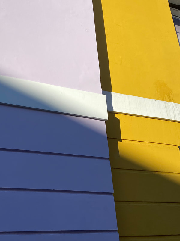
TASK TWO: Development in Kentish Town
For this second shoot I wanted to capture in his style more so I was more aware of looking out for negative space, bright colours and composition. I noticed these few houses had many lines of bright colours that went up and even matched with the sky making for a very eye catching image. Overall I think these images were well comprised and planned out, in a way that it highlighted all lines and colours. When I was shooting I was thinking about lighting and how It was effecting the shadows of my photos to create more abstractions and shapes.
|
|
|


Edits
|
Original
|
Normal colours


|
colours


|
WWW: I think these were my most successful edits as the colours I picked co so well to complement each other, I edited them in great detail and included all the shadows to add extra depth.
EBI: I thought this shoot was good but I could have shown more variations of colours in my edits, and again I found it more difficult to match colours that I thought looked good together so I used a colour wheel to help me.
EBI: I thought this shoot was good but I could have shown more variations of colours in my edits, and again I found it more difficult to match colours that I thought looked good together so I used a colour wheel to help me.
Abstracting the environment
Saul Leiter [1923-2013]

|
Leiter was an American artist who became encapsulated by photography and painting as young as his teenage years in the city of Pittsburgh. He later relocated to New York City in 1946 and he became one of the most iconic and well known photographers of the twentieth century. He began experimenting with colour photography in New York during the late 1940's using slide film like Kodachrome. In 2006 there was the release of his first monograph called 'Early colour' was a ground breaking and innovative way of photographing colour that permanently changed the history of fine-art photography.
|
Leiter's work used to be mainly in black and white where he experimented in portraiture photography. He liked to photography himself with bold compositions and messing with the focus, making the images blurry or clear. In his early years he was a great painter, he liked to paint daily and produces loads of bright and colourful paintings, most of his work was abstract and were made by using water colours. This later was used to influence and inspire his current photography of condensation dripping of the bust shelter windows creating a paint dripping look of a paint brush. He intrigued people with is carful use of obstructions, blurred movements and half concealed details of street life. In 1992, his work came to the attention of Jane Livingston, who included him in her 'New York School' - a group of mid-century photographers, including Robert Frank and Diane Arbus, with a film version of the city.
finally Leiter was also a pioneer of colour photography; he developed a distinctive style that played with with shallow depth of fields and a diverse, bright colour pallet. These photos are closely related to his love of painting, ' you can see influences of abstract expressionism in his colour work'
finally Leiter was also a pioneer of colour photography; he developed a distinctive style that played with with shallow depth of fields and a diverse, bright colour pallet. These photos are closely related to his love of painting, ' you can see influences of abstract expressionism in his colour work'
|

|

|
He goes around and captures the city life as unfiltered, unglamourised as people on on with their days - unlike typical abstraction it is what you see, this plays with out minds about what this type of photography is.
Contact Sheet-
|
|
|


Best edits-
|

|
|
|
WWW: I think these images were really successful as they captured everyday life and little moments that would have been looked over. When we were shooting I kept an eye out for bright colours like the orange coat and the red jacket as they complimented other colour in the surrounding environment. This was a common thing that Leiter included in his work.
EBI: I would like to take more photos like these and capture more people doing everyday activities, I would also shoot up more as it enables me to capture the reflections of cars and busses and other houses in the background it give the photo more depth.
EBI: I would like to take more photos like these and capture more people doing everyday activities, I would also shoot up more as it enables me to capture the reflections of cars and busses and other houses in the background it give the photo more depth.
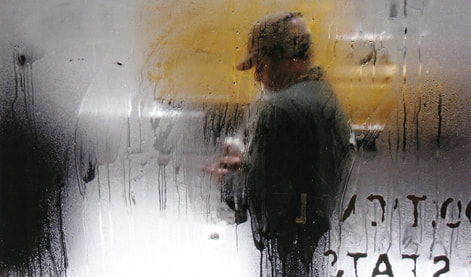
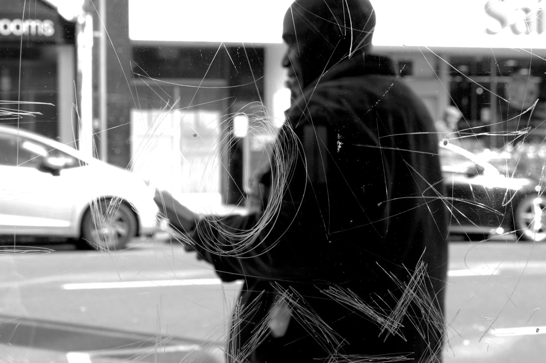
Stephen Calcutt
|
Calcutt's unique form of street photography is a consequence or scratched, graffitied and broken glass at bus shelters or windows in shops. He was based in the city of Birmingham. Even though Graffiti is a great expression of art it can also look like a outlet of frustration, anger and annoyance, compared to another type of graffiti that is typically seen as art like colourful drawing on the side of building are usually happier and welcoming. Calcutt felt that a windows full potential as a clear barrier between yourself and the elements is compromised when the view is beyond obscured, distorted or blurred by the scratches. He focus this photos by focusing in on the bad, like scratches and marks making them crisp and the most prominent thing in the photo. He creates a new perspective that emphases the energy of the graffiti and all its line, curves and slashes.
|
This bus stop series can evoke feeling of detachment from people as their whole figure are blurred making them a mysterious figure in the background hidden behind the graffiti. He wanted to create this feeling expressed through photos as he was very familiar with it when he suffered through anxiety and depression. These images also give on a dream like feel and sense of not reality as the what used to be a clear glass become a barrier between reality and scratches.

|

|

|
Contact Sheet-


Best edits-

|


|

|
|
WWW: What I think what was successful about these images were the fact I focused in on the minor details like the scratches and graphite, keeping the background and people blurred to attempt to resemble Calcutt's work. I was still focusing on colour and positioning between the lines as I wanted to make them the main focus.
EBI: I found It hard to keep the lens in focus on the lines when the people in the background were moving around so sometimes they weren't as blurred as I would have liked. I would have liked to capture more photos with people or busses passing by as it would have added more colours.
EBI: I found It hard to keep the lens in focus on the lines when the people in the background were moving around so sometimes they weren't as blurred as I would have liked. I would have liked to capture more photos with people or busses passing by as it would have added more colours.
Lee Friedlander - Mannequin Series
Friedlander was an American photographer who photographed between the 1960's and 1970's. He moved to New York in 1956 and began photographing for Atlantic Records where he photographed jazz singers like Duke Ellington. He was most known for his asymmetrical black and white picture of the American social landscapes and city life. These photos included people going about their everyday activities, in streets, parks and shop windows. I like his work as it focus more on reflections of mannequins in shop fronts and less on colour like Leiter. To create his Mannequin series he walked the streets of NYC and LA with a hand held camera, looking at street signs and shop reflections. I like his composition of the images as they include many dimensions of the camera being held upwards and down. The abstraction of the images are so interesting as you immediately see the mannequin as its a bigger object not blurred at the foreground of the images, however he also captures the reflections of clouds, sky and people/ transport in the background to add even more detail.

|

|
Contact Sheet-


Best edits-


|


|
WWW: I think these photos really reflect his work as I captures colours in my images and brought them out even more during the editing process. With the composition I tired to get different angles and In the bottom left photo there were dark lines splitting the image and putting the mannequin in the background that I thought looked interesting.
EBI: I would try to experiment more with different angles, as he shot mainly with a lower angles so next time I would do that to make them more like his style.
EBI: I would try to experiment more with different angles, as he shot mainly with a lower angles so next time I would do that to make them more like his style.

|
Chemigrams
|

|
The chemigram process was discovered by Pierre Cordier on November 10th, 1956. He founded out that a thick substance can hold back the chemical process that effects of the developer and fixer on black and white photo paper. If your paper is places into the developer that has been exposed to normal room light for a long time it will turn black except if there is a restriction barrier between the chemical and light. If the paper is put into the fixer it turns white, but the parts of the paper covered will continue to change from the light exposure. To do this task we needed:
|
- photographic paper
- developer - fix - water - fairy liquid |
Obstruction between paper & chemicals:
- honey, soap - salt - coffee - oil |
Process:
Firstly we added the liquid to the paper, for example what I found worked best was the vaseline as it acted as a thick barrier between the paper and chemicals. I rubbed this over my fingers and hand then printed it onto the paper creating a fingerprint. I then sprayed it with a bottle of developer to get the small black dots without the whole background changing this colour. However you could also put it in the fix to get a white background. Once it had fully developed I moved it into the soap bath to wipe of some of the vaseline. This meant that I had a fresh layer to developer, I decided to fully submerge it into the developer to turn the finger prints black, I found it really interesting how it turned out. Because of the vaseline bumps it gave the photo lots of texture and depth. Finally because of this some of the line turned pink while some stayed black. To finish the process you need to wash of the chemigram again and do a final fix for five minuets, rinse and then leave to dry.

|

|

|

|

|

|
WWW: I liked this process as we had freedom to do what we liked and experiment with varying amounts of liquids. We didn't know how they would turn out until the end of the process so its a very mysterious process. I think the finger print ones can out especially well as the Vaseline made miniscule details that resemble skin. I also found the most interesting texture was made by spraying the developer onto the paper.
EBI: To improves these images I would experiment with more products like soap and coffee to see they effects they have on the images and mix around with the way I put them into and out of the developer/fix.
EBI: To improves these images I would experiment with more products like soap and coffee to see they effects they have on the images and mix around with the way I put them into and out of the developer/fix.
Developments
Development One-
Radu Zaciu
Radu Zaciu creates his series called ' The light inside ' aim was to turn fruits and vegetables into light sources. He uses objects light light bulbs with strawberries, pineapples, potatoes and pears, he uses light to illuminate the inside of the hollowed out fruits. The skin of each objects acts as a barrier to cast a low hue of colour from the outside of the fruit, he notices that different fruits had different thickness and therefore projected different colours. For example the strawberry has a thin red skin meaning it will let of a bright burn red glow, and when inside the cauliflower it gives of a volcanic glow. In order to makes theses images Zaciu introduced small and large bulbs to the fruits, then carves into the base so the light can fit inside. This series is an unexpected mix of technology, photography and food.
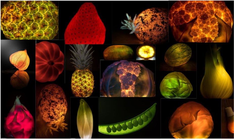
I really liked this style of work as instead of focusing on the fruit as you would typically see it, by lighting up the inside it illuminated parts from the inside that you may not have usually seen. For this shoot I used a light box that let out bright white light to reflect in into the fruit. Then I used black card to create the background and another piece to place onto the light box so the light was only shining on the fruit
Contact sheet-
|
|
|


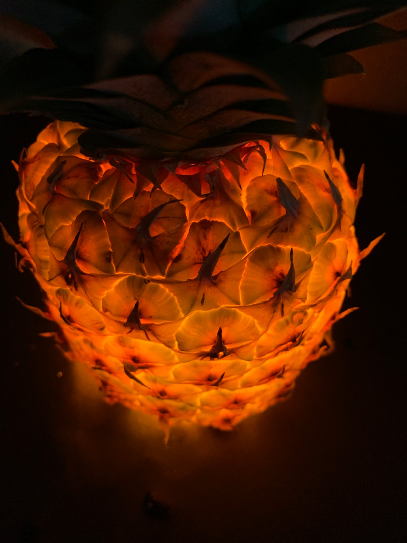

WWW: I think these images were really successful as they clearly show all the finer details from the light shining from the inside. I especially like the pineapple and the Lettice leaf as the pineapple let of a fiery glow lighting up all the darker bits giving it lots of depth.
EBI: To improve I could collect more veg like peas and cauliflowers to get a starker contrast in objects and colours, I think the cauliflower would work well with colours like I used under the pineapple as it was white so is more able to shine through. I did find I difficult to fit the entire pineapple onto the frame and it was to long and the black piece of card used for the background did not cover the whole thing.
EBI: To improve I could collect more veg like peas and cauliflowers to get a starker contrast in objects and colours, I think the cauliflower would work well with colours like I used under the pineapple as it was white so is more able to shine through. I did find I difficult to fit the entire pineapple onto the frame and it was to long and the black piece of card used for the background did not cover the whole thing.
Best Edits:
For these edits I cropped the images to make them more centre and used the levels tab to make the brightness better. Lastly I used the selective colour tool to enhanced and dull down the colours to make they glow more.


|


|
Further development
I wanted to develop this further and do a second shoot by using a light box to highlight all the segments of the inside of the slices, this highlighted the finer details by lighting the while side of a fruit rather than shining up, this gives a completely different effect.
Contact sheet-
|
|
|


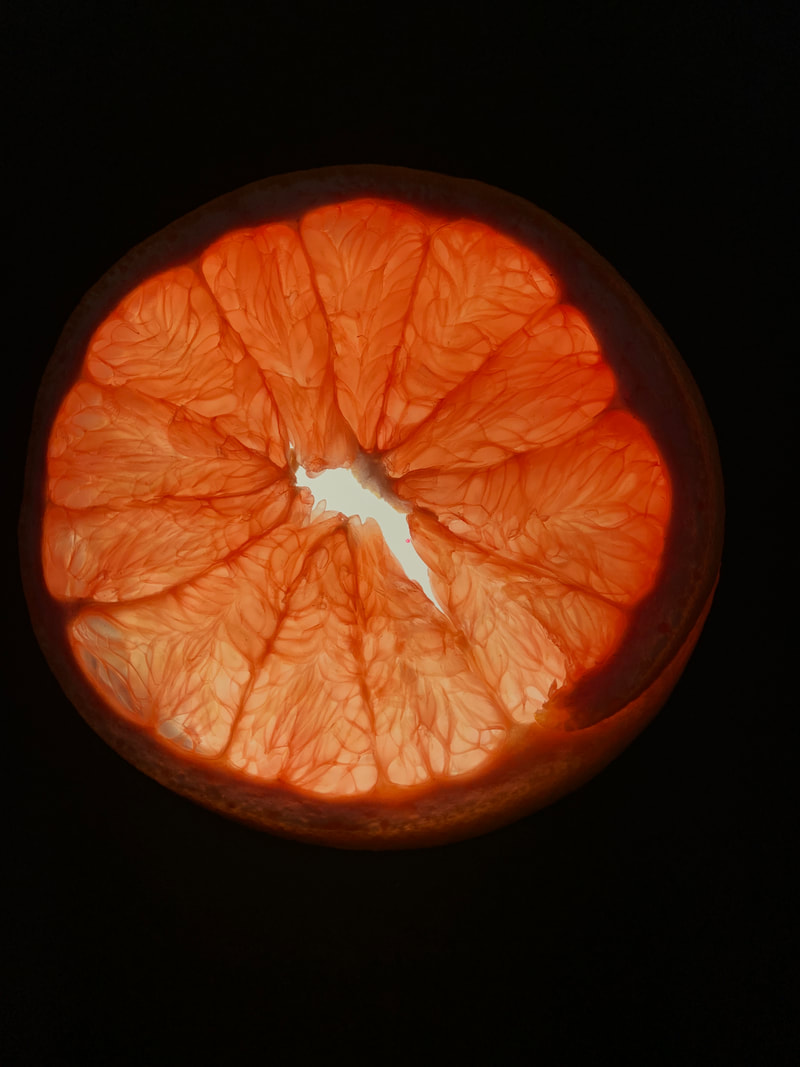


WWW: I used coloured sheets of clear plastic and placed them under the fruit to make them light up that colour, this worked very with the red colour more than others as it was bright and gave a more stark effect. To archive this effect I cut a small hole into the card they the light was able to shine through without lighting out everything else. It turned out well especially with the Kiwi as you can see all the individual seeds.
EBI: In fruits like the Kiwi the hole that I cut was to visible through the thinness of the slice, to even if you can see the finer details its not a clear photo so to improve I would cut a wider whole to go over the whole surface of the kiwi.
EBI: In fruits like the Kiwi the hole that I cut was to visible through the thinness of the slice, to even if you can see the finer details its not a clear photo so to improve I would cut a wider whole to go over the whole surface of the kiwi.
Final edits


|


|
Development Two-
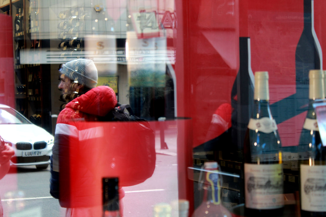
Saul Liter
Leiter was an American artist who became encapsulated by photography and painting as young as his teenage years in the city of Pittsburgh. He later relocated to New York City in 1946 and he became one of the most iconic and well known photographers of the twentieth century. He began experimenting with colour photography in New York during the late 1940's using slide film like Kodachrome. In 2006 there was the release of his first monograph called 'Early colour' was a ground breaking and innovative way of photographing colour that permanently changed the history of fine-art photography.

|

|
I really liked Liters work as he incorporated many aspects of photography to make the best images. He looked at composition make focused on bright colours of peoples cloths or shop windows. When I went to do my shoots I payed attention to these colours in the reflection as that's what I think most stood out.
Contact sheet-


WWW: I managed to capture reflections with lots of different colours and blended them all in together, this made the images whole. I also especially liked the images of the cheese shops and the ones with round glass as it incorporated the houses in the background, the sky and the stuff in the shop.
EBI: I think I would pay more attention to the people and transport in the background to give the photo more depth and be more interesting to look at at first glace.
EBI: I think I would pay more attention to the people and transport in the background to give the photo more depth and be more interesting to look at at first glace.
Final edits


|


|
Further Development
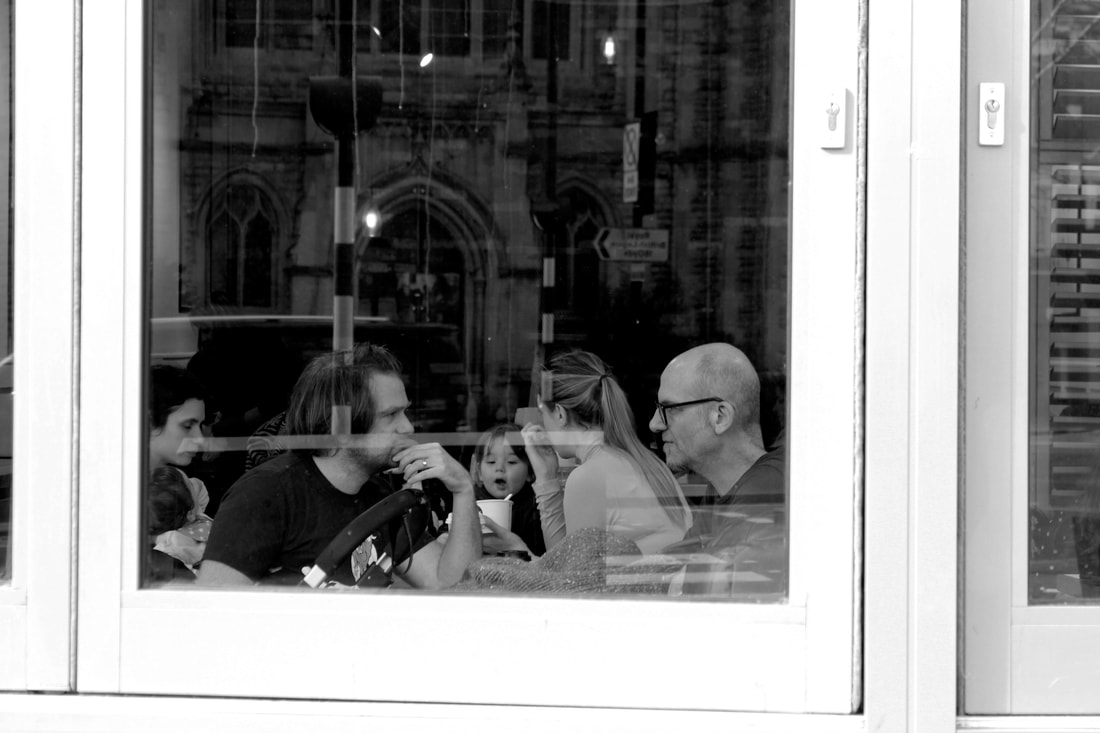
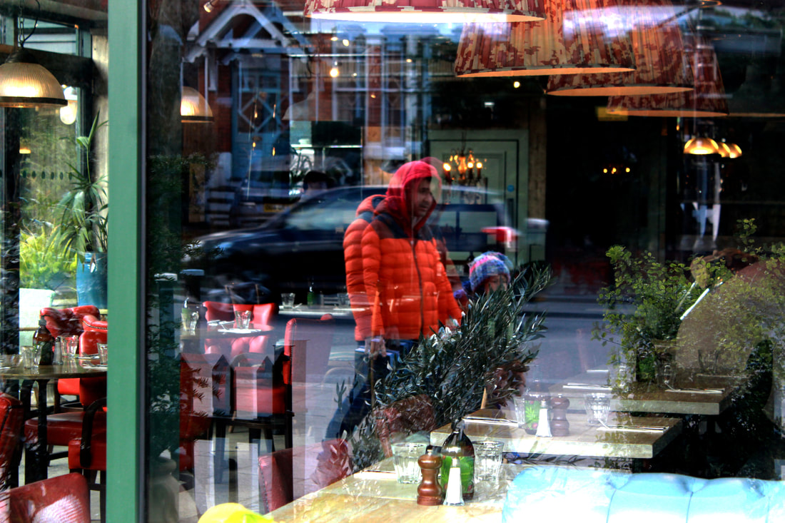
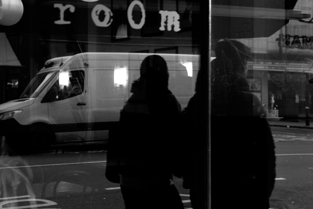
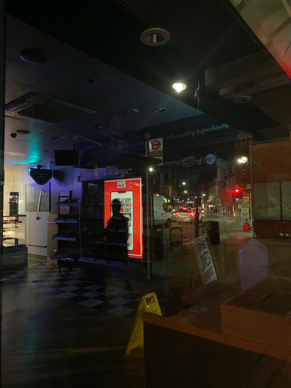
To develop the street photography further I wanted a change of scenery to capture different people and reflections. I decided it would be interesting to go into the centre of London. I walked from Southbank to StPauls to capture these reflected images. I looked at people windows in there houses, restaurant windows and shop windows. Out of all these photos I think the restaurant ones worked best as it photographed the London skyline in the composition not jus some houses.


WWW: These photos show the reflection of people walking past famous London landmarks, I like the it has the stability and blurry movement of people walking past making the image more full of depth.
EBI: To improve I would go to more locations with windows are I feel it didn't show the full potential of London's looks, places such as shopping streets might have more options to shoot.
EBI: To improve I would go to more locations with windows are I feel it didn't show the full potential of London's looks, places such as shopping streets might have more options to shoot.
Final Edits


|


|
Final Development-
|
|
|


Final Edits


|


|
