Exhibition one-
Christian Thompson AO: Being Human Human Being
I visited the exhibition of Christian Thompson AO: being human human being. It ran from June- November 2022. He is a Indigenous Australian artist who presents his photography through two films and a sound installation for Soho photography quarter; this is a new area around the edge of the photographers gallery that offers open air exhibitions to highlight the best contemporary photography.
Thompsons multidisciplinary practice draws on his own identity and multicultural background. His work challenges established systems of representation by imagining new collective and person positions. There are two series shown below 'Flower walls' and 'King Billy' they are seen as often unconventional images that reflect the artists interests in fluid identity's and cultural interests. I found these images most interesting as it reflected what I had looked at before about hidden identity and how it mixed two forms into one. The nature and flowers swarmed the faces and hand that were poking from underneath.
Thompsons multidisciplinary practice draws on his own identity and multicultural background. His work challenges established systems of representation by imagining new collective and person positions. There are two series shown below 'Flower walls' and 'King Billy' they are seen as often unconventional images that reflect the artists interests in fluid identity's and cultural interests. I found these images most interesting as it reflected what I had looked at before about hidden identity and how it mixed two forms into one. The nature and flowers swarmed the faces and hand that were poking from underneath.

|

|

|

|
These cross street banners were representing a project called 'Equinox' and 'Polari'
Thompson called them anti-portraits, where he portrayed himself into different identities by wearing costumes that he made by himself and posed regally in front of multiple backdrops. There was also a new soundscape 'Burdi Burdi' (fire fire) where the artist sings in his native Aborignal tounge Bidjara, now extinct. |
Exhibition two-
How To Win At Photography
This exhibition at the photographers gallery in Soho explored the relationship between photography and play. It wanted viewers to focus on the game like aspects of visual culture, across five different chapters. It draws on the unexpected connections between the history of photography (camera obscura) and contemporise practises of image-making with computer games. It looked at certain right and wrong rules that occur frequently in photography to create the 'perfect photograph' they are instantly monetised, competing as part of a larger attention economy and score systems are becoming increasing influential. It also showed how photography was a influential part of todays videogame culture, and how for many artists the exploration of these spaces and practices of image making is not about winning or loosing, its about bringing to the foreground what tensions lie beneath the surface of our visual landscape. Even as play, the photographic can be political.
Room One- Image making is play
|
|
|
For the third photo was done by a photographer called Justin Berry, from the US. He created a hyper-realistic images of the visual landscapes found in popular video games like call of duty. He is fascinated by the environments he encountered, the artwork that was displayed here was taken from his 2018 project 'Road trips' Here he shown a road driving through a forrest with a car hidden in the shadows. This was named after a location in Bolivia.
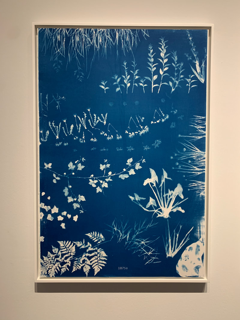
The first photo shown here is by Alan Butler,1981. He looked at abandoning the objective of winning at a game in order to shift his attention to exaggerating texture files of trees and plants from gaming software. This becomes part of picturing botanical archive documenting the specimens of virtual lora that inhibit game landscapes populated by millions of players.
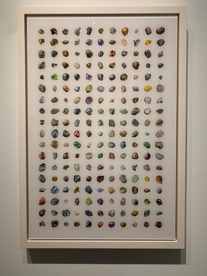
Finally the middle image created by Tabor Robak who creates imagined worlds that address our increasing overflowing digital realities. He worked with software-based tools traditionally employed in the production of video games, special effects and motion graphics. This work called 'Rocks' he singled out 198 stones using cutting edge computer graphics of that time, looking abstract and realistic. It created an ambiguous space in where the natural world and its artificial simulation in virtual game environments coexist in a state of tension, it presents a new kind of artificial nature, that appears familiar yet can only exist in digital worlds.
The first photo shown here is by Alan Butler,1981. He looked at abandoning the objective of winning at a game in order to shift his attention to exaggerating texture files of trees and plants from gaming software. This becomes part of picturing botanical archive documenting the specimens of virtual lora that inhibit game landscapes populated by millions of players.
Finally the middle image created by Tabor Robak who creates imagined worlds that address our increasing overflowing digital realities. He worked with software-based tools traditionally employed in the production of video games, special effects and motion graphics. This work called 'Rocks' he singled out 198 stones using cutting edge computer graphics of that time, looking abstract and realistic. It created an ambiguous space in where the natural world and its artificial simulation in virtual game environments coexist in a state of tension, it presents a new kind of artificial nature, that appears familiar yet can only exist in digital worlds.
Room Two- Game Play
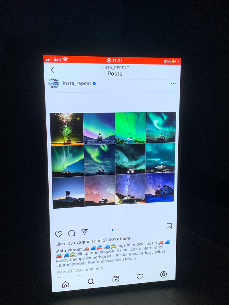
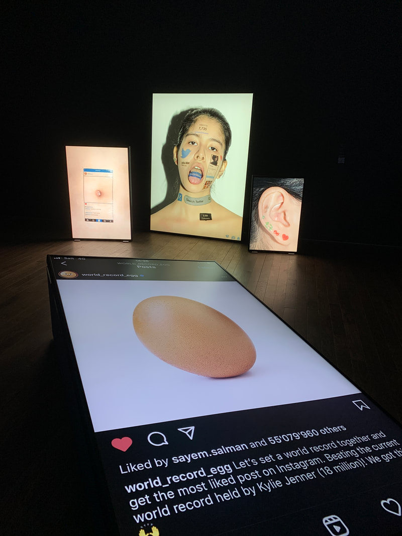
On the 4th of January 2019, a plain photograph of a egg went viral. It was created with the explicit intention of generating a new record as the most like picture on the platform of Instagram. It quickly became a viral phenomenon and accumulating more then 55million likes, reaching its goal.
The egg was later revealed to be part of a advertising campaign. This success story can be read as a symbol of how influential and the value of a networked images can determine its circulation. The egg demonstrates how tradition ways of interpreting a photograph through sermonic analysis and aesthetic evaluation have been supressed by the quantified attention an images gets online, with its relevance and success measures how effectively the image circulates.
I thought it was really thought provoking how a images sent on Instagram or a social media platform, that when we initially see we have no second thought about can effects the way we interpret life.
|
|
|
Room Three- replay, restage, react, recreate
This room consisted of photographs, the one that interested most was called 'Twenty-six gasoline stations' by ED Ruscha. For this series it appeared in the book of the same title published in the early 1960's. Ruscha photographed various filling stations across USA inclluding route 66. In the black and white photographs, we are presented with a matter of fact chronical of deserted landscapes. These generate a desolate atmosphere while also conveying a sense of repetition, the twenty-six filling stations were all photographed from a similar point of view.
The fact the photos have been used by other artists is indicative of the iconic status they have gain over they years.
The fact the photos have been used by other artists is indicative of the iconic status they have gain over they years.
|
|

|
Room Four- Camera Play
In this room included a section called 'Scanograms' by Ria Patricia, 1983.she creates her motifs by capturing images with scanners. In addition to found objects, the German artist also scans fragments of images that show has already scanned and printed as will as shapes cut out from paper and other materials. Accordingly the motifs she selected crop up more than once in different variations, she views them as declinations of the real objects.
The narrative quality is created entirely through the analogue arrangement and the dynamic relationships between razor sharp and blurred elements that are attributed to the shallow depth of field in the scanning processes. Roders scanograms constitute an experiment with a medium that has certain similarities with the conventical photo.
The narrative quality is created entirely through the analogue arrangement and the dynamic relationships between razor sharp and blurred elements that are attributed to the shallow depth of field in the scanning processes. Roders scanograms constitute an experiment with a medium that has certain similarities with the conventical photo.

|

|

|
Room Five- Replay
The one that caught my eye in relation to my project on 'Identity' was a series by Cindy Sherman,1954, called 'Film stills' this US photographer re-enacted iconic Hollywood poses of many female protagonists from the Hollywood films of the 1950's and 1960's. The black and white pictures evoke emotions in the audience and marketed with a certain audience with the film. The shot types were approximate genetic, degenerate into clichés of feminiety whose were exposed as scrutinises. Taking on the role of the gauche women, for example when she sits over the bed, looking unexpected.
This series consists of seventy photographs, it also reads like a category of female stereotypes that demonstrate the construction and appreciation of identify through media. Sherman's ambivalent re-enactment therefore challenges the norms of media that are solidified through performance for the camera, their instrumentalization and marketing.
This series consists of seventy photographs, it also reads like a category of female stereotypes that demonstrate the construction and appreciation of identify through media. Sherman's ambivalent re-enactment therefore challenges the norms of media that are solidified through performance for the camera, their instrumentalization and marketing.

|

|

|
Strand One:
My Shoot:
Greek culture, daily life
When on my holiday in Greece I walked around the little streets and restaurants and captured their houses, buildings and daily activities. I also looked at the scenery to create a group of photos that represent the Greek style of life. I wanted to capture the daily lives of people living in Greece, Careful shots and composition really showed the different ways people lived and I thought It was interesting to see how different it is and all the natural beauty of simply wonder around and seeing places and objects that as a tourist you might not always have seen.
|
|
|


Best images:


|


|


|
I edited these images to be brighter and have more depth. They way it captures the more natural side of Greece that is so naturally peaceful and quiet. The composition is placed in a way that is sectioning the windows for example, this gives the eye something to look at it and allows the viewers to see it in a different way. To improve I could have looked at the people more and take more photos of them doing daily tasks like working in the restaurants and on the fishing boats.
Strand Two:
Alexey Titarenko
Time, time passing, old vs young, trapped in time
Alexey Titarenko was born in Petersburg, 1962 and has been taking photos since the age of 9. He graduated from the Leningrad Public uni of society-related professions in 1978 with a degree in photojournalism and during that year he got the chance to hold his first solo exhibition through being a part of the independent photo club. His first major piece of work came about after the collapse of the soviet union in 1991 he proceeded to take several series of photos about the human condition of the Russian people during this time and the suffering that they endured through the twentieth century. He wanted to illustrate links between the present and the past, one way he did this was by creating powerful metaphors by introducing long exposure and intentional camera movement into street photography. The most well known series of this period that I looked into was called 'City of Shadows' it was taking in urban settings and landscapes like the Odessa Steps. He often produces these prints in darkrooms, bleaching and toning to add depth to his nuanced palette of greys to make the location more emotive.
'City of Shadows'
After the collapse of the soviet union in 1991, he said after years of trying to find a photography to peruse he was simply walking through the streets in the town centre that he once described as cheerful and teeming with people. However that late afternoon it was barely lit and devoid of cars. It was eerie with silence and empty shops. He could recall hardly recognising the people that once filled the streets as they seamed so lost and motionless. To him they looked like shadows and he wanted to contribute this sadness and distress to his audience through his photographs.

|

|

|
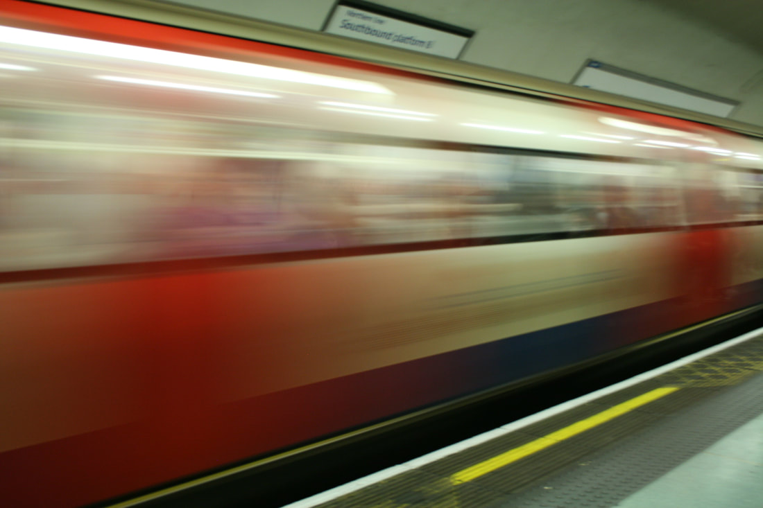
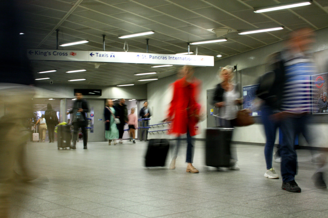
I wanted to go around London and in the main busy destinations for example, tubes, bus stations, kings Corss as it places people in a place where they looked so small and it allowed me to capture to blurriness of London city life.
|
|
|


My Edits:
|

|
I found it hard at the beginning to set my camera to the right shutter speed in order to create the people moving as blurrier than they were normally. It was also hard to get the surrounding locations as still as they could be because of the high shutter speed. Therefor some of my images are not as clear as I hoped. However I did manage to get some good composition of people in the tube station of Kings Cross. I saw opportunities like bright clothing, There were lots of people wearing red. I thought this was a good time to photograph as it linked to the background of the location with the tube, lights or the map. There were the photos that worked the most, I liked how I had one main person in focus and the other surrounding them were blurry. Creating a swarm of people.
Strand Three: Hidden Identity
George Mayer

Mayers work was called 'Anima' and was based on a psychoanalysis Carl Gustav Jung who believed there was a female part to the set up of our subconscious minds. He gave it the name 'Anima' meaning 'soul' from Latin. It represents the haziness and vagueness of feelings and moods that people have in love. If a man does not try to relate to his anima then he gets called a 'loss of soul'
While creating these images Mayer did a series of meditations to calm himself and establish a connection to his anima, he illustrated this by using a nude woman as his model. This touch to the subconscious mind gets rid of rudeness and one-sidedness. The red circle that highlights different angles of the body and mainly face is a reference to the planet Mars. The ancient Greeks associated this with the god of war, Ares who was personification of violence and cruelty. In western astrology Mars is associates with aggressive masculine elements. It manages wars, disasters and accidents. However in these photos he makes this anima positive and against violence and helping to find inner harmony.
While creating these images Mayer did a series of meditations to calm himself and establish a connection to his anima, he illustrated this by using a nude woman as his model. This touch to the subconscious mind gets rid of rudeness and one-sidedness. The red circle that highlights different angles of the body and mainly face is a reference to the planet Mars. The ancient Greeks associated this with the god of war, Ares who was personification of violence and cruelty. In western astrology Mars is associates with aggressive masculine elements. It manages wars, disasters and accidents. However in these photos he makes this anima positive and against violence and helping to find inner harmony.

|

|

|
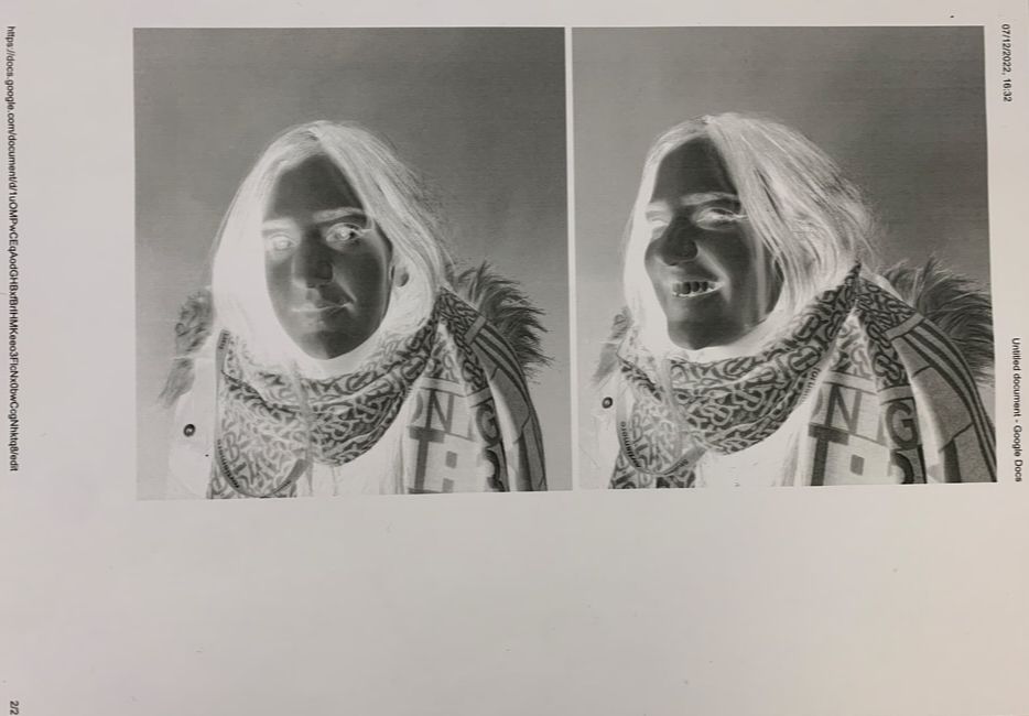
For this shoot I used a sun set lamp that I have to create the 'anima' it created a full circle of colour around the models face. I wanted to use it to highlight certain areas and make shadows of the face.
My Shoot:
|
|
|


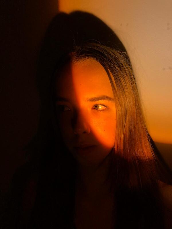


The colour from the sunset lamp is really striking once I made the background darker. It bring out the shapes of the facial fetures and adds depth into the photograph.
However I would want to accurately create these photos again with a cut out circle of colour to create the coloured background so that I can get the models full body in the photo with no reflection of the shadow.
However I would want to accurately create these photos again with a cut out circle of colour to create the coloured background so that I can get the models full body in the photo with no reflection of the shadow.
Best Edits:

|

|
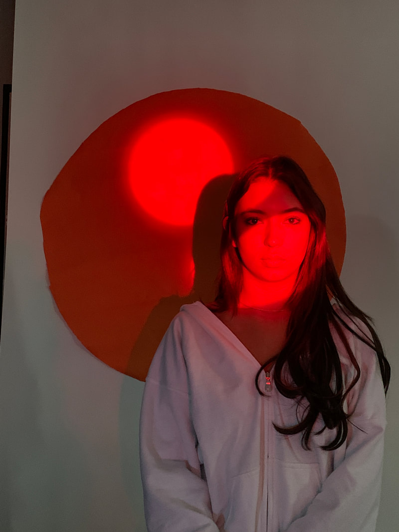
The wat the black circle carves out the eye and corner of the face, It makes the composition more interesting along with the orange colours making the lighting give a warm tone, because I edited the brightness and darker tones down to help the colour stand out. However I was still not satisfied with the photographs as they did not capture the likelihood to Mayer's work. I wanted there to be two defined circles around the head, IN my next shoot I tried to better capture this effect.
Development One
In this first development I still wanted to reflect the same ideas of Mayer, to do this instead of using a sunset lamp, I used the apparatus available to me in the classroom to have the ability to adjust the light circle and focus it on certain parts of the face and have a colours circle in the background. I noticed from the first strand the light didn't have any depth, so by using a light projector I was able to make two circles onto the models face. I experimented with different size circles to see how to change the composition of the final photographs. Overall I Still wanted to create the effect of the light matching up with the circle behind.


Best Edits:

|

|

|
These set of images were quite effective in they way that the lighting highlighted the orange circle of light onto her face. I wanted to try and create the circle so that it perfectly fit around the models head. However I think I had the model positions to close to the wall because It didn't quite fit, so in my next shoot I want to move the model to standing much further away so the circle is projected onto the paper circle in the background. I also experimented with different colours and what effect they had on the overall images, I used a plastic film to cover the white light and I liked the look at first however I think I want to stick to one shade of colours as it takes away from the atmosphere.
Development Two
For my second development I wanted to improve on my last shoot because the results were not as effective as I would have liked. I used a light projector that showed the coloured circles onto the model, I then used a plastic shape with two circles carved into it to create the round shapes onto the model. This was much more effective in mirroring the original images from Mayer. Overall I wanted to make a more bold photos and have the colours contrast more to each other against the darker background.
|
|
|


Best Edits:

|

|

|
This first set were slightly successful however I was still not satisfied with the results. I found that the overall atmosphere and brightness of the photos were to dark where you were unable in some to see the orange circle on the background. Furthermore Because I used a white backdrop I needed the model to be dressed in black to put her in the shadow's and make the viewer focus in on the colours, In my last shoot I changed this and planned in advance for the model to be wearing a black vest top.
I also recognised that the model was standing too close to the backdrop, making it hard to reflect my intentions of having the circle in the background colours her whole face.
I also recognised that the model was standing too close to the backdrop, making it hard to reflect my intentions of having the circle in the background colours her whole face.
Development Three
For this final shoot of improving my work of George Mayer I used the same equipment however I added a bright studio light to make the background lighter and more intense so that the shadows on the chest are darker. I also tilted the lamp more and had the model stand much further away from the background to capture the projected circle onto the one in the background, this brings the photo together much more and created a overall better composition to the photo.
|
|
|


Best Edits:

|

|

|
This shoot was the most affective shoot and clearly shows my development as I changes the thing that went wrong. The brightness is much better and highlights the shadows in contract to the luminous background. I wanted the model to wear a black top and remove the lanyard, blending into the background. I also tilted the light so that the circle was correctly lined up and projected onto the one in the background.
Development Four
Lucas Simoes
In his series called 'Desretratos' meaning 'unportraits' Simoes invited a close groups of friends and family around and requested they told him a secret while he took their portrait, his intention was never to hear the secret but to capture their changed expression as they tell it. He also asked them to choose a song for him to listen to while he was doing the shoot, then after all the photos were taken he asked if their secret had a colour- these will be the colours that the portraits carry. In order to create this style of images he printed ten different photos to overlap and cut different geometric shapes from. This made the face become distorted to the viewer and almost unrecognizable and is a clear template of a section of their identity.
I found it really interesting how he quietly included different information into these photos, that look distorted at first however when you look behind at the creation of the photos you can tell lots about a individuals personality and identity that before seeing the photo you might have known nothing about. He uses his architecture background to create these geometric, abstract shapes that modify the face, warping the photo, it force us as viewers to see the perspective differently as there has become no correct way to view the photo.
I found it really interesting how he quietly included different information into these photos, that look distorted at first however when you look behind at the creation of the photos you can tell lots about a individuals personality and identity that before seeing the photo you might have known nothing about. He uses his architecture background to create these geometric, abstract shapes that modify the face, warping the photo, it force us as viewers to see the perspective differently as there has become no correct way to view the photo.

|

|

|
First Shoot:


|

|

|
Second Shoot:


|

|

|
To edit these photos I created a geometric pattern photo as my print. Then I opened them in photoshop to add layers. Once I had all three images opened, I traced the shapes with a lasso tool and deleted them on the first photo I wanted layer so that they would come onto of the original photograph. This left me with two images blended together to created this distorted patterns onto the faces. I think this is really effected to distorted reality and fractured identity. Overall the edits came out as I hoped and they portray my ideas well, and I experiment with different geometric shaped to get different patters and results, however I could have added more images to add more detail and depth.
ARTIST VS ME

|
|
Development Five
I wanted to look more at how people see and interpret a person from a outsiders point of view. Usually we can make subconscious judgements of someone when looking at them without really knowing them. For this development I focused more on walking around seomens home and capturing fragments of their identity from what they own, and the design of their house. When I was taking these photos I really wanted to capture to the atmosphere and colour scheme of her home. I think this really expresses itself in the warm, orange tones. My Grandma has lived in this house for over twenty years and its her place to display all her photographs and special items she has collected over her life and from all her travels. I wanted to show how you can acquire a sculpted view on a person without seeing there real face, so no judgements are being made. They only thing you know about them are simply what you see around their home. Its much more personal to them and interesting.
My Shoot:
|
|
|


Best Edits:

|

|

|

|
|
These photographs clearly captures my grandmas identity through the objects she has collected and displayed throughout her home. The composition maps out a view that we see. It lines up the photos with the other objects in frame. The lighting highlights the edges of the images and gives of a golden light around her home. This adds texture and atmosphere to the photos to help strengthen the views idea on this person, without knowing what she looks like.
While doing this development I learned lots about my own family that really adds to my point of gathering a view of someone before you learn when they look like. My Grandmas house is filled mainly with family photos, objects from travelling as that's a big passion of hers and she has been doing it since she was as young as 16. Also lots of books on travel, photography and historic events. My Grandma (right)
|

|
Development Six
KayLynn Deveney- 'The Day-To-Day life of Albert Hastings'
KayLynn Deveney met Albert Hastings in 2001 when they lived in the same neighbourhood in wales. As they started talking more she learned facts about his life,past and how they combined to create the man he is today. He lived through historic events like WW11, being a general engineer and his relationships with the people he surrounded himself with. As they spent more days together on this photography project she become fascinated with they way he organised things and his time, long with the approaches he took being very thoughtful. This is when she started to develop her focused idea on depictions of home and family life of a individual. Deveney often sought photographs in the banal moment of the days, experiences that are not usually considered significant enough to warrant a photograph. One way she completed this was by looking for two domestic patterns and practice daily routines that make us feel at home or conform to what our home life should be.
The captions we see below the photographs are from some interesting and fascinating thoughts Albers expressed during the shoots, it made her think about they ways different people perceive photography. She then wondered about her perceptions as well and if they differed from how Albert saw himself, this idea of self image is quite thought provoking about the identify of a person. Therefore, to better understand Alberts thoughts of himself and the photographs she requested him to accompany them with a small note speaking of his own perspectives. Beginning with the dialog and then deeper thoughts. Overall some of her photographs correspond to the thinking that shaped the image, others interpreted the image in a different way. This added a new layer of depth to the photographs and a second critical perspective to her work.
Sadly in 2007, at the age of 91 Albert passed away, this is what motivated deveney to produce all her photographs into a book called 'The Day-To-Day life of Albert Hastings, featuring 83 photographs by KayLynn Deveney and 77 captions written by Albert Hastings.

|

|

|
My Shoot:
|
|
|


Edits:


|


|


|


|
The edits for this shoot came out how I wanted, they show some of my Grandmas everyday activities and I got her to write along side when she was doing like Deveney did. The contrast between real life and writing on paper is very dynamic. In the editing process I dimed the lighting down and increased the saturation to produce a warmer atmosphere to the photographs. This reflects the feel of the images and help to convey a warm and welcoming tone. I do think I could have got different locations and clothes to show the progress of the time of day.
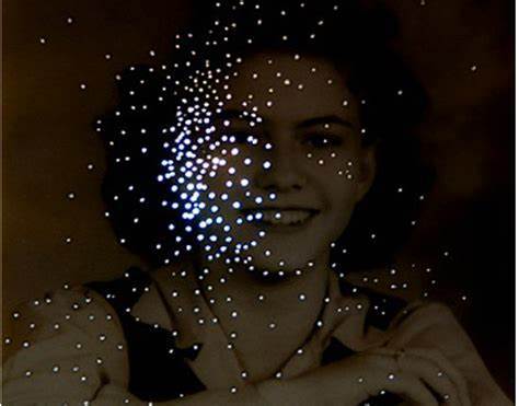
Development Seven- Amy Friend
Amy Friend is a Canadian artist working with many methodologies through the many forms of photography,installation and community based collaborations. Her work investigates relative history, time land, memory and connections to the universe. She used photography as a medium that explores the relationship between what is visual and non-visible. The series that particularly interested me was called 'Dare alla Luce' where over a period of time. She initially responded to a collection of vintage photographs taken from varying sources. Then she hand manipulates then by re-photographing the images to re-make them to oscillates between what is present and absent in our lives. She aimed to comment on the fragile quality of the photograph material but also the fragility of our lives and history. She used another photography medium of light to shine through the picture by making holes into the photograph. She liked to see this as a way to bring the light back into the photographs, it acted as a metaphor to allow new ideas surrounding the pictures.
The name of this series 'Dare alla Luce' means the images are being permanently altered, lost and reborn. The titles of each final photograph are either taken from the notations found written on the photos, but those with no annotation were commented on by the presence in the photo.
I found this concept really interesting, while the holes allowed light back into the photos to further highlight the most prominent and important parts of the photograph's. I experiment with making them around shadows and key features of her face to add depth and texture.

|

|
|
My Shoot:
|
|
|


These set of images I produced thinking out lighting and shadows and the way they work to create space for the manipulation. I used one main studio light to focus the light onto the side of her face to create a highlights onto her face. I focused my composition on maily shooting the side of her face capture the emptiness of her face to allow space for adaptation.
Black and White edits
I then edited my best images into a black and white tones to mirror Friends work, this allows the lights coming through to be more drastic and strikes a grand comparison between formats.


My Edits:


To creates these images I used a compos to create the little dots and then places the photos over a light box to shine a glow of light through them. However I don't think they came out as best as they could. Because the light was strong and the paper I used was really think , when the lights came through you could also see it trying to escape through the rest of the paper as it was so thin. So I think a thicker photo paper would have worked better and make the actual dots stand out. Also using a compos make the dots so small so hard to actual see through the light, to improve this I would use a needle
Development Eight-
For this development I took the idea of fragmenting someone's identity by peeling of the first layer of photographic paper with a shark tool. I like the symbolic meaning of this, taking away a layer of the identity to reveal someone thing underneath. I think the smooth shapes make the remaining features standout more for the eyes to look at.


For these images, because I used the leftover paper from this shoot I only had three attempts. I learned what shapes worked well to cover the others facial features. I discovered that by using curved shapes and lines with no straight edges made the final edit more round and better to create this idea of a fragmented identity.
Development Nine:
Dryden Goodwin- 'Cradle 2002'
Dryden Goodwin's work included drawing, live action videos and sound tracks to accompany his artwork. One specific series he called 'Cradle' in 2002, included large scale photographs where he traced a face with a compass to scrape lines all throughout the face. These close quadrants of the face all represent a individuals personally from a estranged view. It allows the viewer to distance himself from the initial judgement of a person by there face and focus on the beauty of life. In each photograph the models are caught at a moment of counterbalance between introspection and focused thought, compared to the mundane nature of the urban context that they are placed in. The fascinating gesture of mapping out faces with added lines could be constructed as a act of violence, yet still has a intimacy as the lines formed a web much like a cradle to hold their particular features and expressions. I found that they typically circled around key features like the nose and eyebrows to highlight to different face shapes.The markings are a attempt to elevate the individuals above where they have been photographed.

|

|

|
My Edits:

|

|
Development Ten-
I then wanted to try some different techniques of mine own, one included using a pen knife to sculpt and actually cut out areas of the face, to create a new photo entirely. I found this was quite effective in making your eyes draw directly into the main features left and created a interesting idea, however it was quite hard to cut into the paper without it ripping so i was unable to get really clear cut parts, doing it on photos paper that was stronger might have been better.


I found this was quite effective in making your eyes draw directly into the main features left and created a interesting idea, however it was quite hard to cut into the paper without it ripping so i was unable to get really clear cut parts, doing it on photos paper that was stronger might have been better.
Development Eleven- Putting layers onto each other
I wanted to carry on with this idea on sculpting and fragmenting a persons face in a different way, my still cutting out parts of their faces and also placing behind another persons face. In this shoot I placed two different photos but of the same person. I want to develop this idea further by looking at many different people. I liked this idea as It looked at identify from different perspectives, viewpoints and emotions.


Overall I found using a knife to cut out the faces works best, then I placed the photos behind, I moved them around to see what works best and discovered that placing it upside is most successful as its creating this distorted images of the face and places parts of the face where they never noramlly go or are seen. So the viewers really need to look and think about the images before they realise what they are.
Development Twelve- Mixing photographs
To further develop my work above I did another shoot of people, this time with different faces to cut out and overlap. I think this is a really interesting way to look at identity as it blends people together and you see them as one person.
My Shoot:
|
|
|


Best edits:
I edited these phots and chose to print them out onto paper. They all have interesting lighting and composition as I used a studio light. I looked out for the shaping of the face and where I would cut out the features for the others behind to shine through, thereofre picking images of a similar size is key to ensure you get this effect.
I edited these phots and chose to print them out onto paper. They all have interesting lighting and composition as I used a studio light. I looked out for the shaping of the face and where I would cut out the features for the others behind to shine through, thereofre picking images of a similar size is key to ensure you get this effect.


|


|
My Edits:
|
|
|


These images were harder to cut and blend together because they were of different sizes, this make it difficult to know what sections of the face lined up with other sections. So in some images I was left with some blank spaces that were not being filled with other facial parts. I tried to change this my flipping the underlying images upside down to create different angles and views. I think this was more successful as they created another side much like someone's identity. Overall I think they would have looked stronger in black and white as the colours clashed to much so some of the features were unidentifiable in contrast to the others.
Black and white edits:

|

|
When editing these photos into black and white I lowered the contrast to bring out the textures and layers between the multiple images. Overall it makes it easier to blend in the two images together and its therefore smoother to mix them together and merging the two identies.
Development Thirteen:
Myra Grene
This series of photographs by Greene, she started in the summer of 2005 after she learnt the process of ambrotype on black glass this process dated back to the invention of photography, 1850-1890's. Greene commented that this linked to slavery and how her skin is recorded making it seam ' historical and contempory in nature' . She wanted to make a photo that combined this process and the current issues that she was experiencing with race and identity.
Soon after she came up with this idea Katerina the hurricane hit in 2005, when this happened it led her to reading about culture and how other people see and judge people of colour. Greene then was inspired by the mug shot and how it captures different features in al angles. Her final showcase of work consisted of twenty plates of three by four inches. She shot a verity of facial features including teeth, lips, eyes and ears. She wanted people to build their own ideas of racial identity and how they are views by the world through the expression of futures in the photos.
Soon after she came up with this idea Katerina the hurricane hit in 2005, when this happened it led her to reading about culture and how other people see and judge people of colour. Greene then was inspired by the mug shot and how it captures different features in al angles. Her final showcase of work consisted of twenty plates of three by four inches. She shot a verity of facial features including teeth, lips, eyes and ears. She wanted people to build their own ideas of racial identity and how they are views by the world through the expression of futures in the photos.

|

|

|
I took the photos of the two models above and printed them onto asotaype for use in the darkroom. I selected images that were similar in size with a small difference in expression. For example looking in a different direction. I found this best for results because I wanted to explore the idea of separate identities coming through and how people can portray themselves from the inside and outside. Also how people can change expressions in seconds.
Asotape prints

|
|
Process-
In the darkroom I first created a test strip with all images to see the best timing to process the images. Then I experimented with different methods to create the best images:
In the darkroom I first created a test strip with all images to see the best timing to process the images. Then I experimented with different methods to create the best images:
FIRST PROCESS

|

|

|

|
1. Firstly I placed the prints one at a time on top of each other to double expose them, and moving them slightly away from each other, however this meant that the first image developed very dark as it was exposed for much longer and did not fully show beneath the top one. It did create a very faded or distorted print because the development was so dark.
SECOND PROCESS

|

|
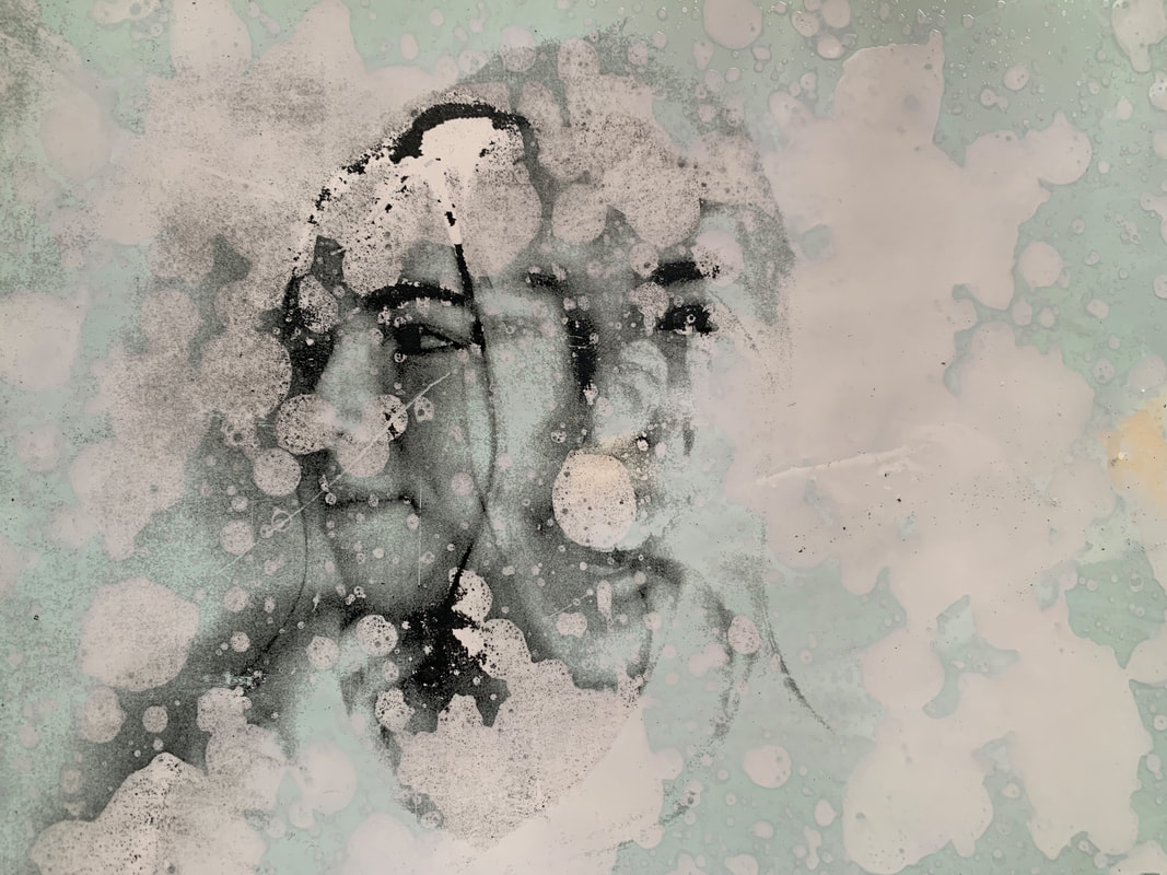
2. For my second attempt at creating the perfect double exposure print, I did the same process as above to create the initial prints, then I used a big paint brush to brush over the developer onto the paper. This gave the photos a fascinating pattern, the perfect circles created blank out certain parts of the face, leaving white spaces. This is really interesting dynamic however it's covering the images that is printed behind, so in my next development I just carried on with the normal developing process.
THIRD PROCESS


3. For this process was my final idea as I found it created a very interesting and dynamic double exposure. I place the two photos onto of each other on the paper and expose them at the same time. This means the is equal light giving to each photos and the one underneath comes out darker and more mysterious as its slightly worn away. And the images onto gets very exposed and bright. It creates such a interesting contrast between the two photos perfecting reflecting the different personality types. I think the graininess from the asotape also gives it more depth and texture to the photos. I also discovered that placing these images onto of each other allows the bottom to shine through, you get a very different effect of for example the scarf appearing around the second images head, something very unrealistic and unexpected however I like it and makes the images more detailed and as if these two people really are coming together.
|
Best Edit-
This photo I edited the contrast darker between the two layered images, this creates a ghost like figure appearing through. The contrast between lighter and darker faces is a stark difference between two separate identities. This allowed the photo beneath to faintly appear through. |

|
Development Fourteen:
For my final piece development I wanted to continue the idea of different peoples identities coming together and forming different emotions and personalities that are not seen from first glances on the outside. I photographed more portraits of members in my class to gather many different and divers images to uses in the darkroom onto of each other, along with taking photos of people my age I also gathered photos of older people to get different textures in the images. I used a mixture of studio lights and ring lights to create a very bright lighting and less shadows as I could manually. I took photos from all angles and some close to to cover all facial features and that I could match similar ones of other people. This means that when I take them into the darkroom to develop they will have more dynamic to them and I will be able to experiment with the same people or different people blended together with a variety of angles and features of the face.
My Shoots:
|
BELLA
|
Jasper
|


Dad
|
|
|


Libby
|
|
|


Final images to develop in darkroom:


|


|


|
Images for darkroom:


Darkroom Developments:
For these images in the darkroom I wanted to create a ghost like figures that faintly shine through each other. I liked my previous development and after I archive the perfect balance between the two faces, I want to start experimenting with different patters like using tape to creates a more washed away look. I did a test strip to find the perfect time for the developer, than I did my prints. Again I found it best to test with the same people and then mixes of people. I think this idea as its portraying identity of many different people of all different ages and facial expressions.


These images from this shoot in the darkroom came out not exactly how I wanted. I found that because the images were not that contrasted to each other that the different layers of images don't give the ghostly atmosphere or look that different. I put them under the light for four seconds and it still appeared to dark yet no depth. To change this I would try with a filter to increase the contrast in this images. However I do like they way some blend together, and parts of the face overlap. For example on the ones that I placed upside down give a new point of view to the photos and another angles that's unexpected in reality.
Best Edits:

|

|
I choose these as my best edits because the different layers of the faces blend together smoothly and create a duel identity.
Development Fifteen-
For this development I was happy with my ideas for the previous development in the darkroom, however I wanted the images to be contrasted more and showing a clear difference between light and dark faces. I think it makes it more dramatic and stands out the individual faces. To do this I use a lenses filter placed over the enlarger in the dark room.
Images:


Development Sixteen-
For my final project I wanted to resume the idea of the washed out tones from the filter I added. This gave my images a bigger contrast between sides because before I found they developed to dark to able able to identify between the two. So this washed out tones give the images a depth. It enhances the distant figure hiding in the background, it creates a mystery idea circulating the on growing discussion of what identity means to a person. I wanted to blend the four portraits of different people together to create a collage of people and their ever changing emotions that are sometimes hidden from view.

Development Seventeen-
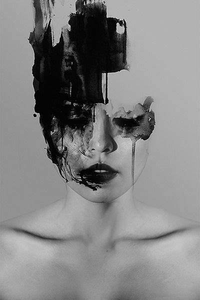
Janus Miralles
Janus Miralles is a photographic artist from the Philippines who used digital processes to manipulate his subjects in his photography. Through this process he added paint to alter and develop the photos physically. The way the paint effected these images was eye opening and It left small patches of the image untouched, giving the photos a mysterious effect because some parts of the image are missing therefore we cannot see the full face making the viewers question what they are seeing. He wanted these images to be almost unidentifiable, disturbing and unusual through the fading of the paint dripping down the images like paintbrush strokes. In my work I wanted to take this idea and use it on blue photographic paper to get the effects of parts of the face missing or fading away, much like my idea of identity not being all that you see.
To create this look, I applied bleach physically to the photography instead of digitally. This meant I had more control onto where I placed the bleach and what areas I wanted to fade away. I printed my chosen photographs and printed them onto blue photographic paper, this made the bleach come out a light pink colour that I like because its bring the black and white into more depth and colour. I chose the bleach as it peels of a layer of the photograph mimicking the metaphor like peeling away layers of a persons personality when getting to know them. There was many different ways to apply the bleach, each giving a different result. However the one I felt best worked was using a paintbrush and dripping it onto the images. It allowed me to have greater control over the bleach and on what parts were going. I felt its important to keep the key facial features like how Myra Greene did, like the eyes, ears and nose. All key ways we communicate to others.
To create this look, I applied bleach physically to the photography instead of digitally. This meant I had more control onto where I placed the bleach and what areas I wanted to fade away. I printed my chosen photographs and printed them onto blue photographic paper, this made the bleach come out a light pink colour that I like because its bring the black and white into more depth and colour. I chose the bleach as it peels of a layer of the photograph mimicking the metaphor like peeling away layers of a persons personality when getting to know them. There was many different ways to apply the bleach, each giving a different result. However the one I felt best worked was using a paintbrush and dripping it onto the images. It allowed me to have greater control over the bleach and on what parts were going. I felt its important to keep the key facial features like how Myra Greene did, like the eyes, ears and nose. All key ways we communicate to others.
|

|

|
My Edits:


|

|
These images on photographic paper carefully displayed my ideas about identity fading away over time and also identity and personality coming being peeled back as we begin to know someone. From using a paint brush it gave me more control over where the drops of bleach were places, highlighting the key features of communication for example the eyes. Theses are a key to opening up and seeing people the way we do. Having the bleach stronger and more concentrated around these areas brings in the eyes to look at the key features. Furthermore I found that there were certain areas in the middle that I used a paper town to get a splattered effect on the image, making no gaps left white and that all areas were covered in bleach. I thought this was really effective in attracting the viewer because the images is very busy. However I can see that in some areas there are parts that are to crowed than I hoped, there is to much bleach and it takes the focus away from the face and I wanted that to be the main point so I could have added less bleach to avoid this.
Development Eighteen-
In this development I wanted to explore Using different medias in photography. One that I find particularly interesting is film cameras. I like the mystery of the unknown and developing it to see how your photos came out. When I used the film camera I placed a colour film inside as I felt this gave more more variety of photos are depths. Then I used the Twenty four negatives to take portraits of people in my class. Next I wanted to create a double exposure effect by re-rolling the film to over lap them, this meant I could take another set of images layering over previous ones. I liked the way this communicated my ideas of duel personality and a persons true identity fading or appearing as you get to know someone. The two facial expression it demonstrated are reflective of this idea.
To develop the film I used the process of filling the bucket with developer for Six minuets, Fix for Five and the stop for One. This process worked well and after I felt them to hang, to check if they developed correctly I check that my film was clear and it was.
I am happy with the result of these and went ahead to create a contact sheet to have the ability of easy access to see what photos were going to work the best.

|

|
Contact Sheet:
To make my contact sheet I layered the film in rows of four, then I places the paper underneath with a sheet of glass on top. This made sure the negatives stayed still and produced the cleanest sheet. This was really helpful to see the images in full, however I found it hard to make sure I wasn't printing loads of the same image so to sort this out I used a pen to circle all the good print that I wanted to develop further, and crossed over the ones that were to exposed and didn't show enough of the two faces. This was a good method of insuring I was not wasting time or paper.

|

|
My Negatives:
Overall I was please with the way my negative came out and reflect the theme of hidden identity. I like how the faint figure comes out from behind the other person. In certain lights you can see glimpsed from underneath, areas like the eyes and rear came out strongest. I experiment with using a paintbrush to brush the developer over the photo. This gave a splattered look and I like how it enhances certain areas and hid some others. It is a good mix between revealing and hiding parts of the face. However overall I think you archive a better effect if the whole photos is in the developer as it gives a more rounded photograph for the viewer and you can clearly see all the different parts of the facial features. However I felt that some of the photo prints were to dark and this got in the way of seeing other parts of the face that I wanted to be the main focus. The contrast was to small therefore the face that was lighter underneath was harder to see and in my next edits I wanted to fit this.


Second Trial
As I was not that happy with the contrast of the photos above because it looks like the developer was to dark therefore it restricts your ability to see the face underneath. This was going to be the main focus of my photos to reflect the idea of Hidden identity. I decided to use a filter on the enlarger of a four point five, this made the contrast more dynamic and dramatic and I think this makes the overall feel of the photographs more depth and I like how you can show different angles and it really look realistic of the layers and points of view.


Final Piece images:
For my final piece I wanted to take the best photos from my film camera, these are displayed below. I felt these showed the wider range from faces, I liked the way they shone threw from below and highlighted the ideas of people hiding their true personality and identity from people in order to save judgement. I think the way that different people have appeared onto of each other are really effective in translating this. I still wanted to made my photos brighter to further enhance the contrast and to help highlight the difference in people. I think the most effective ones where where you could see the person positions on top, it clearly demonstrates the contrast between people and their appearance and tells the viewers not to judge people based on how they look.


|


|


|
Making of Final Piece:
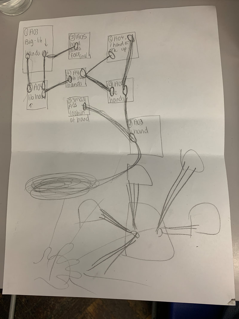
In the making of my final piece I decided that on reflection, overall I liked the photos from my film camera and I loved the atmosphere they gave out and I thought It was really interesting and eye catching. Because its not a typical way you would picture a person and so It brings in parts of surrealism and makes the viewer stop, think and really question what it is they are looking at, this would really engage the viewer because the two people are so blended together it makes it hard to depict what feature belongs to what face. It looks unrealistic the way there are ears in the wrong places and gives a different feel to the photo. I also printed my final Six onto size A4 paper to make them bigger once transferred onto fabric.
For my final pieces I wanted to use another medium of photography, fabric. I think this adds a element of truth the the photography because your are able to see a physical copy and I liked how it looked at blending two forms together of the film camera negatives and the fabric. I liked the way it also represented this idea of your identity being able to be manipulated and messed around manually.
The process I went through to make these consisted of choosing my best photos, I then edited them to make the contrast bright, I found that when the dark parts were enhanced it made the over images lots stronger and the lighters parts were also made more noticeable because the background turned whiter so anything stood out. This also worked out better because it meant the photo blended into the fabric more. Next I used fabric paper and printed two of each photo therefore I could experiment on one and choose the best for my final photos. After I had them on the paper I used a iron to place it onto the cut out fabric. This process was great to present them onto a different form that reflected my ideas further. Overall I liked how my final piece really reflected my ideas surrounding Hidden Identity of how peoples fear or judgement is highlighted with the double exposure of the peoples faces. the fabric enhances this idea and I like how it blends together. However I wanted to use a metal brush to scrub away the edges of the prints to the lines are less harsh however it was to strongly ironed on that nothing was moving. Instead I used scissors and my hands to rip the edges and peel the string away to give more texture and make them look older.
The process I went through to make these consisted of choosing my best photos, I then edited them to make the contrast bright, I found that when the dark parts were enhanced it made the over images lots stronger and the lighters parts were also made more noticeable because the background turned whiter so anything stood out. This also worked out better because it meant the photo blended into the fabric more. Next I used fabric paper and printed two of each photo therefore I could experiment on one and choose the best for my final photos. After I had them on the paper I used a iron to place it onto the cut out fabric. This process was great to present them onto a different form that reflected my ideas further. Overall I liked how my final piece really reflected my ideas surrounding Hidden Identity of how peoples fear or judgement is highlighted with the double exposure of the peoples faces. the fabric enhances this idea and I like how it blends together. However I wanted to use a metal brush to scrub away the edges of the prints to the lines are less harsh however it was to strongly ironed on that nothing was moving. Instead I used scissors and my hands to rip the edges and peel the string away to give more texture and make them look older.
FINAL PIECE


|


|

