
For my unit two section, I felt the word that connected most to me was the word Attachment. After doing some research and looking at different artist based around this work I decided it gave me lots of freedom to experiment and take my project further with all its many meanings and pathways. I looked into physical and mental attachment along with attachment in nature.
Gallery Visit:
Chris killip- Retrospective
Killip had a continued effort to value and document the lives of those affected by the economic shifts in the North of England during the 1970's and 80's.These have made him one of the most influential figures of British photography. This specific exhibition 'Retrospective' featured more than 140 photos of his to date and some of his previously unseen work. One special thing that was communicated through his work was his ability to give and stark and sympatric observation and extreme focused attention on issues that often go neglected or hidden from the public, Its really interesting that he gives another view and helping to educate the world on these historic events through photography and this inspired me. His sustained immersion into the communities that the photographed remains individual and often unseen, this is what makes his work so special as its completely individual.
Killip had a continued effort to value and document the lives of those affected by the economic shifts in the North of England during the 1970's and 80's.These have made him one of the most influential figures of British photography. This specific exhibition 'Retrospective' featured more than 140 photos of his to date and some of his previously unseen work. One special thing that was communicated through his work was his ability to give and stark and sympatric observation and extreme focused attention on issues that often go neglected or hidden from the public, Its really interesting that he gives another view and helping to educate the world on these historic events through photography and this inspired me. His sustained immersion into the communities that the photographed remains individual and often unseen, this is what makes his work so special as its completely individual.

|

|
STRAND ONE:
Romain Jacquet Lagreze's 'Wild Concrete'
Romain is a French photographer who is currently based in Hong Kong since 2009. He has had his growing passion for photography since 2010 when he used a camera as a way to capture and explore his new home city in a different way. It inspired him to looked at the unfamiliar street in a different way and this led him to develop some of his most famous work including 'City poetry' and 'The blue moment'.
The series 'Wild concrete' compares the living conditions between humans and nature. It came about from a passionate belief of a series of photos that he wanted to represent the resilient behaviour of nature and how it links and spreads its self to a more developed and urban environment. Romains main focus was when he moved to Hong Kong,2010, and he was able to photograph the phenomena of trees spouting from residential buildings. The sense of human alienation that he is able to create is equally embodied by the clusters of trees and flowers sneaking their way into urban settings.
I liked this contrast of two forms of life and out daily world that have a grate contrast and deeper meaning once placed together because as a audience we typically are not used to seeing them together. He discussed that no matter how good we are as a planet at dominating out environment we live in, including building, homes, concrete structures. There is a pattern here, these are all man-made structures to keep nature out and something really special, and he wanted to point out, is that nature will always find a way to tangle its self back in and find its many ways to fight back.
Romanis photographs show a wide variety of plants, branches and flowers all sprouting and showing signs of life all coming together and breaking through in the most unlikely places such as domestic places. This demonstrates how our own concrete jungle eventually will have given into the force of nature when we all are gone.

|

|

|
My Shoot:
For my set of images, I was inspired by the background ideas of Romanis work. However I wanted to go on a walk around my local area and into town to see what forms of attachment happen in our daily lives and unplanned ones. I found that there were many ways nature attached its self to man-made objects such as fences, walls and doors. This is very reflective of this fighting ideas and nature trying to makes its way back in. There were also examples of attachment of objects and how they bind together as a whole. This was interesting to see the contrast between the two and I was able to include examples of both types of attachment styles.
For my set of images, I was inspired by the background ideas of Romanis work. However I wanted to go on a walk around my local area and into town to see what forms of attachment happen in our daily lives and unplanned ones. I found that there were many ways nature attached its self to man-made objects such as fences, walls and doors. This is very reflective of this fighting ideas and nature trying to makes its way back in. There were also examples of attachment of objects and how they bind together as a whole. This was interesting to see the contrast between the two and I was able to include examples of both types of attachment styles.


Best Edits:

|

|
Analysis:
For my best edits, they consisted of a mix of the different attachment types I discovered in everyday life as I was inspires by the ideas behind Romani's work. I found the hanging shoes and jumper photos very deceiving as from first glances its hard to tell what's its up against, its the sky. I liked this way of manipulating the viewer so they need to focus and can see the photos in their own light. I think the lighting also gives the photos a lot of depth and texture because I photographed it with the composition so the objects were positioned with the sun behind them, making them really dark and almost blacked out. This is really effective to highlight the contrast of light and dark and can bring a new element to the photograph that might have been missed if shot from a different angle. In the editing process for it I just increased the contrast. However, I would like to see more of nature interacting with the urban lifestyle, the photos I took of this I felt didn't highlight the layers as well as they could have and I found it hard to capture interesting angles. So I would go out and photograph of a more sunny day to create some shadows and give the photograph more emotion behind it.
STRAND TWO:
Landgon Clay
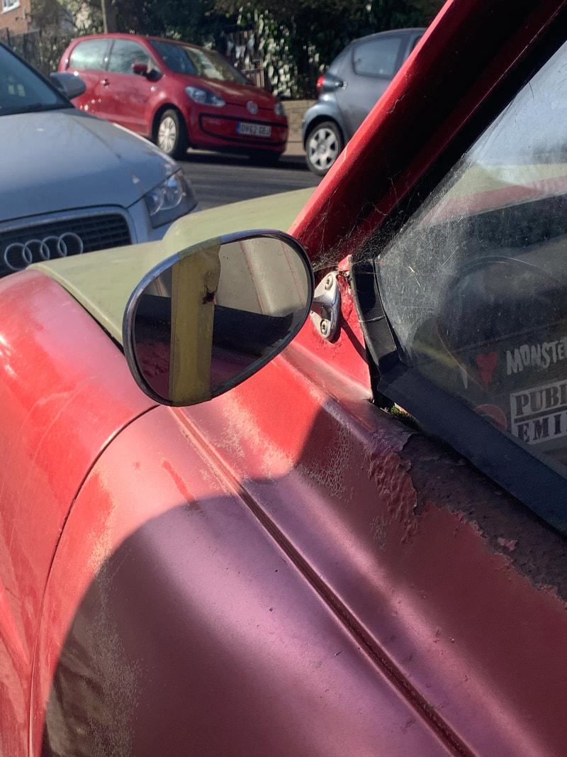
Clay was born in New York city, 1949. Raised in New Jersey and Vermont he attended a school in Boston where his love for photography started to develop. In 1971 he moved to New York City and spent Sixteen years perusing his photography job there. His chosen format was cars, especially vintage ones. He found that each were different to others and this made it very interesting for him to photograph. In the 20's they were a indispensable aspect of this era both for their utility and aesthetics. From 1974- 1976 Clay photographed the cars that he had encountered while wondering the streets of New York at night. These photos feature a distinct array of models and variations against the gritty details of their surrounding urban areas and buildings around environments and sometimes the ghostly presents of other humans.

|

|

|
For this strand I wanted to look at the connections and different attachments people have to some possessions that they might use everyday. For example cars, I found that some people take big pride in the cars they own and often have a fascination to older cars. I wanted to capture the more old fashioned style of cars to show the time that has passed. I also felt that they had a more of an individual look to them and I could imagen all the different angles and composition I could photography them in.
My Shoot:


Best Edits car one:

|

|

|
Car Two:

|

|

|

|

Analysis:
For this shoot I was very happy with how they can out, While shooting I walked around my area and photographed any cars that looked colourful and more worn out to get that interesting vintage look to them. I was able to zoom in and capture areas of the car that were more worn out and had signs of use and love to display the attachment. I used my camera and shot at many different angles to try to make the car look different and almost unrecognisable to how it would normally look, I did this by sitting down and isolating the curves of the car from its surroundings to make it look isolated and bold. In the editing process I enhanced some of the orange and red tones to make them stand out more, I love this effect as it increases the depth and contrast of the bold bright colours and the pale blue sky making it striking. However I could have taken some photos of more modern cars to show a contrast and I found it hard to isolate the car completely because of its surroundings that I couldn't control for example other cars being in the background.
STRAND THREE:
ATTACHMENT TO OBJECTS
After looking at different areas of attachment, I wanted to venture into peoples attachment to certain possessions and what we can learn about a individual by looking at what is important to them and what they have collected over the years. I was really interested to look into this idea more and I began to mind map objects that people might have emotional attachments to, even after many years; tickets, wristbands, stamps, posters, travel tickets. The list went on, then I looked around my house and my friends and found most of the things listed above. When shooting this I used a white backdrop to ensure a clean background as all my objects were coloured I wanted them to stand out more. I also used a ring light to make sure that any shadows were eliminated and weren't cast over the objects as this would block the view.
My Shoot:


Best Edits:

|

|
Analysis:
I found that when Editing my images it was hard to find ways to arrange them In a more interesting dynamic, so Instead I used composition to try and create different angles that are more unusual and interesting to look at like from the side where your eyes don't normally set. It was also difficult to bring the brightness up on the white background, I wanted to make this a lot brighter to deepen the contrast between colours however when I used photoshop to do so it was hard not to change all the colours.
I liked how I the editing allowed me to single out the brighter colours again the pale background to enhance the contrast and the brighter colours make it more eye-catching for the eye to look at. I also think the lengths of the wristbands and the way I laid them out make the dynamic more deep and meaningful. I like the busy feel to the photograph how its organised yet messy.
I liked how I the editing allowed me to single out the brighter colours again the pale background to enhance the contrast and the brighter colours make it more eye-catching for the eye to look at. I also think the lengths of the wristbands and the way I laid them out make the dynamic more deep and meaningful. I like the busy feel to the photograph how its organised yet messy.
DEVELOPMENT ONE
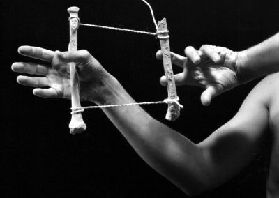
Collin McAndoo 'The living'
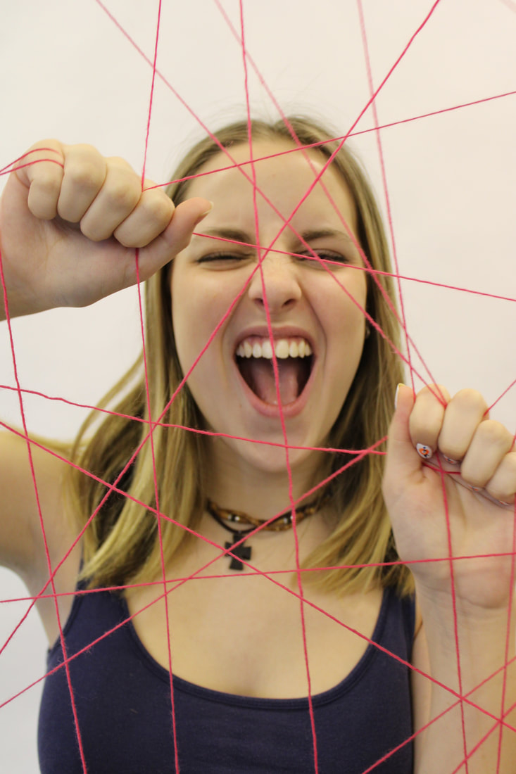
Collin McAdoo was born in Ohio, 1997. His love for photography developed at the young age of 15, and his work delved deeper into portraiture and landscapes. He wanted to depict the connection between humans and earth and the emotional element of geometric patterns and self reflection. In these photos he used string as his material to show attachment to other people and physical objects like the ring, not only does this reflect his ideas of attachment but also detachment, as in a few of his photos the hand is not physically attached to the string. I thought both these ways were affective in reflecting levels and types of attachment humans have to each other.

|

|

|
My Shoot:
For this shoot I used my parents hands and a ball of white string to connect the two together. I wanted the string to represent different levels and strengths of attachments that two people for together and the type of relationship that they have. I thought about what fingers I would use to attach the two, and how this can show the type of attachment. How close the hands were together and other aspects like the length of the string. For example if the string was longer it fell down and made a loop, I think this reflects the more relaxed and less dependant type, on the contrast to that is when the string is pulled tight reflecting more of a strong relationship. I also thought the flexing of the finger could also reflect this so I wanted to show many attachment types therefore I took photos of all. I also used a ring light to help ass some contrast and shadows to give the photos more dimension.


Best Edits:


|

|


Analysis:
This set of edits and photographs were effective in portraying the different types and strengths of attachment that people have between each other. I thought the use of the string to show this relationship was a strong way to show this attachment because I was able to physically manipulate it by tying it tighter or making it hang below and I liked the way of using two different peoples hands to show this relationship between individuals.
However the variety is not as big as I wanted, I feel like there could be more styles to photograph like having the string wrapped around individual finger, this is something I went onto explore in my next development. The white string also could represent purity and calm however I found that it didn't show up as much as I wanted against the white background so I will use red string next and that has connotation of hate and danger that I think is more interesting.
However the variety is not as big as I wanted, I feel like there could be more styles to photograph like having the string wrapped around individual finger, this is something I went onto explore in my next development. The white string also could represent purity and calm however I found that it didn't show up as much as I wanted against the white background so I will use red string next and that has connotation of hate and danger that I think is more interesting.
Artist and Me
I noticed some comparisons between the artist and me when looking back through my work so far. We both used string as a material to physically attach body parts together, in this case we both also chose hands. I personally chose this as I felt that when looking and researching attachment I noticed they usually all have one thing in common, this being the hands that connect them all together. Therefore I decided to photograph this as the for front of my attachment process. In my work I took inspiration from McAdoo in the ways that he used multiple hands connected vertically, I wanted to used this in my work as I felt it accurately represented attachment from a frontal point of view and enables the viewer to clearly see the different layers and levels of this particular attachment type, wether it be complex, more string or less string for a more relaxed relationship of attachment that I wanted to display.

|
|
DEVELOPMENT TWO:
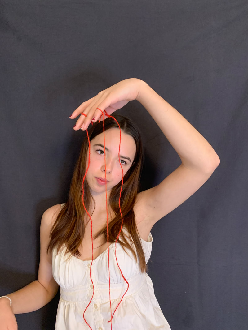
For my second development I wanted to use the ideas from my previous shoot to show the attachment from a print photograph and translating that into nature and the environment. I took more photos of individuals hands as if they were holding the string, so that when I print it the spacing is right to pull the string through. I thought this idea was very affective in portraying the relationship between print and nature. To get the most dynamic photos I got some red string to thread through the printed images.
I took these new hand photos and printed them out into black and white and stuck them onto a some card to make it able to stand up when I balanced them onto the branched. When I went into my local woods to take them I poked holes through to make it look like the string was being pulled through the physical print and making its way into environment. I wanted to create this idea of the attachment to humans and the environment but to express it in a way where we are disconnected and trying to hold onto what is left. By having it in black and white not only makes the red dramatic string stand out but also shows how were stuck in modern times and destroying the Earth, while nature is in colour and still thriving. The red string also symbolise the danger we might bring and threats to out environment.
I took these new hand photos and printed them out into black and white and stuck them onto a some card to make it able to stand up when I balanced them onto the branched. When I went into my local woods to take them I poked holes through to make it look like the string was being pulled through the physical print and making its way into environment. I wanted to create this idea of the attachment to humans and the environment but to express it in a way where we are disconnected and trying to hold onto what is left. By having it in black and white not only makes the red dramatic string stand out but also shows how were stuck in modern times and destroying the Earth, while nature is in colour and still thriving. The red string also symbolise the danger we might bring and threats to out environment.
My Shoot:


Best Edits:


|


|
Analysis:
I think my shoot showed the relationship between humans and their surrounding environment and how strong it can be. Using the red sting gave me the ability to reflect this strong idea of danger that humans threat to earth and how the attachment can be one sided. I also liked it against the colourful background of greens and the black and white print makes it stand out more and signify to the viewer that that string is the division. For some of my images I used composition to make sure the end of the string was not showing on the picture so it looked like it was cut off, and some I left hanging in full view. I found that the ones that carried on outside of the image make it feel more whole and as if it was continuing of the page, so this composition was most effective.
Overall this shoot reflected my idea of attachment of humans to our outside world, however when I edited the original hand photos into black and white they were very detailed and had lots of depth from the shadows and lighting I used, but when these were printed out it lost that detailed look and the black and white made it look flat so I would print them onto photo paper next time to enhance this look as I think its very good contrast from colour to black and white as it separates the two elements and also makes the string stand out more.
Overall this shoot reflected my idea of attachment of humans to our outside world, however when I edited the original hand photos into black and white they were very detailed and had lots of depth from the shadows and lighting I used, but when these were printed out it lost that detailed look and the black and white made it look flat so I would print them onto photo paper next time to enhance this look as I think its very good contrast from colour to black and white as it separates the two elements and also makes the string stand out more.
DEVELOPEMNT THREE:
I wanted to expand on the shoot above, I found it interesting how I could use a material such as string, to show the attachment relationship between two objects. For this development I wanted to draw on the different setting I could photograph this one being the outside elements and the other being inside setting. I went around my home to place the photo of my hand around objects in my home and used the red string again to attach the photos to objects like controls, lights and furniture, even people.
My Shoot:


Best Edits:

|

|
Analysis:
I found that this shoot didn't entice me as much as the last, I wanted to show the difference in attachment in the environment and objects people use in their everyday life. The way I used the string still is effective and the red stands out against the more black and white toned colours like the radiator. The different pipes of the radiator also allowed me to wrap the string around. However for my further developments I'm going to stick to the outdoor environment as I think its more effective in portraying the contrast the physical photos in the natural environment.
I found that this shoot didn't entice me as much as the last, I wanted to show the difference in attachment in the environment and objects people use in their everyday life. The way I used the string still is effective and the red stands out against the more black and white toned colours like the radiator. The different pipes of the radiator also allowed me to wrap the string around. However for my further developments I'm going to stick to the outdoor environment as I think its more effective in portraying the contrast the physical photos in the natural environment.
DEVELOPMENT FOUR:
For development four I was interested in looking at how individuals can feel trapped and like they are being held back by something in their life like standards or relationships with other people. I used another model to show frustrated and alarmed facial expressions to help convey this feeling of wanting to escape but there is an attachment to the thing or person that is holding them back from being free. It's really important to get this across the viewer so by re-introducing the material of string to show this as I now know I want that to be a constant theme as it shows the idea of attachment as a physical thing. I will use the string tied to an empty frame to show these boundaries that are holding her hostage and have her grip and pull at them as her attempt to escape.


Best Edits:


|


|
Analysis:
I found that overall I was pleased with the results of this shoot. I like the way it clearly reflects the themes of the string being the main source of her attachment and also the thing that is keeping a bridge between her escaping all her pasts negative relationships and attachments. I pined the string close to the wood board so that some appeared tightly connected and other more loose to show the different strengths and levels of attachment. I wanted my model to experiment with different facial expression to match the feeling of suffocation and anger. These were very affective at making the viewer feel emotions and pity for her.
However I wanted to keep the theme of red string going but I had none available at this time, so it therefore looks slightly different and not as drastic as I would hope so that helped make it clear to me that the colour red was going to be a important factor for me to include in my future developments. I turned one image into black and white to try and help me decide if my future photos should be in colour and this allowed me to see that at some points it may add depth but for my final piece I would like my photo in colour as it will strengthen the emotion and highlight the colour of the string against the black background and ghostly looking figure.
However I wanted to keep the theme of red string going but I had none available at this time, so it therefore looks slightly different and not as drastic as I would hope so that helped make it clear to me that the colour red was going to be a important factor for me to include in my future developments. I turned one image into black and white to try and help me decide if my future photos should be in colour and this allowed me to see that at some points it may add depth but for my final piece I would like my photo in colour as it will strengthen the emotion and highlight the colour of the string against the black background and ghostly looking figure.
DEVELOPMENT FIVE:
For this development I wanted to bring the idea of having the string and the portrait in the same photo to having them separate and using the string as a method to attach the two physically together. I used the ideas surrounding attachment as a way to attach two objects together with the red string again to act as a fabric that will stand out against the photo. I also wanted to edit the images on photoshop into black and white as I felt they allowed the red colours to be more dramatic and I think it adds a nice contrast and more deeper message to the overall images. The red stitching is almost resembling of blood flowing or connecting these two images back together.


Photos to print:

|

|


Process:
- I ordered some fabric paper and used that to print the chosen photos on, I decided to use this fabric because it made it easier to sew the string into it without pulling it away.
- Then I cut around the edges of the paper to that I just had the plain photo to sew onto
- The sew process was simple yet effective I was able to place the two together and reform the original images but attachmed together in a different way.
My final edits:

|

|

|
Analysis:
I like the way these images came out with the string, the red stands out against the black and white background, I did this in order to hep the red be more dramatic and represent blood coming out and connecting the two parts back together. The colour red has lots of symbolic messages connected to it than most colours hence why I chose it to use as my method of attachment. Once accomplished I felt that this ideas of using string to physically attach photos was something I could develop further and use in my final piece. However I didn't like the shade of red I used, I felt that it looked to bold and garish against the timid background so for further developments I will use a darker shade of string to blend the two together more.
I like the way these images came out with the string, the red stands out against the black and white background, I did this in order to hep the red be more dramatic and represent blood coming out and connecting the two parts back together. The colour red has lots of symbolic messages connected to it than most colours hence why I chose it to use as my method of attachment. Once accomplished I felt that this ideas of using string to physically attach photos was something I could develop further and use in my final piece. However I didn't like the shade of red I used, I felt that it looked to bold and garish against the timid background so for further developments I will use a darker shade of string to blend the two together more.
DEVELOPMENT SIX:
Nelly Agassi
A place of tears, 2001, performance
For Agassi's performance she wore her skin colour dress with thousands of strips made from fabric that were suspended from all different points of her body, mainly focused around her waist. Some flowed of her body and trailed onto the floor whilst other were attached to another point on the wall and ceilings that incaved her. Her art installation was a live performance where she looked completely absorbed and immersed in herself perfectly taking her away from the eyes of strangers. The live performance is her sewing these other strips of fabric onto her outfit for hours on end so that is shows how she is visibly connected and attached to the walls. As her performances comes to an end she emerges herself from the dress that she has made and we see what she has left behind, the dress that remains attached to the walls suspended in mid air as a remnant of her performance and produced of a intricate sculpture. Through her captivating performance she mesmerised everyone with her subtle movements and precision, I really took a liking to this and thought it was a really interesting way to show attachment and how she is physically attaching herself to something permeant yet also has the power to remove herself from the same thing she just made like when she leaves the dress. This symbolised that the power is still in her hands and its almost like she is her own puppet.

|

|

|
My Shoot:
For my take of this photographers artwork I decided I wanted to take my model and photography back into nature and look at the ways in that people act around it and how our bodies look and react. I also wanted to use the string as a way to further manipulate my model and I made it look like a puppet and like she was being controlled and structured by the woods and trees almost connecting her back to the Earth. I wanted to keep this running theme of attachment thought out as that's my main idea.
For my take of this photographers artwork I decided I wanted to take my model and photography back into nature and look at the ways in that people act around it and how our bodies look and react. I also wanted to use the string as a way to further manipulate my model and I made it look like a puppet and like she was being controlled and structured by the woods and trees almost connecting her back to the Earth. I wanted to keep this running theme of attachment thought out as that's my main idea.


|

|


|
Best Edits:

|

|

|
Analysis:
I found this shoot was very successful in archiving the effect I wanted ghost like figure in the woods acting like a mysterious girl that is trying to get loose from her attachments. I chose the white and flowing clothing to create a empathetic mood of mystery and wondering as it stood out from the busy background of all the intertwined trees. I experimented with different ways to attaching my model to the trees and seeing what displayed the tangled string that I wanted. I found that using lots of trees with branches of varied lengths, heights and thickness added to the confusing and maze like mind that the model is trying to escape from. Having the string fall down from the trees at the top also help to show the many structures in the environment and I found this worked best. I also like the look when the model uses her hair to create a Francesca Woodman style photograph adding to the effect of ghost figures.
However one thing that I think could develop more is using thicker pieces of string or even sheets to help almost encase my model into it, like she is being swamped into the string, attachment. The thinner string is still effective as it links to what I will use in the real exam final piece however It would be interesting to see how the thicker string is effective.
DEVELOPMENT SEVEN:
For this development I will stick to the idea of puppet and make the model look like she has the power over herself. I was influenced by the work of Franchesca Woodman, who takes photographs of models to make them look ghost-like and blank facial expressions. I plan to take photos similar to this as I want to give off the feeling of being trapped and like she has given up being a slave to herself through this attachment. I will dress my model in all white clothes and I want them to be flowy like a dress or skirt to achieve this ghost-like look. In this particular part of this development I will include the sting in the photos with her and sew it as it comes off the pager after I have printed it onto the fabric. I want to experiment with this in this development and then not have the string in the original picture in my next development. I aim to see what evoked the most emotion in the viewer.
For this development I will stick to the idea of puppet and make the model look like she has the power over herself. I was influenced by the work of Franchesca Woodman, who takes photographs of models to make them look ghost-like and blank facial expressions. I plan to take photos similar to this as I want to give off the feeling of being trapped and like she has given up being a slave to herself through this attachment. I will dress my model in all white clothes and I want them to be flowy like a dress or skirt to achieve this ghost-like look. In this particular part of this development I will include the sting in the photos with her and sew it as it comes off the pager after I have printed it onto the fabric. I want to experiment with this in this development and then not have the string in the original picture in my next development. I aim to see what evoked the most emotion in the viewer.
My Shoot:


Best Edits:

|

|

|
Printed Edits:

|

|

|
Analysis:
These edits are very effective in displaying what I want to archive in my final piece, I was fascinated with how the string could be used to connect the string in the photo and also carry it on outside the image its self. When attaching the string I found it simple to do yet still get a effective final look and this is what I think went well and made me realise how I would like to do this for my final piece. I also edited the photo first to make the contrast brighter and I know from practice that when ironing it onto the fabric it can alter the colouring of the original image so I made sire the contrast was balanced before printing it. When sewing the string I make sure to trip the ends so they don't stick out from behind the photo. However After experimenting with the other method is not including string in the original photo I think I prefer the other look as a final piece as it enraptures my ideas more that its attaching the photo together and it makes the idea stringers as its something that is not already in the photograph to start with.
These edits are very effective in displaying what I want to archive in my final piece, I was fascinated with how the string could be used to connect the string in the photo and also carry it on outside the image its self. When attaching the string I found it simple to do yet still get a effective final look and this is what I think went well and made me realise how I would like to do this for my final piece. I also edited the photo first to make the contrast brighter and I know from practice that when ironing it onto the fabric it can alter the colouring of the original image so I made sire the contrast was balanced before printing it. When sewing the string I make sure to trip the ends so they don't stick out from behind the photo. However After experimenting with the other method is not including string in the original photo I think I prefer the other look as a final piece as it enraptures my ideas more that its attaching the photo together and it makes the idea stringers as its something that is not already in the photograph to start with.
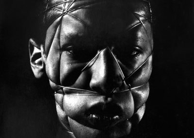
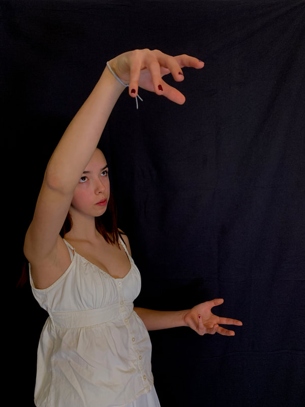
DEVELOPMENT EIGHT:
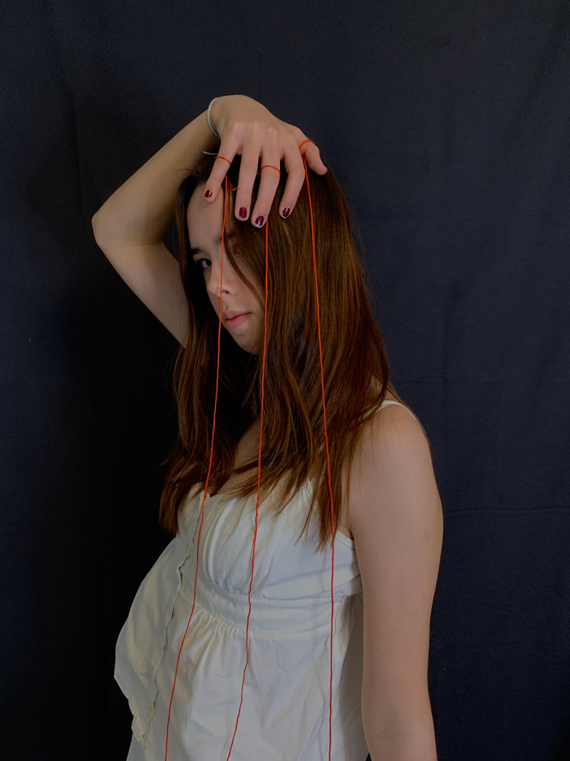
Henry Lewis 'Body Art'
|
Henry Lewis was born and grew up in Sydney Australia before he moved to San Franscio to study art in the late 1970's. During this time he happened to come into contact with a student with connection to many artists like Chris Burden who was an influential figure in his photography career. Later in his life he retired to France where he was captivated by the works of Klaus Rinke and in particular Vilen Flusser. He often uses them in his work that make him focus on the notions of the body, optics and visual perceptions. Overtime a large number of solutions have been made due to advances in technology that range from portraiture to radiography. In particular he had a series called 'body art' where he took an advanced approach to portraiture, only taking photos of himself yet never seeing his face. He uses different methods to make the model blind, mute and even appear bruised to help enhance the violent and disturbing facial expressions. Many photographs were produced in this series however there was one photo in particular that I felt connected to my word of attached. I loved the way he used string to pull the hands away from his body even though we cant directly see it. The low lighting makes the skin look more textured and overall I want to use this in my work to show how she is being pulled away from her self and into other versions of her self, I liked how it connects to each finger making it busy and like there is lots going on.
|

|
For this development I liked the idea of the one above where I used string inside the photo to them carry it on outside the photo. So for this next development I wanted to carry this theme on and instead try the opposite way round, I took photos against the black backdrop again and dressed my model in a white, free flowing outfit to make it look more ghost like and drastically symbolic. I payed close attention to how I wanted her hands to be placed, like making sure her fingers were spread apart to ensure that when I transfer them onto the fabric each each finger will have enough space to sew a bit of string into to make the illusion that its really there. I wanted to create a solanum effect that makes it look a gloomy mood with this red string, symbolic of blood, that will be coming out of the photos.
My Shoot:


Best edits:

|
|

|
Printed edits:

|

|

|
Analysis:
For these edits I used a needle to sew the string onto the fingers and finish it by having it dangle of the rest of the page, I love this effect and I think it clearly shows that I want to look at the attachment between the images insisted of complicating it by including the string in the original photo as well. I like how the deep red stands out against the black background and shows that wide contrast between images. Overall this development made me realise I want this outfit as I love the mesmerising flowing appeal it gives and almost makes a clear background to have the black and red against, also the black background makes it mellow feel for the viewer and helps to enhance the melancholy sadness along with the red string popping out. I could have stuck to one idea, like having string come from each finger, however I wanted to use this development to experiment the different methods that I could attach the sting, all fingers, just one finger or only a few. This enabled me to decide what looked best to use in my final piece. I decided that attaching the string to all fingers looks most effecting at showing a crazy and out of control, almost overwhelming attachment type to each other.
For these edits I used a needle to sew the string onto the fingers and finish it by having it dangle of the rest of the page, I love this effect and I think it clearly shows that I want to look at the attachment between the images insisted of complicating it by including the string in the original photo as well. I like how the deep red stands out against the black background and shows that wide contrast between images. Overall this development made me realise I want this outfit as I love the mesmerising flowing appeal it gives and almost makes a clear background to have the black and red against, also the black background makes it mellow feel for the viewer and helps to enhance the melancholy sadness along with the red string popping out. I could have stuck to one idea, like having string come from each finger, however I wanted to use this development to experiment the different methods that I could attach the sting, all fingers, just one finger or only a few. This enabled me to decide what looked best to use in my final piece. I decided that attaching the string to all fingers looks most effecting at showing a crazy and out of control, almost overwhelming attachment type to each other.
Process of final development:
Re-Shoot:
I did another shoot of the ones above after planning what photos I wanted to go where as I needed to arrange certain position I needed the hands to be in for each one because I wanted them to connect to each other. I had to do this alone with the sizing. Overall one I worked out what poses I needed I didn't want them to all be the same as I wanted the images to reflect different moods and states of minds. So I made more to include all different shot types, some close up some full body and some mid-shots to vary the photos. I also mixed up where her hair was and where her eyes were looking. For example I knew I wanted the middle photo to include both hands as this was going to be my main connector image and also have her eyes in a direct gaze to the audience to make a strong connecting to the work.
I did another shoot of the ones above after planning what photos I wanted to go where as I needed to arrange certain position I needed the hands to be in for each one because I wanted them to connect to each other. I had to do this alone with the sizing. Overall one I worked out what poses I needed I didn't want them to all be the same as I wanted the images to reflect different moods and states of minds. So I made more to include all different shot types, some close up some full body and some mid-shots to vary the photos. I also mixed up where her hair was and where her eyes were looking. For example I knew I wanted the middle photo to include both hands as this was going to be my main connector image and also have her eyes in a direct gaze to the audience to make a strong connecting to the work.


|


|
The Eight edited photos I used in the final piece :


Analysis:
The Eight photos that I selected to be used in my final piece were ones that I used were carefully planned out after figuring out the positions and sizes I wanted of each, these were used I decided on:
A3- Two images
A4- Three images
A5- Three images
I loved how these turned out and I edited them so that the brightness make it angelic like and mysterious to look at, I want her to look slightly emotionless so that the viewer can interpret the idea of her attachment how they see it. I also felt that having an emotionless face gave a more melancholy feel about the images and mirrors the ghost like effects that I wanted. Like she is being dragged by her own attachments.I also made sure that her fingers were always spreed apart to ensure I have something to sew the string onto and they wont all overlap as it would be more effective when you can clearly see them pouring out from her fingertips. For some photos I wanted her eyes looking up towards other versions of herself and other for her eyes to be watching the hands to give the structure some variety.
Planing sheets:

|

|

|

|

|
Exam Process:
During the exam I felt I had given myself enough time to sew all the images together, before I started I placed the images under a heavy book to keep the edges flat while sewing as this made it easier for me to accurately place the string. I started by sewing the two images together than I knew would be connected to each other, once I had done this and got the initial outline of the structure it made it easier to see the developments that were going on and I was then able to decide that I wanted the middle image to connect to every other images to tie it all together. I felt this was better than my first idea of just attaching it to one images as the middle one was my main photos, I specifically used direct gaze to create a connection to the viewer and I placed both hands in the frame as I knew I wanted this images to include my most attachments. Overall the final product came out how I designed it and after some alters during the exam I feel confidant that it has accurately displayed by ideas of attachment to other people. At the ending of the exam I noticed that I wanted to use lots of string to resemble this messy and maze like attachment in her mind and in that moment in time I felt the having one string on each finger wasn't giving this exact look. So I went and did another round and added at some points up to three bits of string onto each finger tip. Im happy with the outcome for this as it makes it look physically attached the photos to each other and how they are all slightly intertwined together all the different version of her self.

|

|

|

|
Development of ideas
|
DEV 1
Looked at work of collin McAdoo who looked at the physical attachment between the thing that connects us to everything, hands.

DEV 5
Decided to go back to physical printing photos onto fabric and connecting them back together with string. Interesting contrast between black and white and colours.

|
DEV 2
Took the idea of hands and string into environment. Ideas of taking a printed photo and placing it in a contrasting environment.

DEV 6
took the previous ideas of the outdoor environment and string, creating ghost like figures inspired by Francesca Woodman to create mysterious images, attaching her back to her roots of the Earth.

|
DEV 3
Continued the theme of hands and took it back inside to everyday use objects to connect them without a person there. The string resemble this attachment.

DEV 7
Experimentation for final piece, looking at printing photos onto fabric with the string in the original print and then sewing it of the page, helped me realise Its more effective to have no string in the original photo.

|
DEV 4
Explored how string (attachment) can hold someone back, using emotional facial expression to mirror the frustration of being trapped by her relationships.

DEV 8
Last development helped me decide that I wanted this outfit and the string to be sewn directly onto the images with many different connections.

|
FINAL PIECE

|

|
