Mind Map

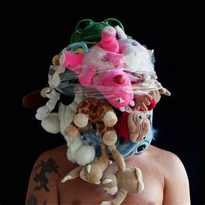
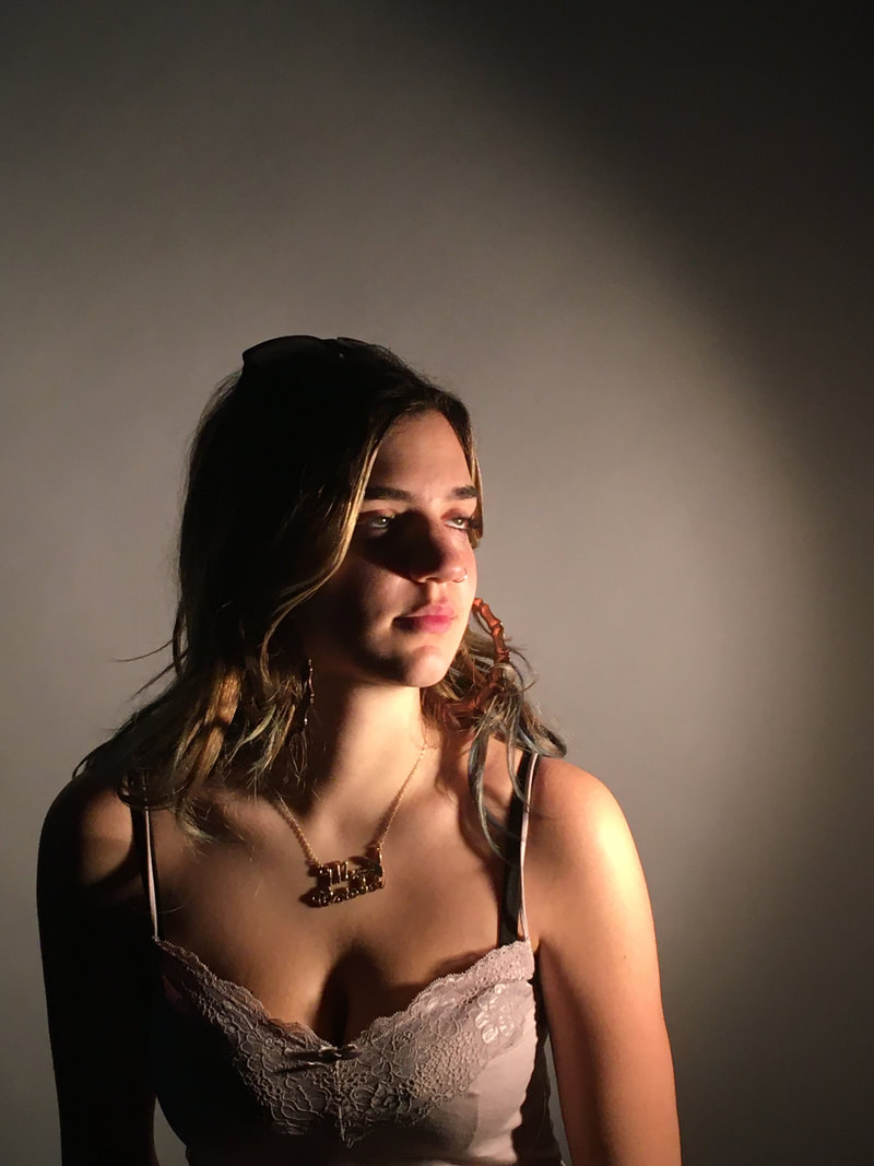
The Selfie
|
What is a selfie?
The selfie can be tracked way back to the origins of photography, this was one of the first things photographers learnt to do when they discovered they could fix a light to a surface was to turn their cameras around on themselves. Once of the earliest known examples of a selfie was in 1939 by Robert Cornelius. A selfie is slang for self portrait and is used in modern times to capture a photo of ones self on a mobile device. This selfie on the right was the first know one ever properly taken. It would have taken hours to complete as he would have needed to go through many process to achieve this look.
|
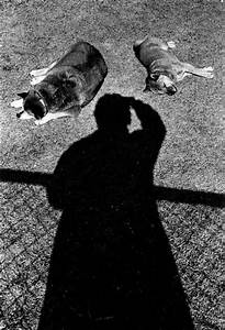
Robert Cornelius ' The Selfie ' 1839

|
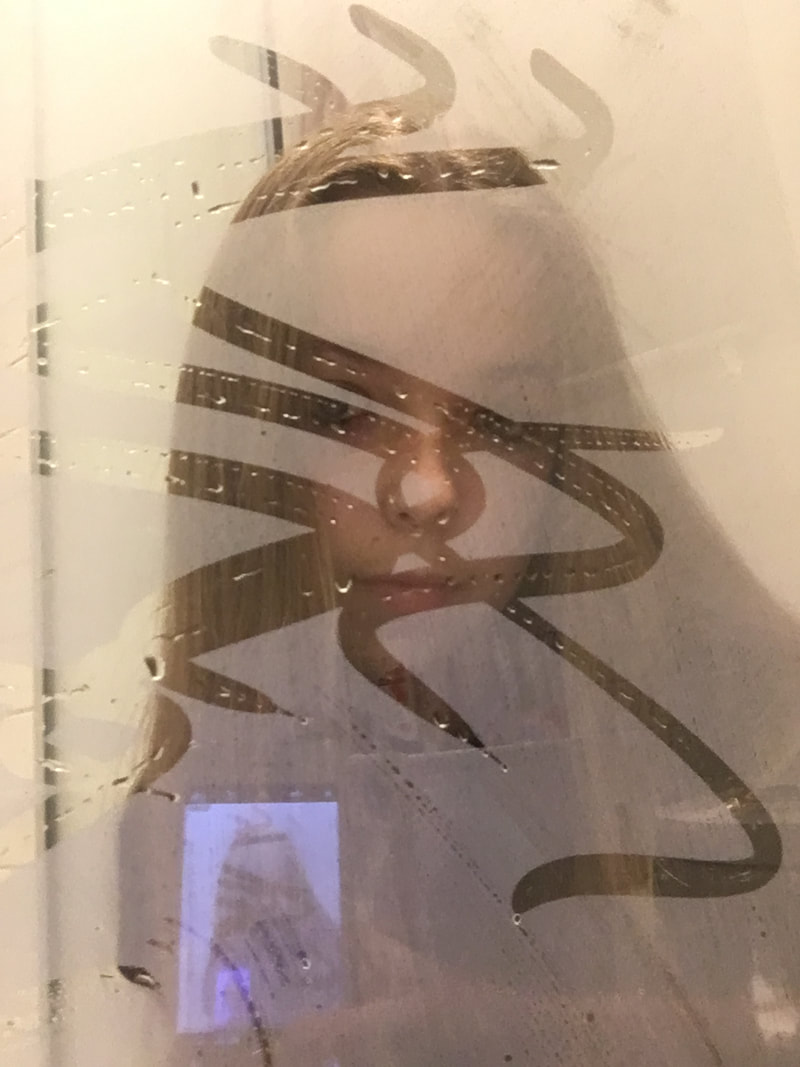
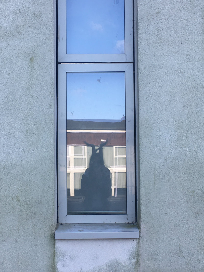
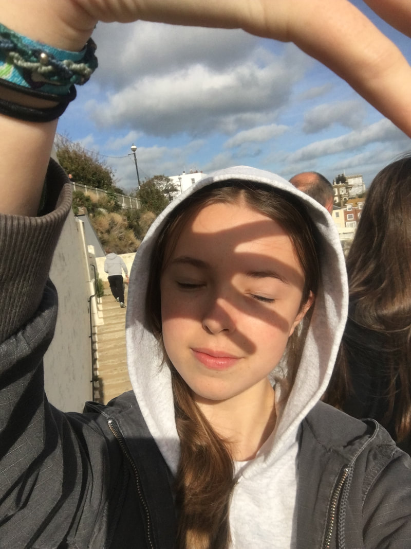
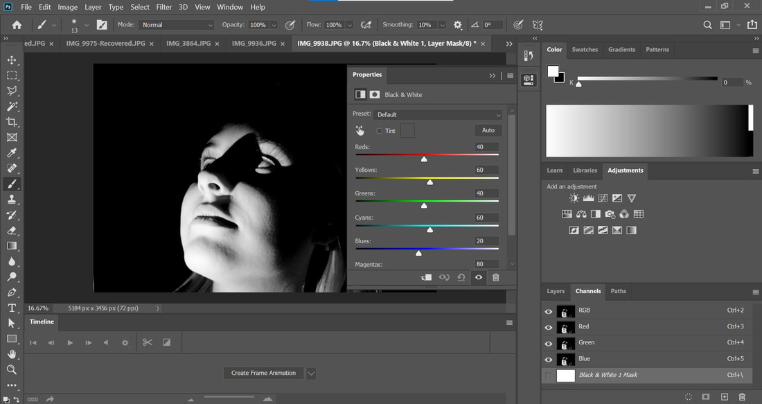
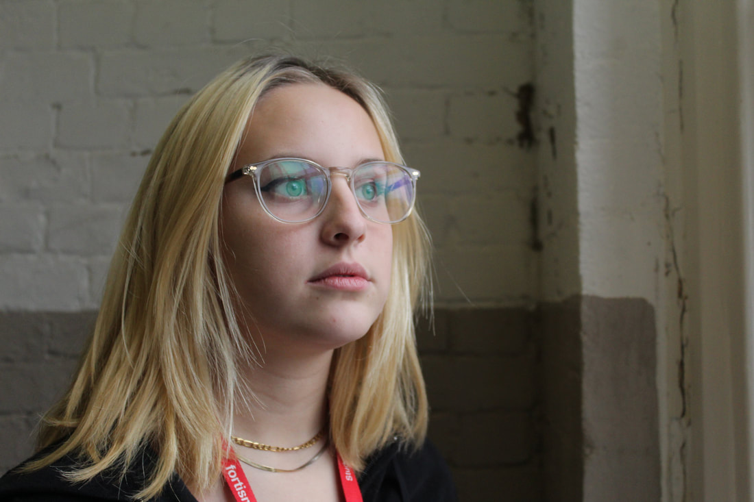
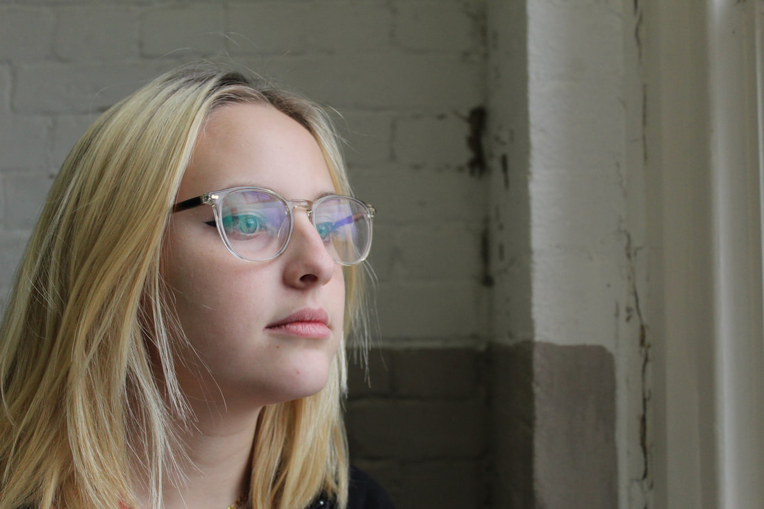
selfie 1- The reflected selfie
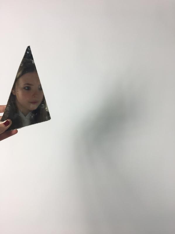
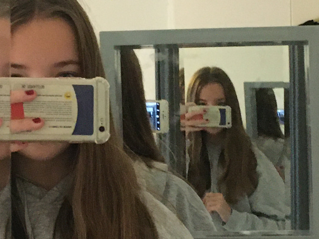
The reflected selfie takes into consideration the angles, lighting, curves and possible sequences of windows that could be included.
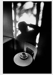
Ilse Bing
Bing grew up in Germany 1899, as a child she had a school education rich of music and art. She went on to buy her first camera in 1928 and has a passion for photography ever since then, with this she liked to photograph fast moving pictures and buildings. She later grew to have a fascination with shadows and contrasts of dark shadows witch she reflected into her portraiture. I really like how affective her photos are, they capture multiple angles, shadows and the black and white shows the contract between the lighting of the room making us focus in on the important parts.

|

|
My Selfies

|

|

|


|


|
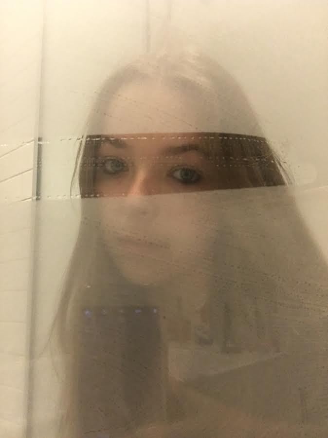
Overall Analysis: I felt that I captured the task of a reflected photo by using mirrors, car doors and glass to do so. I love the way you can see multiple dimensions through the usage of two mirrors to give the photo extra dimension, for another photo I fogged up a bathroom mirror and wiped a section above my eyes, this adds texture.
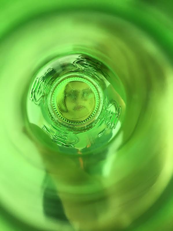
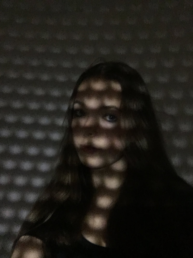
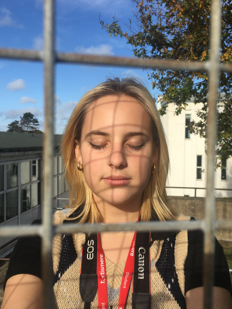
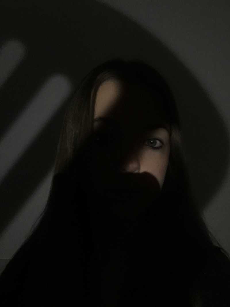
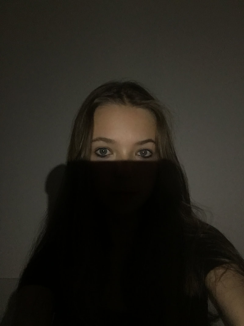
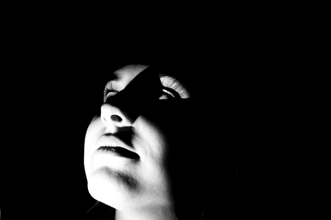
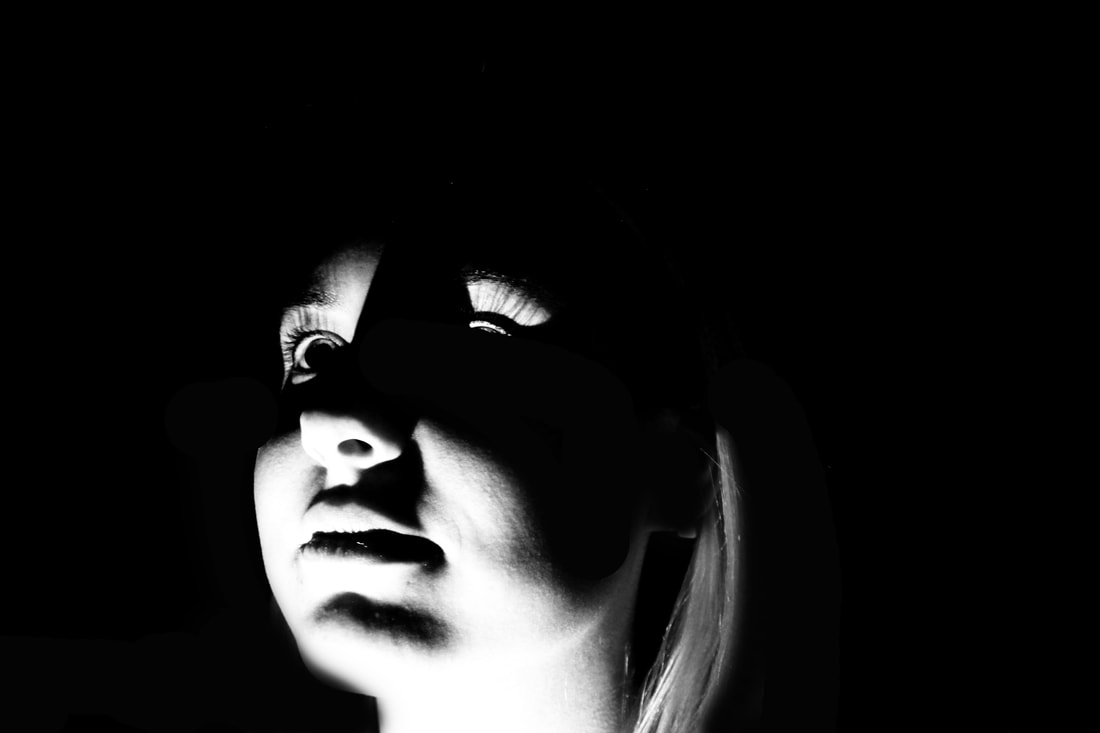
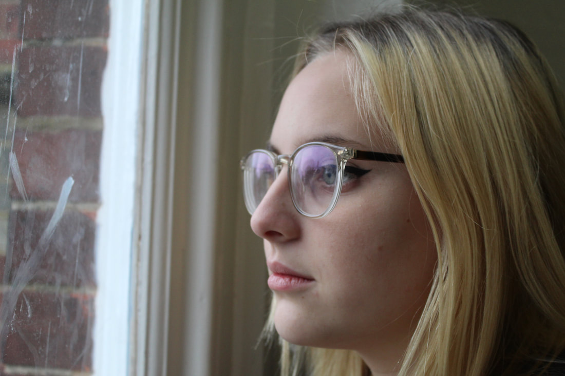
Selfie 2- The Obscured selfie
The obstructed selfie makes the models face look distorted or obscured, this could be by a object, fog, lighting or even paint. This idea of photography includes a different approach as typically you would be able to see the models face to create emotions or a idea of the surroundings.
Edu Monteiro
Monteiro was born in 1972 Brazil. Along with being a visual artist he also had a masters in photography and art. He had been working in photography since 1991 specialising in the relationship between photography and performance. his series called 'Sensorial Portraits' was made to capture his own fears as he pushes his self to come put of the comfort zone in photography in order to get heightened feelings of fear and hunting images.
|
|
My selfies


|

|


|

|

|
Overall Analysis: For this set of images I tired to make my face as distorted as I could using many different textures and props. Some included looking through windows, bottles and raindrops. this give a variation to the set however I could have experimented with string or other mediums to collects more obscured version of these photos.
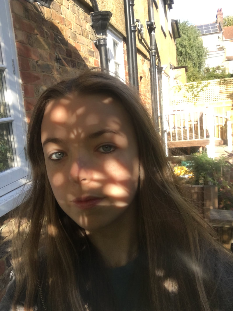
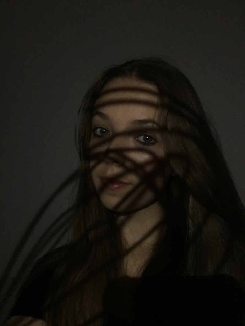
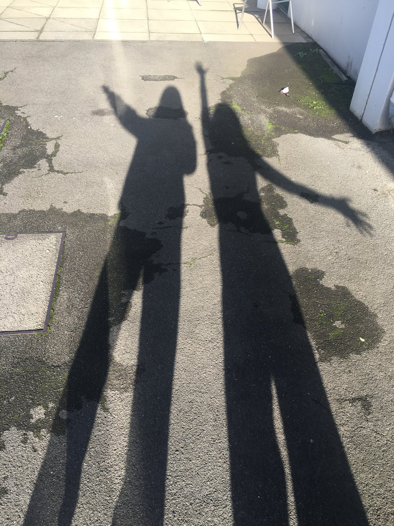
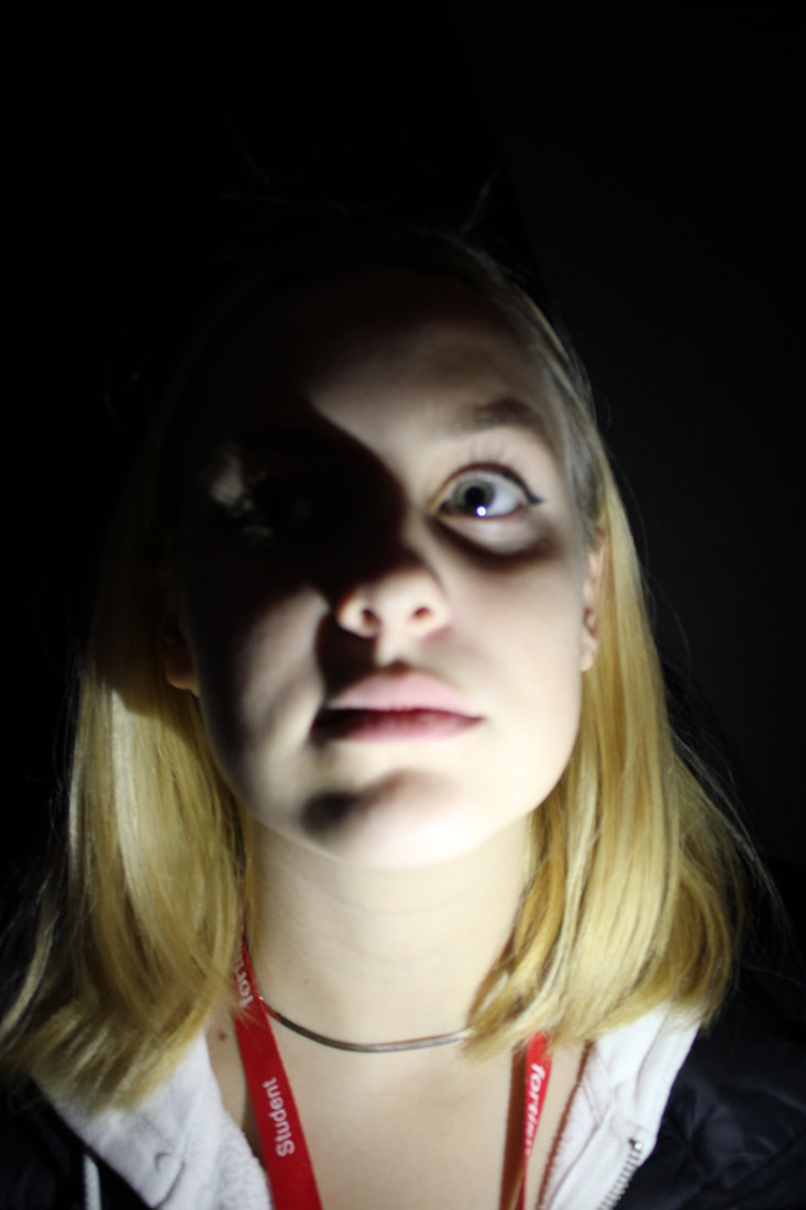
Selfie 3- The shadow selfie
The shadow selfie was trying to capture shadows created with different light forms and a excess of light or an absence of it. This was so interesting to play with as shadows can change so easily and you are able to test out many different styles using different mediums. For example I used a torch and kitchen appliances to cast certain shadows over my face.
David Moriyama - 1938
Moriyama was a Japanese street photographer, graphic designer and writer who was best known for his confrontational, black and white images that show the contrast between traditional values against modern society in post war japan. He studied photography in the Takeji Iwamiya studio in japan before moving to Tokyo in 1961, where he became an assistant to Eikoh Hosoe. This enabled him to have access to the Tokyo photo world through photography.
|
|
My Selfies
|
|
|
|

|
Overall Analysis: I really like these images as the come together to create a nice group of shadowed selfies using natural light and props from my kitchen. I also used the sun shining through the leaves to cast shadows over my face, I thought about my composition and what parts of my face I wanted covered to create a good photo. to make this better I would take more advantage of natural light and shaped to get really interesting shapes.
Some really good examples
Myra Greene
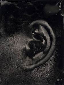
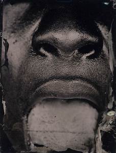
TASK 1
Character Recognition
This series of photographs by Greene, she started in the summer of 2005 after she learnt the process of ambrotype on black glass this process dated back to the invention of photography, 1850-1890's. Greene commented that this linked to slavery and how her skin is recorded making it seam ' historical and contempory in nature' . She wanted to make a photo that combined this process and the current issues that she was experiencing with race and identity.
Soon after she came up with this idea Katerina the hurricane hit in 2005, when this happened it led her to reading about culture and how other people see and judge people of colour. Greene then was inspired by the mug shot and how it captures different features in al angles. Her final showcase of work consisted of twenty plates of three by four inches. She shot a verity of facial features including teeth, lips, eyes and ears. She wanted people to build their own ideas of racial identity and how they are views by the world through the expression of futures in the photos.
Soon after she came up with this idea Katerina the hurricane hit in 2005, when this happened it led her to reading about culture and how other people see and judge people of colour. Greene then was inspired by the mug shot and how it captures different features in al angles. Her final showcase of work consisted of twenty plates of three by four inches. She shot a verity of facial features including teeth, lips, eyes and ears. She wanted people to build their own ideas of racial identity and how they are views by the world through the expression of futures in the photos.
|
|
|
TASK 2
In response to Myra Greens work we created our own close up photos like her with the other people in our class. I wanted to collect a range of different facial features, angles and profiles.
Molly

|
|


Bella

|
|


Bea

|
|


Layla

|
|


Charisse:

|
|


Good layout- well done!
At home development
For this task I wanted to capture age, wrinkles, colours, shapes and textures through the age's of my models. I took a series of photography in daylight to get the best lighting without a shadow casting over the face, however I did use a shadow on some to get a variety of photos and add more depth.
|
|
|


Darkroom development
In the dark room process we choose two of our best images to be printed to a positive print onto the asotape. We then used these to expose and experiment like Myra Greene did, We added tape over the edges, splashed the developer and even re-exposed them to achieve a look similar to hers.
|
NORMAL PRINT

|
POSITIVE PRINT

|
Development One
|
Before starting this process we needed to do a test strip as the enlargers and lighting are changed with every use. I tested this five times and the results I got was that I need to expose the photograph for a total of five seconds.
|

|

|
First photos:

WWW: For this print I used the process of dripping the developer onto the photo, this gave a worn out look and I like how you can still see the eye through the lighter strips.
EBI: I would add more lines and textures to make this into a more Myra Greene style. |
|


WWW: This time I tested dapping the developer onto the photo to mimic the chemicals she used, I like the way this turned out as it looks like her style and covers the photo while still being able to be identified as someone's lips.
EBI: I would have liked the image to have a higher aperture so it would come out darker and more detailed, as some of the corners lost detail from being to light. |

WWW: Again for this image the tape didn't show up that clear due to the photo comping out really dark, however this highlight the different textures in the skin which was done my Myra Greene.
EBI: Inorder to have the tape more prominent the appetite needs to be smaller. |

WWW: This final image was made my placing a double layer of tape in the hopes that it would be more viable. this worked as you can see the tape and the photo is still recognisable
EBI: To make this even better I would have liked It to be more texture and detailed. |
Development Two
For this second development I tested out a new method where I stuck tape and developed the photo as normal except I kept the tape on until it was done processing them. After I peeled the tape of I exposed it to bright white light and took in back into the darkroom to re-develop it again. This left a dark patch where the tape was that turned pink after a while. I felt that these final images were really successful as the method made my tape show so much more with a big contrast between the two colours of paper. I also tried to rip and place the tape where Greene would have,arround the edges and ripped in unusual ways to avoid a straight line. Whats is also really interesting is that when I re-exposed the image sometimes it turned pink, giving it a new dimension to the photograph.


Clear documentation of the process- don't feel you have to analyse each of the images. You can speak more generally.
Shadow and light: Valerie Kabis
Valerie Kabis was a artist who was interested in low light photography, and how shaped and shadows that were casted upon a model influenced a photo and in what ways. To do this she experimented with light, both bright and dark, shadows and this created a series of dark and provoking images.

|

|

|
MY FIRST SHOOT
I thought this shoot was very successfully as I photographed a range of different people with all different face shapes and features that the light would affect differently. All the light angles are varied making each photo different just like Kabis did.
|
|
|


Edited photos:

|
|
|
Using photoshop I edited my best images into the style of Valerie Kabis, to do this I changed the levels of each image until I liked the look of the extreme darkness against the brightened face. After this I changed the photo to black and white as I think it bring out the colours more. Finally I experimented with the paintbrush to paint areas darker to archive the style of Kabis.
FINAL IMAGES

|
|

|
Lighting
|
Main light-
For this you need to position your model in the same place for all three photos to real see a difference. The main light should be placed just above the head and to one side. Also pay attention to where the shadows fall and you can move the light closer or at a angle to archive more drastic lighting. 
|
Fill light-
This light makes the image less intense and balanced the light out, it should not overpower the main light and should just be enough to fill out the shadows. 
|
Hair light-
This third light will be positioned above the models head and angles down to light up the hair to give it a shine. It dint need to be centred above the head but can be tilted to the side. 
|
Natural Light
This shoot with natural night is aimed to get different reflections, shadows, bright light and glares. I shot different variations of angles to see how it impacted the shadows, along with this I tried to shoot against the window to show how light can dramatically change, it made the model really dark and the background really over exposed. The window light creates a very nice soft lighting on the face.
|
|
|
|
Tungsten Light
Tungsten lighting was a red/orange/yellow glowing, warm and artificial light. It can be commonly found in ovens, bathroom and kitchen lights. Its also found in street lights and theatre stage lights. They are made from old filament bulbs where you can see the mechanics inside. Once we experimented with the typical red light, we places colours plastic behind a light to reflect colours onto the models face, this gave great impact as the mix of reds along with the blues creates a glow of colours.
|
|
|


Edited images
To edit these best images I made the red and blue colours much more bold and bright to enhance the facial features. In the middle photo I love how the blue is almost outlining the face.

|

|

|
Lewis Khan
George Town
Lewis Khan was inspired by the people living around him that he saw everyday, he grew up in south London. He always saw this man called George wondering around the streets. They would sometimes smile at each other, say hello or join each other to play some football. Khan took this into account and thought that some of the most powerful images were taken in the moment and sometimes even the most normal objects can be powerful. Along with taking photographs Khan also took a interest in film making and creates a mini film that included him talking about his life story and how and where he grew up. This gave the photos more depth as we got a narrated story line to match.
I really enjoyed these images as you were able to see a insight to a strangers life by photography's that at first glance don't seam interesting however when you look closer they can be really powerful in portraying a person.

|

|
My Shoot:
For this development of Khans work I shadowed and followed my dad around for a day to take photos to show an insite to his daily routine on the weekend. My dads job is carpenter so I knew I wanted to take photos of his work tools, paint and all objects that he uses in his job. I also wanted to see common objects and how they looked in his flat, for example mugs and records.
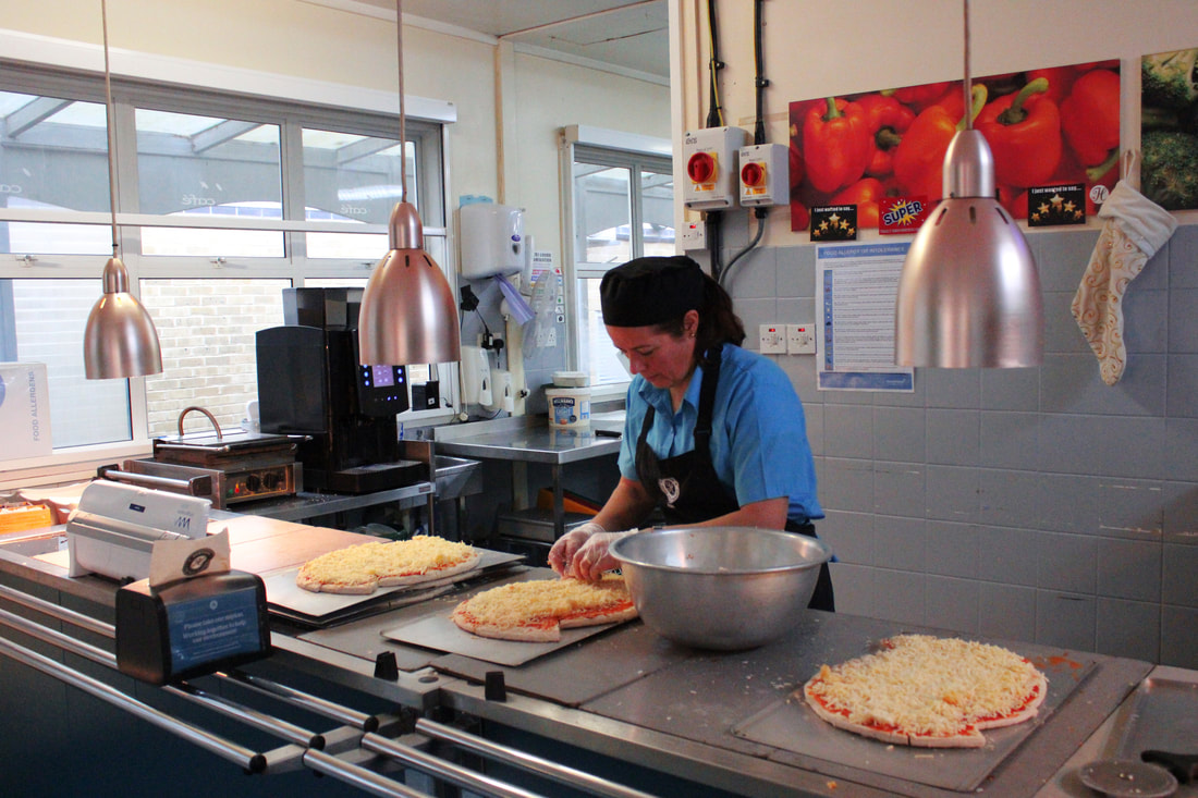
Photographing school staff
For this second development of the Lewis Khan project we paired up and walked around the school grounds with the intentions of photographing cooks, teachers and staff doing their jobs in the natural school environment. I edited all of the photos below by highlighting the most prominent colours that can be seen.
|
CANTEEN
SOUTHWING RECEPTION
CARETAKER
|
MEDICAL ROOM
LIBARY
DT OFFICE
|
Edited photos
WWW: I really like how when editing it the colours like the greens and reds brightened. These were photographed while the ladies in the canteen were doing cooking so I like how you can get a insight to their jobs.
EBI: To improve I would have shot these with better lighting as they came out slightly grainy, I also would have shot them closer to the subject to fully see what they are doing to get a clearer image.
EBI: To improve I would have shot these with better lighting as they came out slightly grainy, I also would have shot them closer to the subject to fully see what they are doing to get a clearer image.

|


|
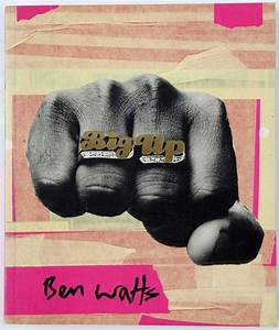
Ben Watts
Ben watts is a British street photographer who liked to explore the urban identies of people in all the countries he visited. His work mainly resembled collages of famous people like street rappers. with his artwork he liked to used different mediums like torn tape, pen and neon colours to make the photo pop. To further do this he never really over crowded his photo to make it bold however he did always fill the white spaces to not draw away from the full college.

|
|
|
Below are two of my own interpretations of the Ben Watts style of photography.
|
MUHAMMAD ALI
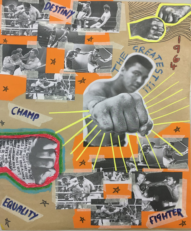
What I really liked about this colleague is the neon yellow lines shining out from the fist, I wanted to make it the main focus and seam powerful and as if it was echoing out the paper. I also used lots of ripped up tape to stick down my photos as that's what Watts uses, along with this the colours with ripped edges is the same style of Watts. The words written over the tape are what were frequently used to describe him, by writing it in blue it make it bolder and more stand out. Lastly to improve I could have filled the space more as Watts never left any white space, unless it was for effect.
|
ME IN 2021

For this colleague I wanted to put across key details about me, like the London landmarks, film strip and photos of my friendship group and all places that I've been to in North London. I like the neon pink boarders behind all the images, it makes them stand out and Ben Watts did a lot of this style in his own work. Furthermore he often used little writing on his work to mention some key details, I did this on the tape and in red chalk to make a statement. Overall I really like this piece of work however I do think I could have filled some more of the blank spaces but I didn't want to distract from the photos.
|
Portraiture development
- DEVELOPMENT ONE
I took Myra Greene's style as my main inspiration as I love her ideas of isolating specific facial features that are more interesting and powerful to breakdown a face into smaller segments that people would normally miss. For my first development I wanted to take another series of these photos with my cousins who I saw over the holidays. I then edited them into the black and white style that was common in her work.
|
|
|


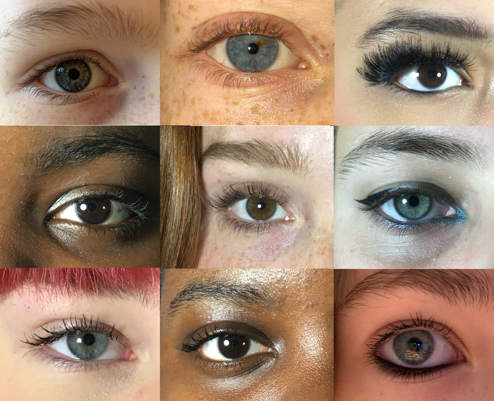
- SECOND DEVELOPMENT
For my second development I wanted to make a college of all the different images I had collected. So on photoshop I cropped and edited nine different sets of eyes and places them all together. I thought this was very interesting to see the same feature but all so different lined up very identical and symmetrical ( in my next development I opposed this symmetrical idea ) furthermore I did another one of these photos with multiple skin textures, as It gave a lot of depth and texture to the images and even tough there were the same idea it created a completely different photo. I really liked these pieces as the composition was in order and looked appealing to look at and it captures Myra Greene's intentions, however I wanted to explore collaging more in my next and final development.
|

|
- DEVELEPOMENT THREE
Bruno Del Zou
For my third and final development I wanted to keep the ideas of Myra Green but instead of making collages that are all the same I wanted to look at the work of Brno Del Zou, in his photography he wanted to capture a singular person or landscape in different views, the distortions and angles revel a scene where we can no longer distinguish the real from the photo.

|

|
I loved his work so to make my own version I edited and cropped all my images of each person and placed then carefully on top of each other to create a distorted view of the face. I needed to pay extra detail to the composition of the layering as some of the overlaps could completely change how the final photo looks. I have put all the photos below and in black and white to relate it back to the original ideas of Myra Greene, and I believe my best one is the one at the top. I like it as it still clearly resembles a face however it has the most facial expressions like squinting eyes, hair and different mouths. This gives it multiple layers of feeling that are evoked to the audience.

|

|


|


|

|

|
