Brutalist structure
The Brutalist architecture began in the 1950's during post war era. These style of buildings are characterized by minimalistic constructions that highlight the materials and decorative design of the buildings. The constructions shows unexposed concrete or brick and and geometric shapes, they also typically include a monochrome pallet in order to make all the textures more dominant. Brutalism is also said to be a nostalgic throwback into architecture in the 1940's.
Simon Phipps
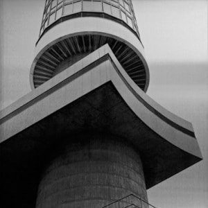
The photographer Simon Phipps was born in Leeds, and is now based in London. He is a graduate in sculpture from the Royal collage of art. Phipps provided a unique and refreshed perspective that portrayed Brutalist architecture in a more realistic and distinctive light. He spent the last 15 years documenting these buildings all over the UK, and he created a survey of photographs that highlighted this architectural style. In his images he reflects his concerns are to document and present post 1945 modernism Britain architecture that loosely fitted into this idea of a social contract that the state would provide housing and multifunctional buildings for the people. The Brutalist buildings aim was to fulfil this brief and they were functional, government buildings and their design reflected that.

|
|

|
My shoot:
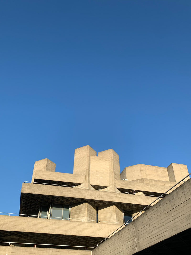
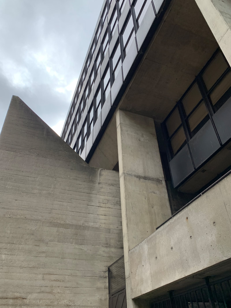
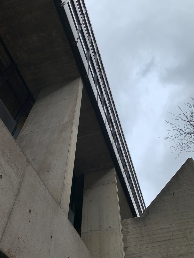
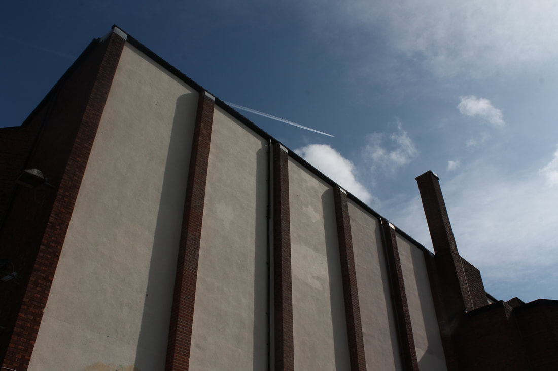
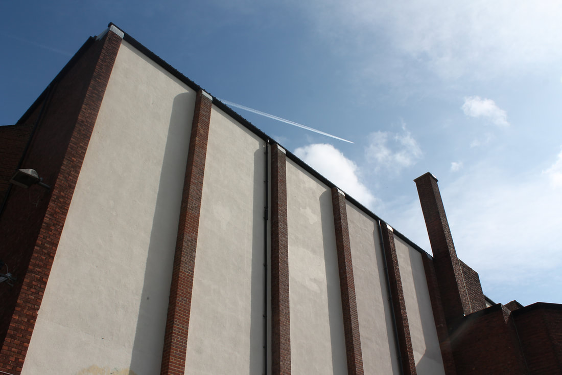
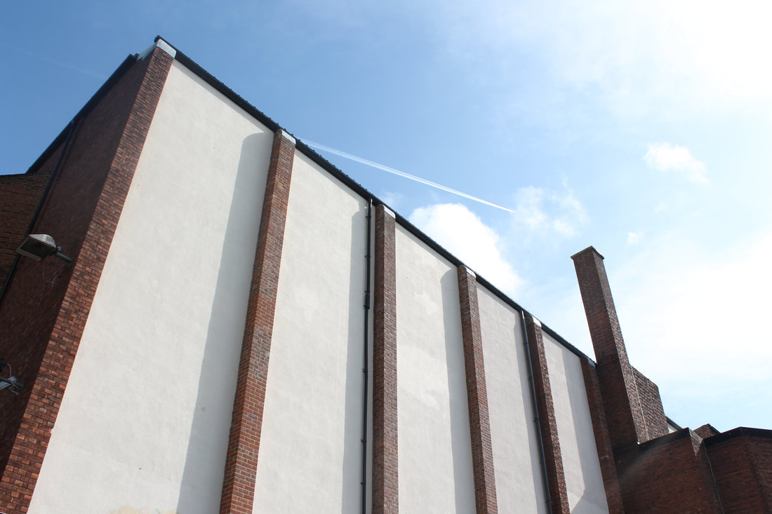
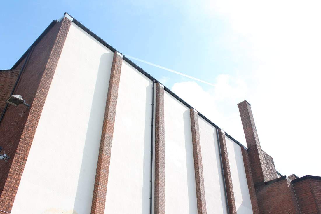
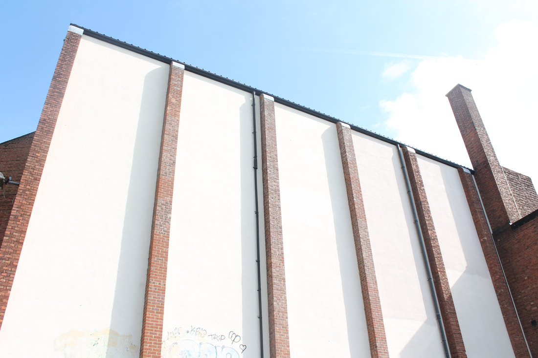
Our task was to travel around London to capture different locations of Brutalist buildings. For this shoot I went to the national theatre, Tate modern and Russel square to the UCL buildings. We payed close attention to photograph Line, perspective and negative space.
|
|
|


Negative Space
|

|

|
Line and perspective
|
|

|
Form and Shape

|

|

|
Overall Analysis-
I think these images were really successful in capturing the different lines, perspectives and forms of all the variations of shapes that are present in the brutalist buildings. I thinks its really effective when you see many different angles of lines all perorating each other in a various different directions.
To improve these photos I would travel to more locations that I found of Brutalist buildings to broaden my photos and make them more interesting. Considering the task required us to look at negative space I feel like I focused more on the lines so to better this I would capture more negative space as it allows you to focus more in on the structure of the buildings and placed against a blank canvas.
Extension- Thomas Danthony
Thomas Danthony is a French photographer who created a project called 'Brutalism' where he took photos of Brutalist structures and then edited them to be simplified into these images and then creates screen prints of these photos. His edits typically uses a lot of negative space to isolate and draw attention to the buildings in the foreground. His edits also highlight little detail and focuses more on shades of greys and blacks, colour blocks and shapes.

My response-


|


|
Overall Analysis-
I went into lots of detail when editing these images and the process is shown below. The block colours really brought out all the layers, shadows and contrasts in the indents of the buildings. I think the looks really powerful against the dark background and is a different viewpoint from a what is sometimes flat image.
However I found it really difficult to increase the detailing in the lines and make them as accurate as possible, even with zooming in I found it difficult. So to improve this I would focus more on this detailing by looking at the photo on a bigger scale and editing parts out as sometimes blank sections can make it more drastic.
Bracketing Task-
How do you bracket images?
when bracketing an image it means changing and adjusting the aperture by using the exposure compensation button. This is on the back of the camera and it allows you to alter the normal exposure that's automatically set by the camera. This gives you the ability to over expose or under expose by two brackets either side. For example in my images I adjusted them to starting at 0 to 3, - and + each way. This then gave me 7 photos of each photo and this gave me options of identifying what the best exposure is and I could select the best one.
when bracketing an image it means changing and adjusting the aperture by using the exposure compensation button. This is on the back of the camera and it allows you to alter the normal exposure that's automatically set by the camera. This gives you the ability to over expose or under expose by two brackets either side. For example in my images I adjusted them to starting at 0 to 3, - and + each way. This then gave me 7 photos of each photo and this gave me options of identifying what the best exposure is and I could select the best one.
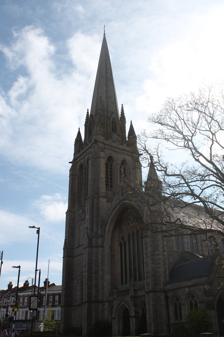
The process in order to create these style of images we were asked to go around Muswell Hill and photograph two different buildings. I went and photographed the Everyman cinema and St. James church. These two buildings are opposite to each other on the Broadway, and have multiple ways in which they are similar. One way they are similar is that they both give people a location where they can sit and watch or listen to someone. These are interesting places to photography as it allowed for two angles of light to be created, one facing towards and one facing away. The sunlight makes each building different with all the shapes and shadows.
Bracketing examples-
|
-3


|
-2


|
-1


|
1


|
2


|
3


|
Everyman Cinema

|
The Everyman ( previously called the Odeon )was one of the original theatres in the Oscar Deutsch owned Odeon theatres Ltd chain. It opened on 9th Sept,1936. It had seating that originally provided for 1,827 with 1,217 in stalls and 610 in the circle.
Facing in the corner of the road its small façade is covered with white faience tiles in the central section, with two bays either side that are covered in black faience tiles. On either side are a parade of shops on the ground floor with flats above, this hides the bulk of the auditorium section of the building. inside the building the decorative art-décor style is considered a prime example of 1930's cinema styling and even created a style in its self, due to architect George Coles, it became known as the 'Odeon style' |
My Shoot:
|
|
|


St. James' Church

|
The original building was constructed in 1842 and 5 years later, the church was extended in 1874. This foundation stone for the current building was laid in 1900, and the completed church was consecrated by the Bishop of London on 30th June, 1902.
The building was gutted by Wold War ll bombing, and the restored church was rededicated in 1952. The church spire was completed in 1910, the spire stands 300 feet above sea level, this is how the church got the name 'Church on the Hill' the tower is 21 feet square and 80 feet high. On top of this the spire rises another 82 feet and the total height to the top is 170 feet. |
My Shoot:
|
|
|


Best Photos:


|

|
Overall analysis:
I liked how this shoot mixed historical factors with current photography methods. Both these buildings contained history that made It really interesting to photograph. I noticed when I was shooting that my eyes were paying extreme attention to capturing all the detailing's of the buildings structure, stones and windows to make sure I included them all into the frame. The bracketing really came in handy to decide the best setting to place my camera on and whether shooting into sunlight was more effective and what effects shooting behind sunlight had. After all methods of experimentation I found that shooting behind sun was better as it prevented the photos from the glare and making it better quality, and having the bracketing on -1 to 1 was usually the best ) depending on the aim of the photograph)
To makes these images better I could include more negative space because In previous task I found it really good for making a dramatic building such as the above to look really powerful and highlight even more the importance of the buildings structure as it focuses you in on the buildings itself.
Nicholas Kennedy Sitton
Twisted Structure-
Artist based in San Frisco, his work is made using film cameras and photo manipulation. He captured images of urban architecture that in the editing process he twisted and swirls to create alternative view points from just one single photo. His aim was to create work that felt unreal, surreal and a mix of the unknown and the known. This encourages viewers to embrace what their own imagination wants them to take away from the photo.
In many of his work he liked to brighten and exaggerate the colours in the photos to make it more eye catching and pop out of the page more than it already does. I also chose three varied edits as some only twist one circle, some twist one building and other twist the whole page, I took inspiration from this and had it in mind when creating my own as I wanted to experiment with multiple designs to see what looked the most effective and with what buildings.
In many of his work he liked to brighten and exaggerate the colours in the photos to make it more eye catching and pop out of the page more than it already does. I also chose three varied edits as some only twist one circle, some twist one building and other twist the whole page, I took inspiration from this and had it in mind when creating my own as I wanted to experiment with multiple designs to see what looked the most effective and with what buildings.

|

|

|
My edits and the process


|


|
Overall Analysis-
I really liked this shoot and edits as it allowed for more experimentation within the images, the lighting created more shadows. I really enjoyed editing these and I tried swerving then both ways, multiple circles and back to front. The results were really interesting because It showed how vast the process was and the different it can make to the final result.
To improve I could have taken more photos with the knowledge of this editing process in the back of my mind so I could capture more photos with wider spacing of the full church as I found It slight hard to fit it all onto one photo.
Structure in nature
Myoung Ho Lee
Myoung Ho Lee is a young photographer from South Korea, his photography presents trees as isolated objects in nature like solitary trees, framed against a whit backdrop in the middles of its natural surroundings. This series of photographs made people think about the reality of representation of art, the environment and what we see. Overall the whole concept of this shoot is simple however takes a lot of complex execution. This needs to be planned in advance, the weather might change, therefore changing to photograph. not only this, you need crains to halt up the white backdrop. By separating the tree from nature it allows you to see the structure of the trees when it would normally be difficult to tell when its standing with other trees. Another thing it does is brings together nature into the studio. Hi work typically consists of four procedures; selection of the subject, separation of the subject, photographing and confirmation of the separation. As we can tell its separated by the rules of thirds, he separates in with the grass in the first third and the rest in the two other thirds, finally the tree is in the centre of the images outlined with a boarder to catch our eyes and draw attention to the main subject.
|

|

|
My shoot
|
|
|


Best Edits:

|

|
|
Overall analysis:
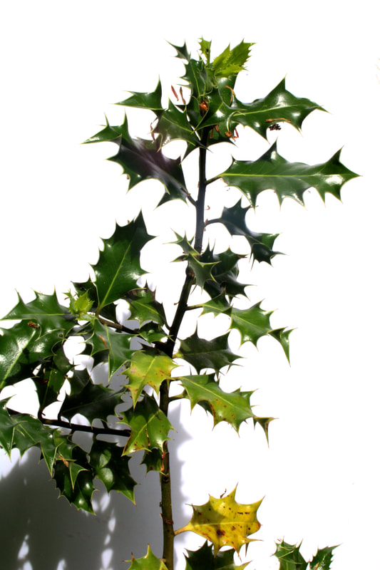
Throughout this shoot I was considering all angles and variations of natures that would be good to capture against the white card. This included ferns, small flowers and holly. Overall this worked out effectively as it caught all finer details with the small leaves and spikes.
On the other hand I found it harder to photograph the trees against the white background because I found they were too big to fit on the size of card we had. So I was mainly able to photograph smaller logs and branches as opposed to the whole tree trunk. So to improve I would get a larger piece of card to make it possible to get the whole tree in the frame because it had some really nice detailing in the bumps on the trees and the moss, the structure was very interesting.
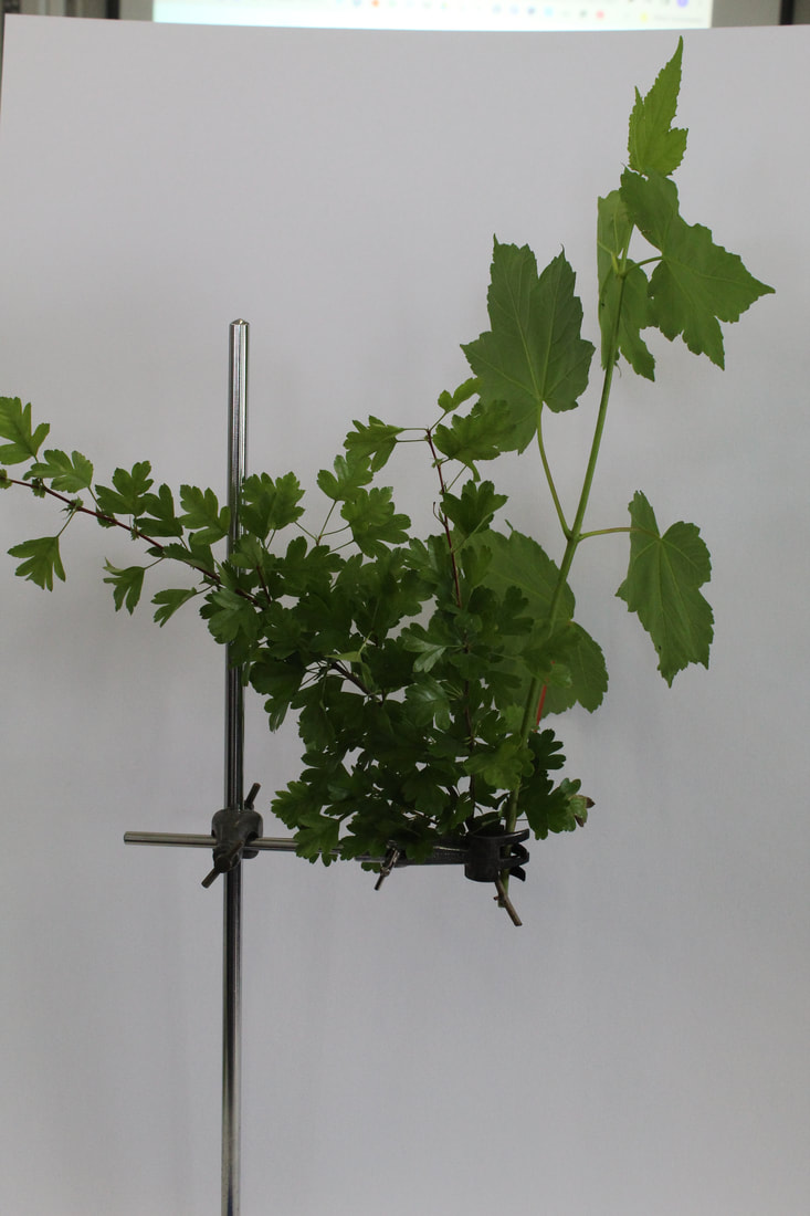
Sanna Kannisto- Field Work
Sanna Kannissto was a American photographer who photographed exotic flowers and plants in a man made environment in her studio. Kannisto started up her photography journey in the year 1997, where she took the role of a scientific researcher when she travelled for 2-3 months in the rainforest to capture the animals natural environment in a scientific station. She made her intentions very clear about wanting to wanting to have the chance to step into a new territory of exploring the interactions between science and nature. During this time one of her first and early interactions with photography and that set her in in inspiring her latest work was when she looked into photographing animals like frogs, she did this by hanging a mesh net to catch all these animals. I thought this was really clever because it gave people the opportunity to see minute details like the wings and feather that you could not have the eyes to see normally. This was made possible because she used a white box like a man made studio going along with tradition of still life in photography and staging these scenes. After this she did a series called ' The Humming Bird series' where she photographed flying birds, this was a extremely creative process as it challenged the structure of the frame and shutter speed. In this series she photographed the birds using a light box with a white background, this was the scientific documentation part, and to do so her work needed her to work along scientists to learn about the animals and collected samples in the scientific bases. Overall I really found it interesting findings about this process of photography as its different from anything we have done.

|

|
Our task was to photograph types of exotic plants that we gathered and placed them against a whit backdrop. For the flowers were clamped together with a science apparatus. I experimented with hanging the pants upside as well to see different angels and how they hang.
My Shoot:
|
|
|


|

|
Overall analysis:
I liked the different arrangements that we explored like hanging the flowers upside down to see how they hang, a mixture and singling out a type of flower. The white background make it east to see the individual flowers and small patterns on the leaves.
However I found it hard to arrange the flowers as they were to small and thin to fit into the clamp, however it worked and turned out well. What was also challenging was shooting on a overcast day inside where little light was available, this made the exposure really dark and hard to get it correct lighting. We tried to help it by adding flash and although it helped it evidently casted a shadow over the flowers and even though not the initial aim of the task I think it gave a different type of depth as it reflects all the small leaves in a more dramatic tone. I would however shoot on a sunny day to fix these issues.
3 DEVELOPMENTS
Internal structure of the body
STRAND ONE
Danny Quirk
Danny Qurik is a 25 year old, self taught medical illustrator who's art form is the avant-garde style. Quirk effectively dicects the body with a paintbrush to turn eye catching painting into atomically mainly for educational gain. He is best known for his series called 'anatomical self dissections' He took the art form of painting to explore inside and outside of the body, in a interview he mentioned how he had always been interested with the structure of the human body in a mechanical way. He chose the medium of painting as he felt it allowed his creations to feel more human without the aid of a machine. Painting can also be altered along the way giving him more space to make intercalate detailing and freedom. Furthermore he said it not only have him creativity but also a challenge.
Our bodies are made up of various layers and muscles that we cant see unless looking under the skin. In order to capture this aspects of the body he is specializing in watercolour, his aim is to aspires to paint what the camera couldn't capture and explore the darker side of our bodies.
His work consisted of dramatic and cinematic lighting to highlights all textures and curves of the body, he got his models to pose in a way that expose bones and revel the skeleton structure that lay beneath the skin. The people in the paintings come from a mix of his imagination and previously taken photographs that he cleans up in photoshop and about 3-4 days later the image is complete.
'I've always been interested in anatomy and the body. In terms of engineering, it's beautifully constructed, and I've always loved understanding how things work. I took a Comparative Vertebrate Anatomy course, and got to see first-hand what a lot of these'- DANNY QUIRK
I wanted to develop from this work as I found it so interesting how you were able to merge the outside of the human body that we are all familiar with and the inside in witch were not so confident about. These two things coming together is so normal yet hardly seen in real life.

|

|

|
My Shoot:


|

|
Its really effective the way its blended into the real face to make it look more realistic and like there is a real skull. To help this I used the brush tool to blend into the edges.
On the other hand did find it hard to do the one on the back because there were so many gaps between the bones, I tired my best to erase these however some still show through the bikini straps.
On the other hand did find it hard to do the one on the back because there were so many gaps between the bones, I tired my best to erase these however some still show through the bikini straps.
Twisted structure/Multiple Viewpoints
STRAND TWO
Myoung Ho Lee
|
Myoung Ho Lee is a artist from South Korea who took a series of photographs of isolated trees framed against a white backdrop in the middle of its natural surrounding landscapes. The white backdrop acted as a division between reality, art and science. The execution of this is simple however its complex to complete, it takes many days to plan as he used big machines to halter up the sheet and very dependant on the weather. The white sheet allowed him to separate the structure of the tree that is normally missed in its natural environment, I thought this was really interesting as it allowed you to see the structure that's normally missed. I also wanted to take inspiration from this work because I thought the way all the branched interwind and connected to create a natural twisted structure. However because I wanted to incorporate twisted structure I tried to take pictures of the trees with no white backdrop and I found some interesting ones already isolated naturally in the environment.
|

|
David Copothorne
|
copithorne is a Brazilian photographer who created very interesting images by mixing film, digital manipulation and geometry . He wanted to capture the idea of the colours included in Brazilian sunsets and edited them in a twisted why to add a effect to his work. In order to complete this work he spent a total of three months in Brazil taking these photographs and the transformed some into animated GIFS as he wanted them to feel alive like the city of Rio was and all the dancers in the carnivals. To shoot the photographs on he used a 35mm camera combined with a vintage and modern feel by merging these two together
|
|
' I seek natural scenarios that you cant find in a studio and attempt to visually adapt the vast crooks and corners of the world into my own creative output'- David Copothorne
I wanted to incorporate his work into mine as I thought the colours were so vibrant and a contrast to what we normally see in everyday life. It gave a different perspective and outlook into what we normally see as neutral and boring. I thought that if I merged them with the trees I could make the branches look more twisted and like its consuming the image.
My Shoot:


I took photos of loads of different structures of trees and twist them as some had one branch and other had many more. Then instead of doing the normal twisted design, I tried to turn the image upside instead. I really liked the way this turned out as it gave a different perspective.
However I could have gotten more photos and style of trees to get a range of locations and images to experiment on. I also found it hard to twist without leaving any white space and I don't feel like it looks good with he whole photo.
However I could have gotten more photos and style of trees to get a range of locations and images to experiment on. I also found it hard to twist without leaving any white space and I don't feel like it looks good with he whole photo.
STRAND THREE
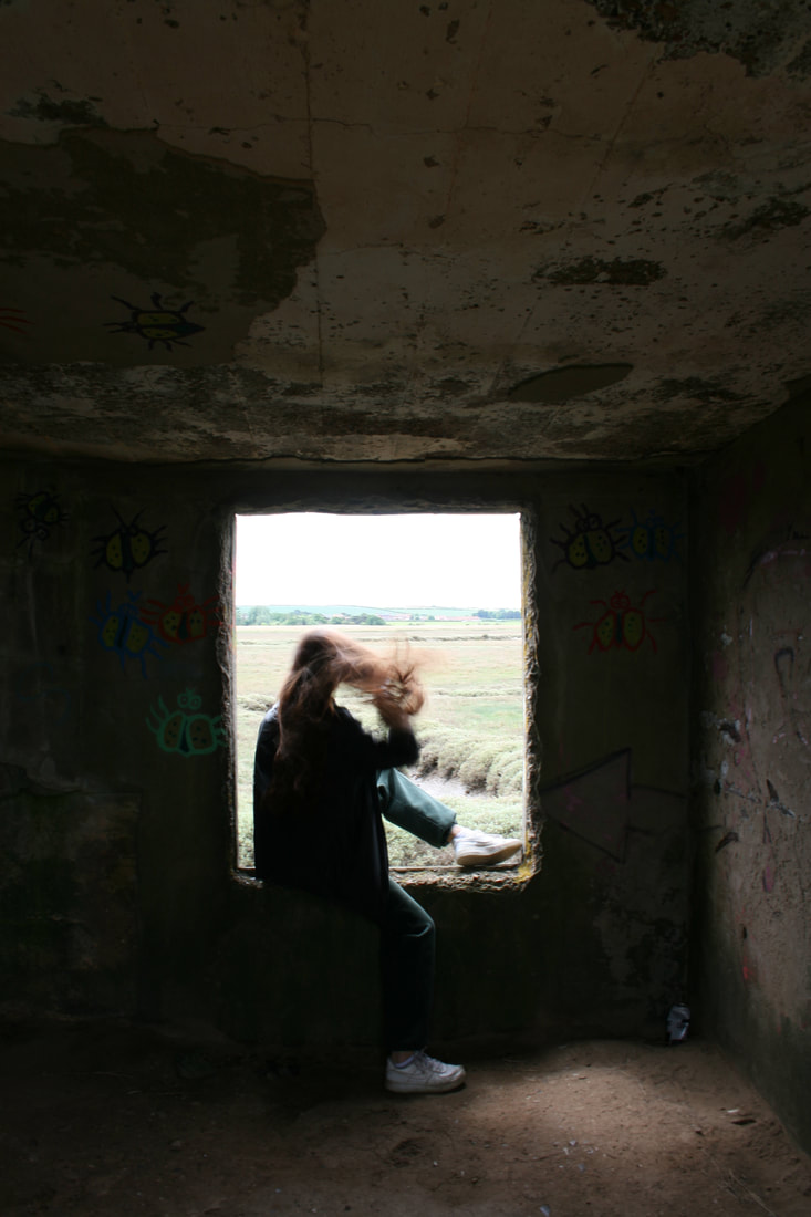
Destruct and Decay
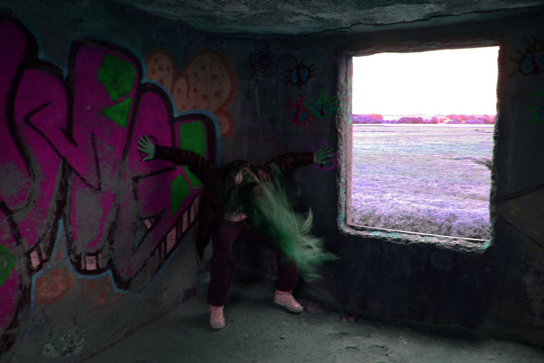
For my first development I took inspiration from three different photographers to create these photographs. I wanted to capture mysterious and ghost like figures against a decrepit and destructed landscape. These three photographers were Francesca Woodman, Duanae Machals and William Eckersley. I think after looking through each ones work that I took inspiration from them all as they all contribute to this theme of isolation, mystery, wreckage and abandonment.
William Eckersey
|
Firstly I looked at the work of William Eckersey for the abandon background and surrounding landscapes. He created a series called the dark city, where he went around areas of London that looked especially haunting and eerie with the lonely street lights. Before this he studied London collage of commination. In this series he liked to decompose the city in a medical way. His work allowed views to gaze at the city they once to be a realm of familiarity. This series especially focused on lighting and how a person may get lost in the darkness. When walking out of the exhibition allows them to appreciate the familiar names of these streets that were made to look slightly disorientating. Many of the buildings that feature are old and decomposing and being put to use again.
|

|
Francesca Woodman
|
She was an American photographer who was best known for her black and white pictures featuring herself and various female models to create these haunting and ghost like photographs. The models are usually seen naked, clothed and very blurred to the point where the surroundings and faces are obscured. Most of her photographs were taken on a medium format camera that produced negatives and she focused on taking pictures in indoor, abandoned and derelict places. she was influenced by many different events, she studied surrealism and the works of Duane Michal's and wanted to recreate some of his work. Surrealism is all about photographing what the eye cant see, unusual and taboo things. Throughout her work there was a running theme of expression of self, gender and the body thought disturbing movements and urgency to evoke feelings of the uncanny. She took her photographs on a fast shutter speed to archive the blurry ghost like effect making the overall image seam haunted.
|

|
Duane Michals
|
He was an American photographer who was most known for use of photo sequences to convey emotion and the journey of sprit after death. For a number of year he was a commercial photographer covering the 'great Gatsby' however he never owned a studio, he always shot people in their natural environments, this was a contrast to methods of other photographers at the time. There were many influence on his overall work such as his political views and civil rights movements and he was used photography as a means of expressing himself. The photographs are narrative with a sense of the unmown that I think links all the artists together.
|

|
My Shoot:
|
|
|


|

|

Overall Analysis:
I like how it captured the surreal aspects of woodman work, I took the photographs in many different locations like a old pill box, woods and a abandoned farm house. This further highlighted the decayed and abandoned feel of the photos.
On the other hand I wanted to make the photos more blurred to create a distorted, uneasy feel and as it was successful I think I could have improved this by getting better lighting and having the camera on a different shutter speed.
DEVELOPMENT IDEAS:
For my developments I want to created naturally decayed and destroyed images by experimented with various chemicals, process and prints to do so.

FIRST DEVELOPMENT
This development was inspired by darkroom prints. I wanted to carry on the theme of decay and destruction with experimenting many different ways I could psychically alter the images until they look different. The aim of this was to highlight the ghost like look and style of the photos. The first way I did this was in the dark room, I printed the four photos of my choice and copied them onto asotape, meaning they could be used to project and transfer onto the paper in the dark room. Some methods of dripping the developer onto the prints were using a sponge to pat it on. I found that this gave the photo a more splatted effect and blurred the photo more however it was a bit too much so Then I placed the print face first onto the developer and lifted it up. This created these circles onto the surface that I think look really striking and even highlight certain areas of the original photo. I liked that It didn't fully distort the photo. I think overall they were successful at destructing the photos to make them less recognisable.
asotape pictures:

|

|


SECOND DEVELOPMENT
I had a idea for my third development to bleach the photos in the Francesca woodman style. In order to do that I through it would be more effective to highlight the colour in the original images to bring the colours out more. I was inspired by images I found on pintrest where they coloured certain parts of the images like tree branches or leaves and the sky. I went onto photoshop and experimented around with the exposure and colour balance and the inverted filter until they felt like it was unnatural so that in the bleaching process the colours will be more enhanced.


THIRD DEVELOPMENT
For my third development I wanted to use the coloured images and bleach then to make the colours leak and create a distorted, decayed image. This idea is to not only picture they decayed building but also the actual print. I like that it almost looks like fire in nature and how the humans are affecting nature negatively. The oranges and white were the main colour presented and that's why that create such a stark image. In the process of bleaching I discovered that the process was more effective than the final product. As at the end when you wash the bleach of its just white so there are a series of photos below that are captured during the bleaching process as I think the outcome is more effective, I also love how you can create so many images from one original product as the bleach never stops changing and creates a different outcome each time.
I also experimented with a can of air that aggressively blew air really fast onto the paper, I found that if I placed some bleach onto the paper and used the tool it created a ripple effect and spread the bleach out but in a more controlled way. Therefore you can control where you want the colours to be altered or bleached for example I think the most effective spots were the hair, windows or grass patches. We also painted it onto the grass to create the burning effect and often highlighted around important focuses in the image like the body, to draw attention. Overall I love the Varity of photos it created and really captured the destroying effect I wanted to get across.
I also experimented with a can of air that aggressively blew air really fast onto the paper, I found that if I placed some bleach onto the paper and used the tool it created a ripple effect and spread the bleach out but in a more controlled way. Therefore you can control where you want the colours to be altered or bleached for example I think the most effective spots were the hair, windows or grass patches. We also painted it onto the grass to create the burning effect and often highlighted around important focuses in the image like the body, to draw attention. Overall I love the Varity of photos it created and really captured the destroying effect I wanted to get across.

|

|
|
|
|


FORTH DEVELOPMENT
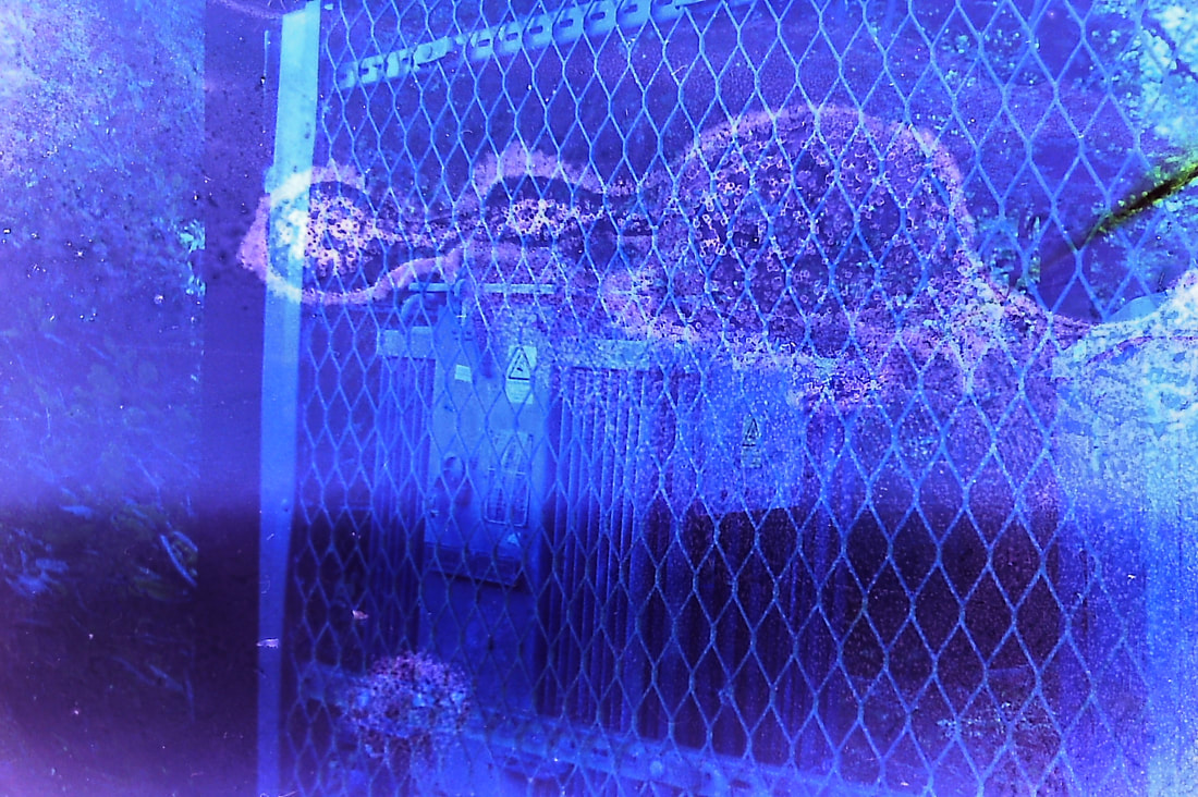
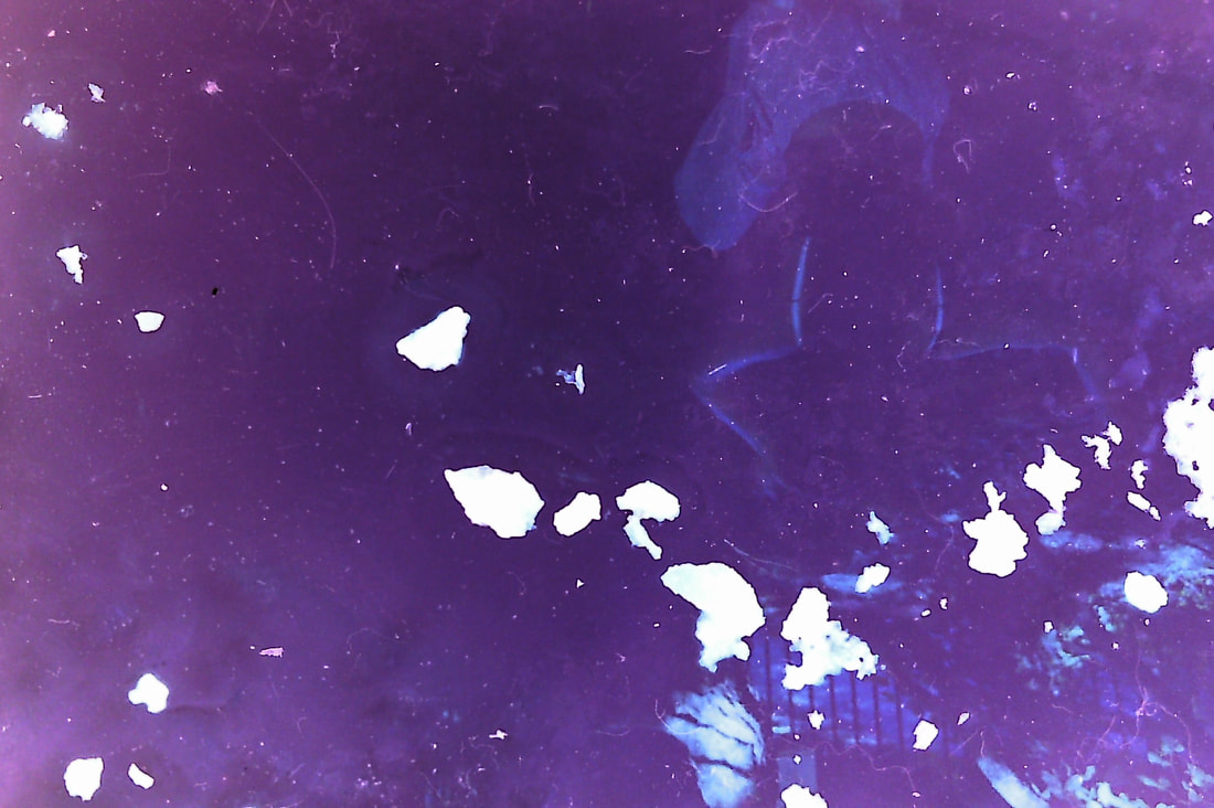
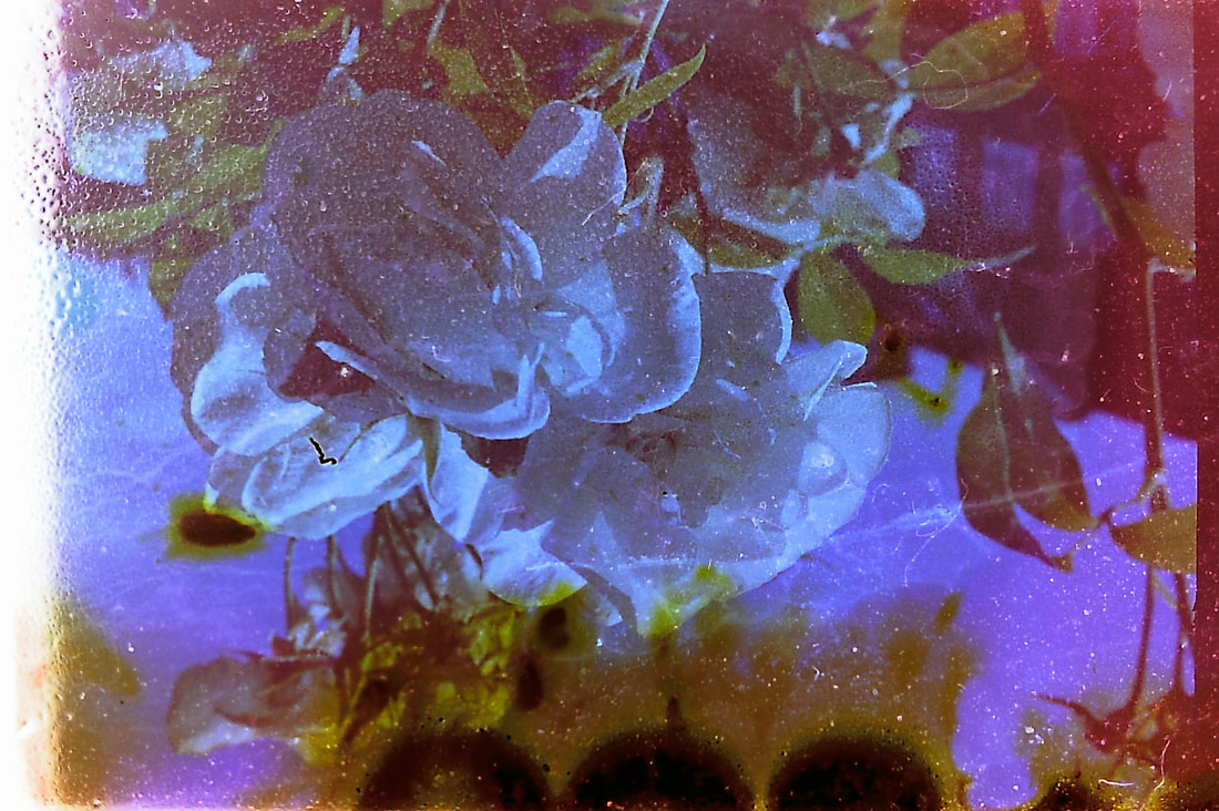
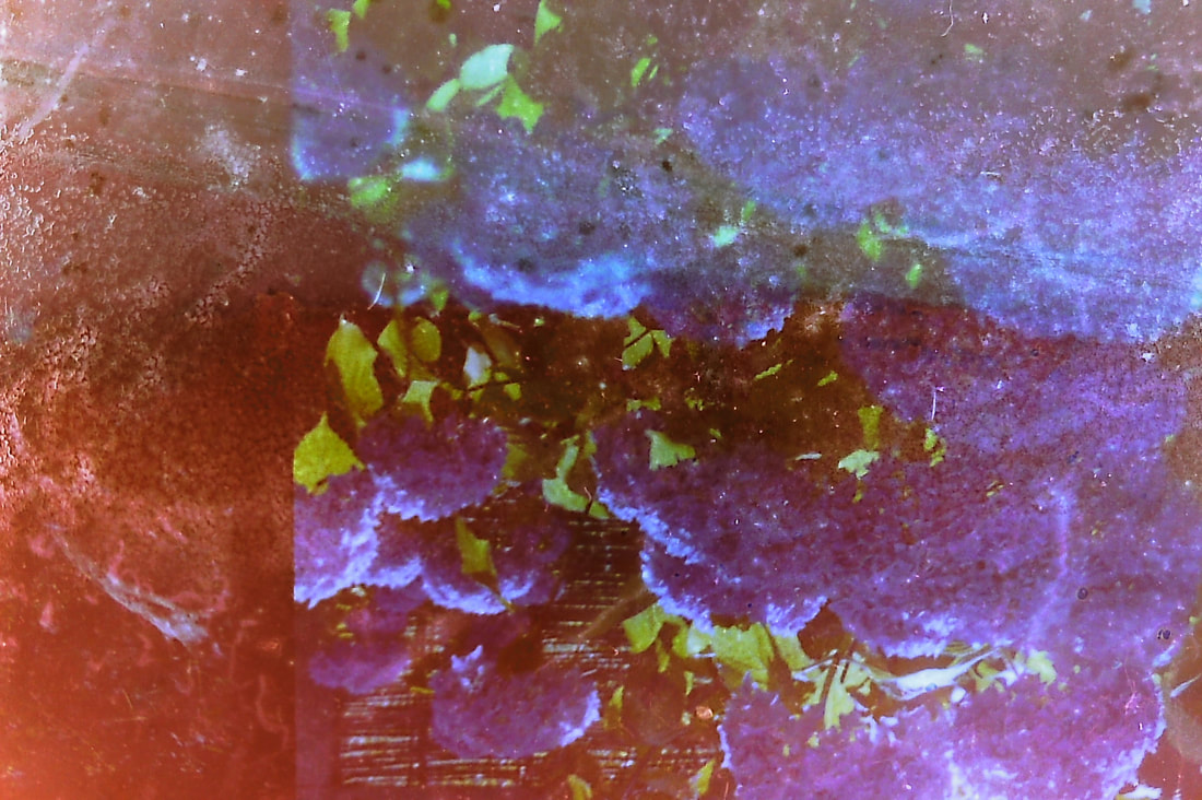
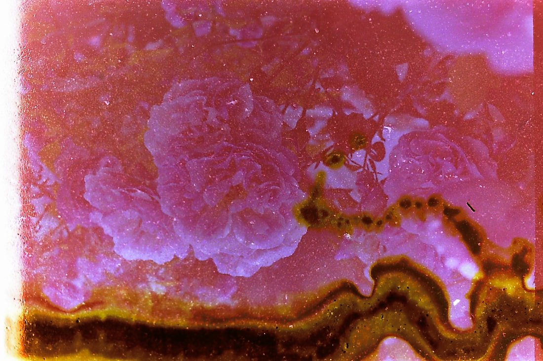
For my fourth development I wanted to use a old film camera to capture nature and carry on the Francesca woodman theme. When shooting I found it hard to tell if they were going to come out as I wanted because you cant see as you capture. The roll of film I used was already tinted red/pink so that added to a vintage and decayed look. However when it came to developing them not all the photos came out successfully as some were really dark and ended up only being red however others in bright light like the flowers were more successful because there was more available natural light. I then went on to use the negatives of these to create my film soup images as my final development.
FITH DEVELOPMENT
Tom Evans
|
|
|
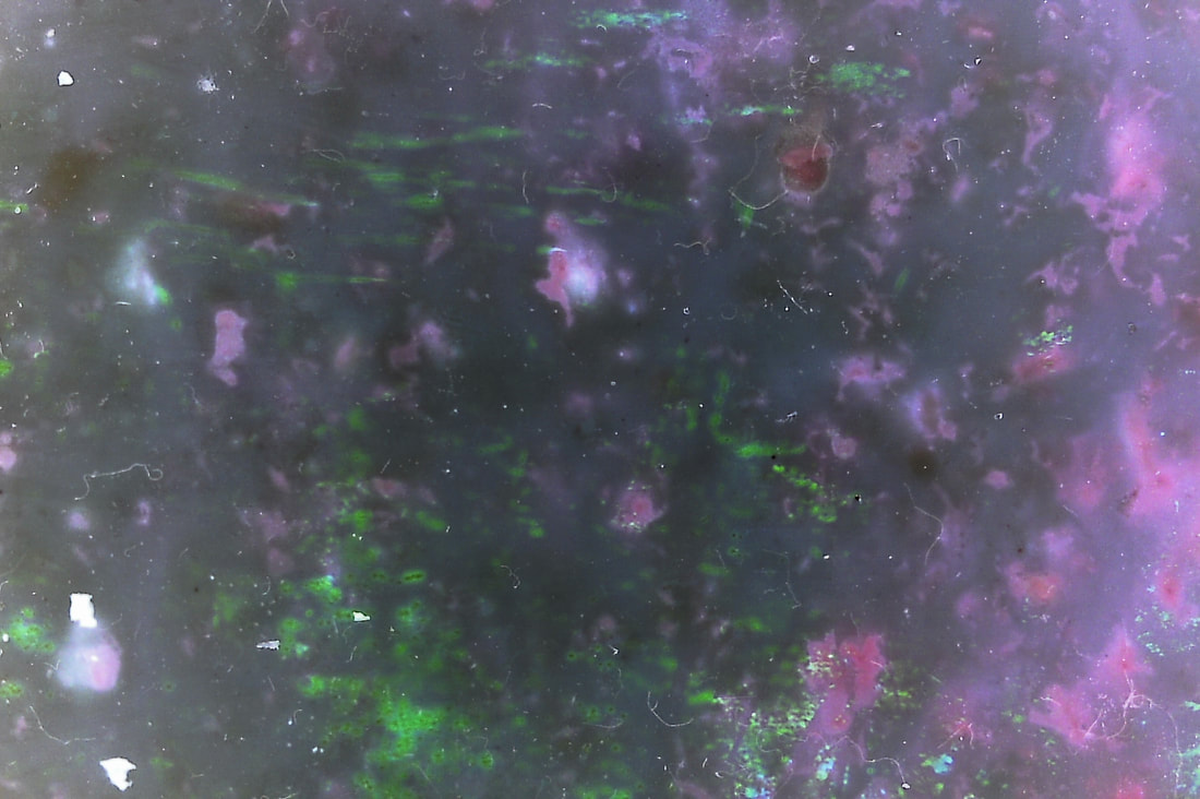
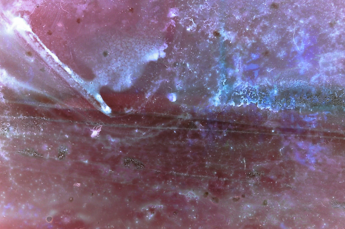
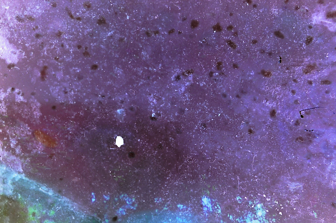
Tom Evans is a video editor and motion graphics designer who is based in Pembrokeshire, Wales. He found his passion through destroying and degrading certain elements of film. Film soup is chemically altering the negatives to produce unexpected results. There are many different recipes that Evans made to each produce a different style of image, even though these recopies are the same ingredients they can produce a different result of each strip of negatives to create unique results each time.
Some of these recipes included lemon juice because its high acidity produces it to almost bleach the photos as it reacts with the silver halide crystals in the film. crushed silica gel, these packets create small dots scattered around the frame, instead I used salt crystals that I found produced a similar result. Other ingredients include bath bombs, energy drinks, perfume, alcohol and inc.
Some of these recipes included lemon juice because its high acidity produces it to almost bleach the photos as it reacts with the silver halide crystals in the film. crushed silica gel, these packets create small dots scattered around the frame, instead I used salt crystals that I found produced a similar result. Other ingredients include bath bombs, energy drinks, perfume, alcohol and inc.
Procedure:
I added my negative strips into small trays that I then filled with boiling water, this allowed the ingredients to spread out. Next I squeezed the lemons and lime juice onto the film and left them in. Finally I added the tea bags, bleach, salt and washing up liquid. After I was happy and all the negative strips were covered I left them to soak and develop over the weekend.
I added my negative strips into small trays that I then filled with boiling water, this allowed the ingredients to spread out. Next I squeezed the lemons and lime juice onto the film and left them in. Finally I added the tea bags, bleach, salt and washing up liquid. After I was happy and all the negative strips were covered I left them to soak and develop over the weekend.
For the film soup I found many different recipes that gave different results, I decided to use:
|
Bleach, lemons, raspberry tea bags, salt, hot water

|
Lemons, limes, blackberry tea bags, soap, hot water

|
salt, lime, raspberry tea bags, soap, bleach, hot water

|
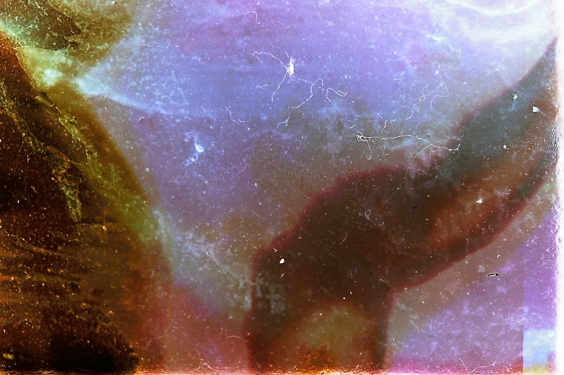
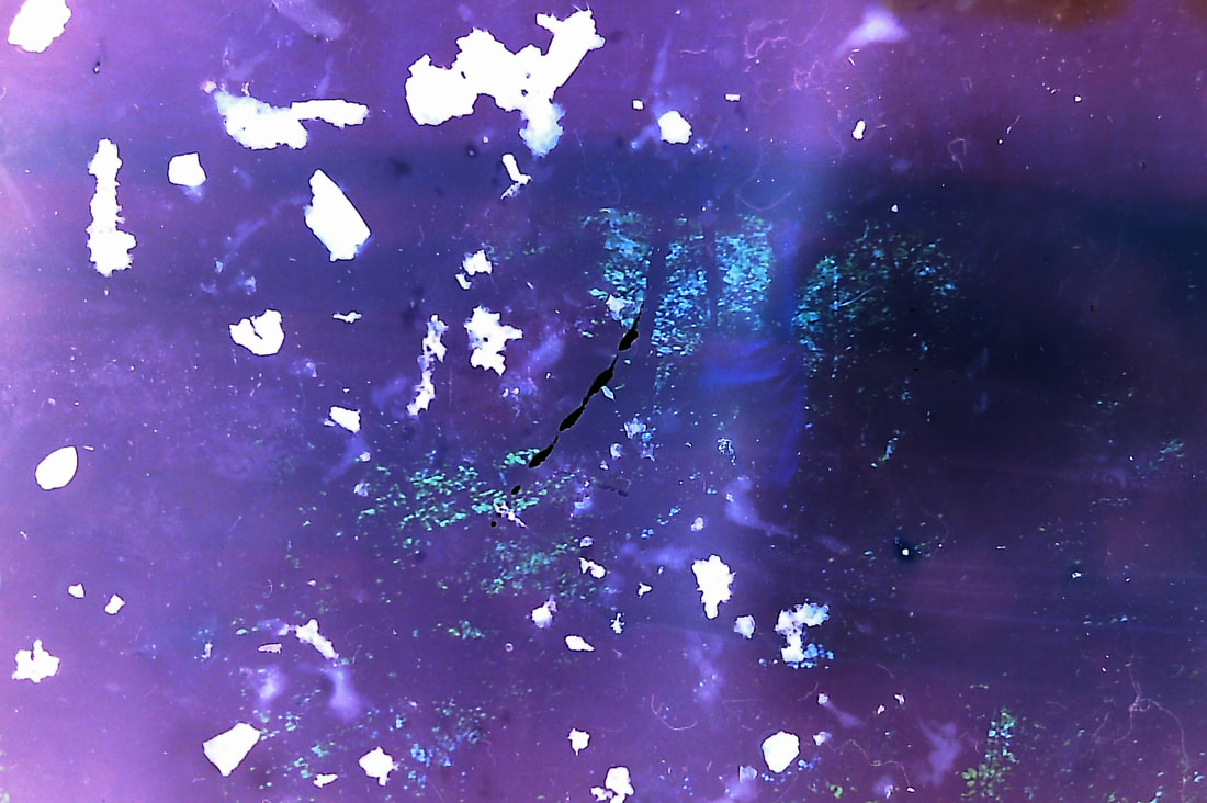
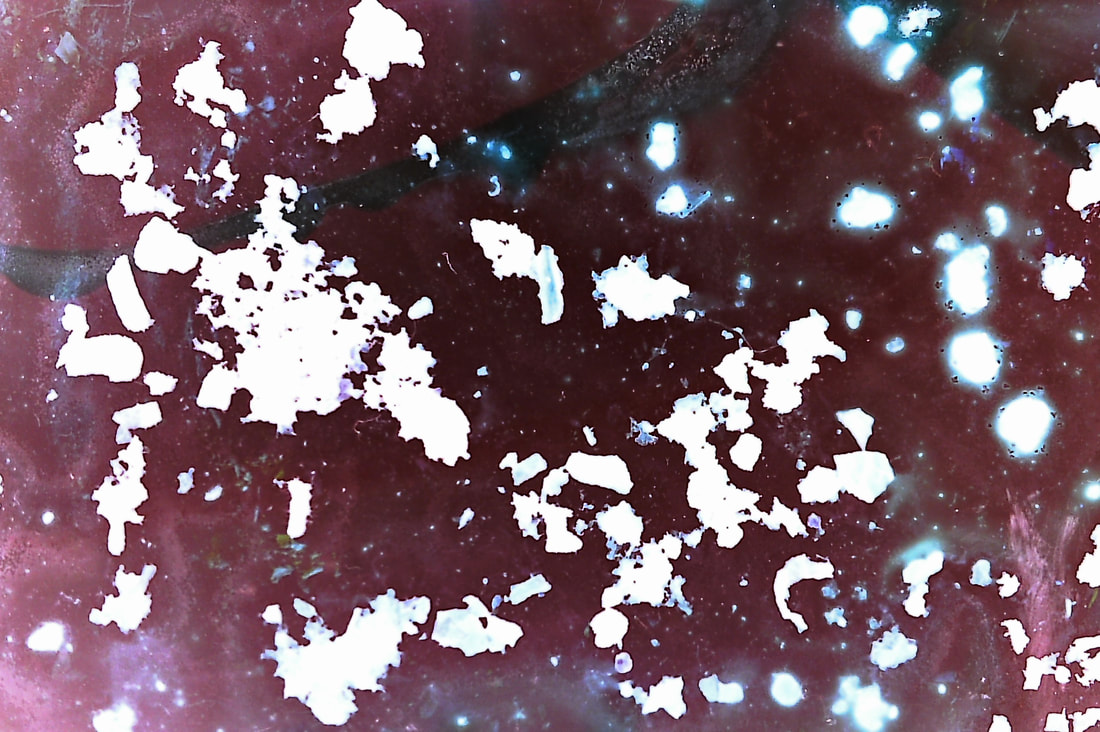
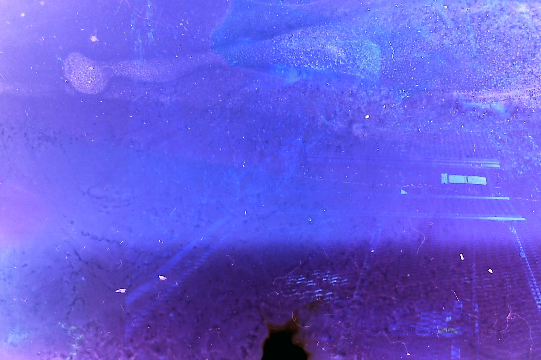
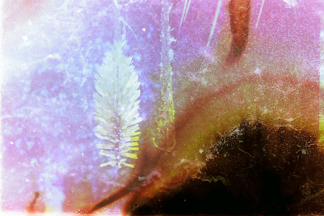
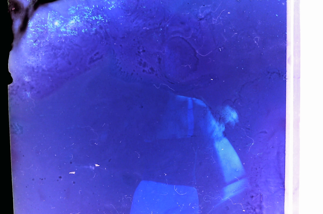
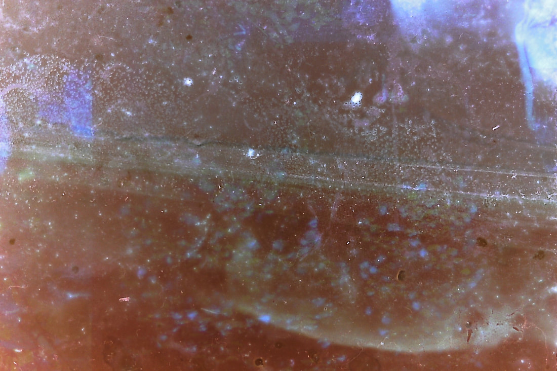
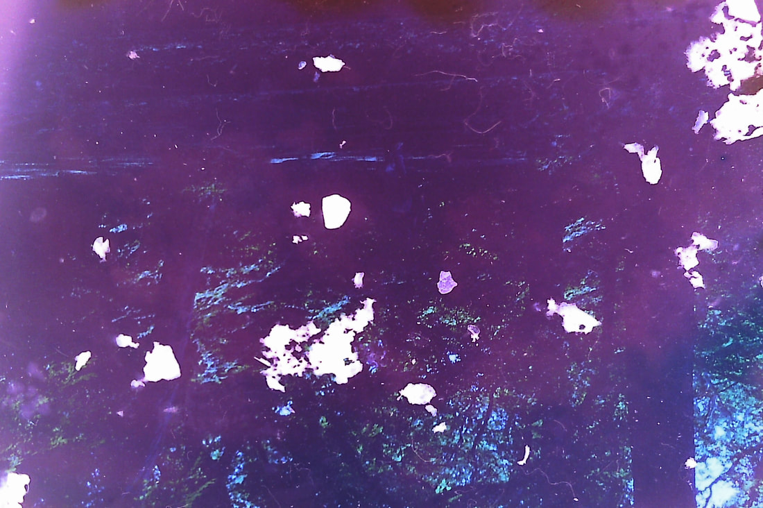
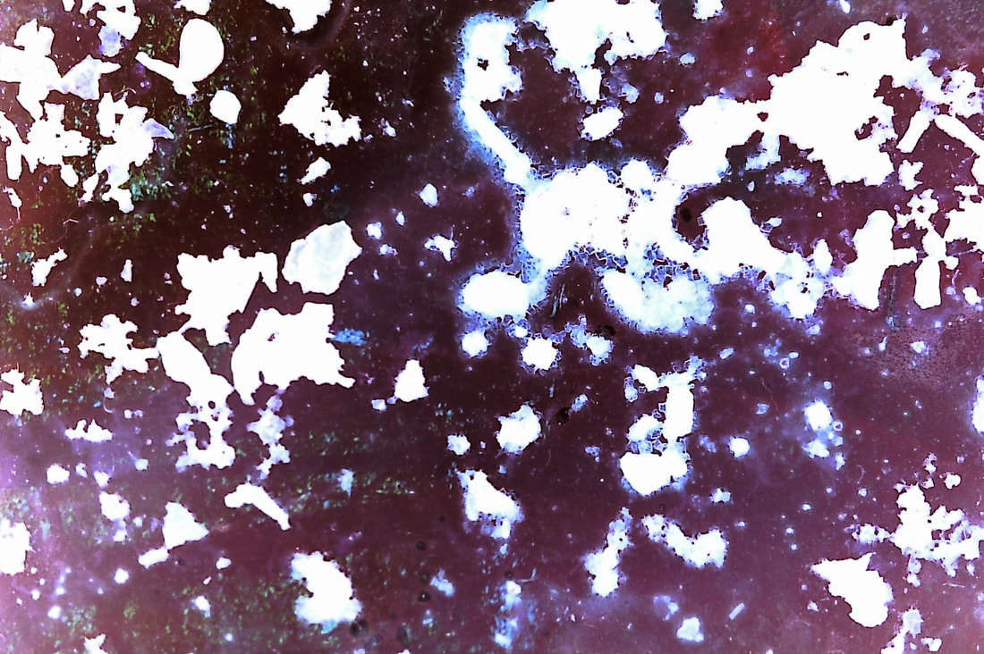
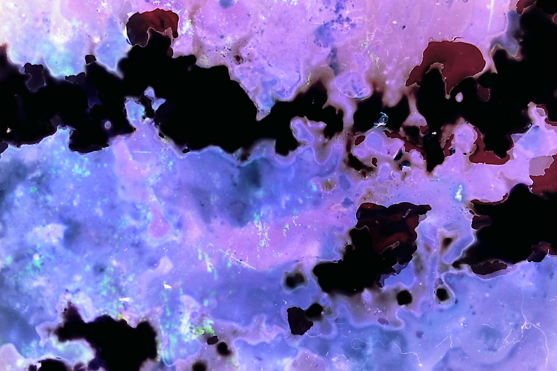
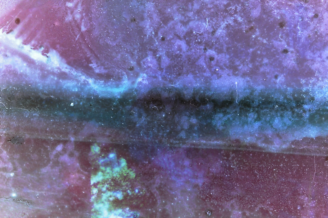
I then used a negative scanner to scan the images onto my computer, I found that the mixture that was most effective was the bleach, lemon and tea bags. The photos came out really clear and distorted, damaged and destructed. I like that you can still see what the photo one was and then how it became to being destroyed. The least successful set of images were when I didn't wash of the petals from the tea bags, at first I thought it would give a ripped or scratched effect however there was to many to see through to the original images. What I found so interesting was that even if you used a similar recipe for film soup, each negative on the roll would be different and unexpended so you get a element of surprise when scanning the final images.
|

|
|
|
|
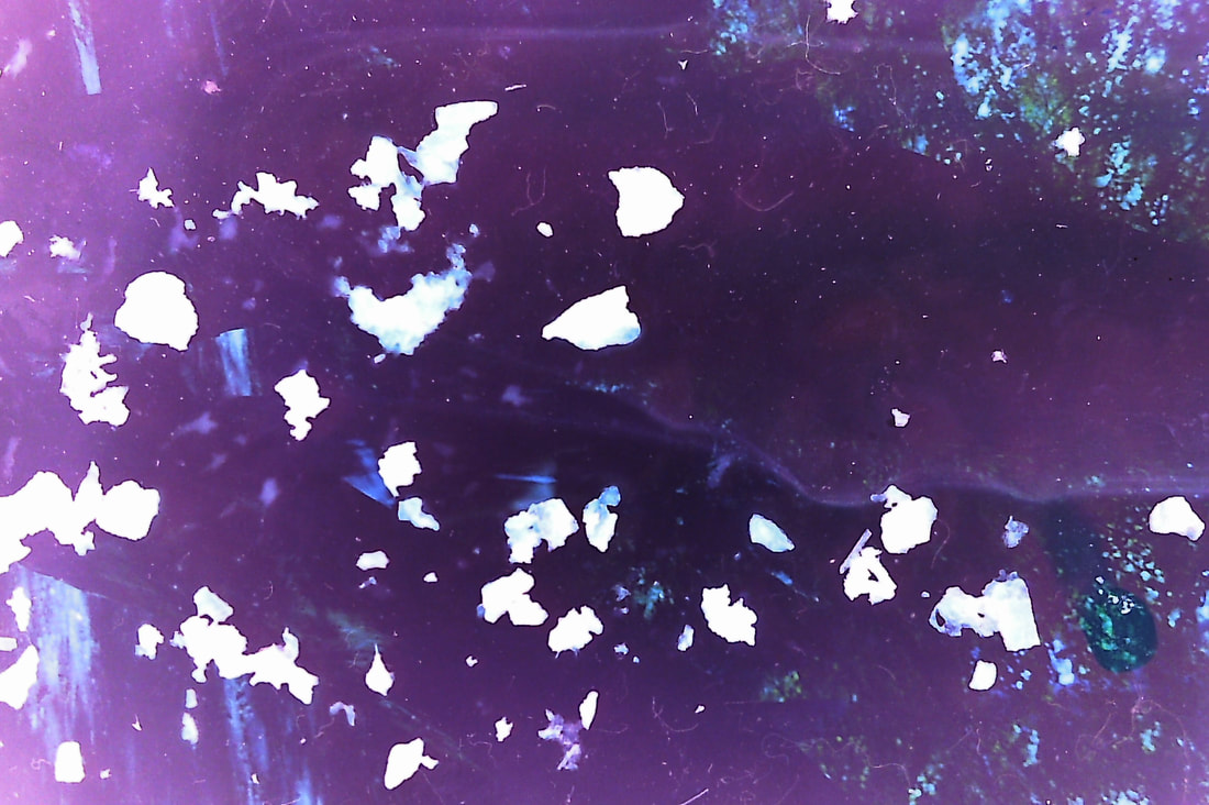
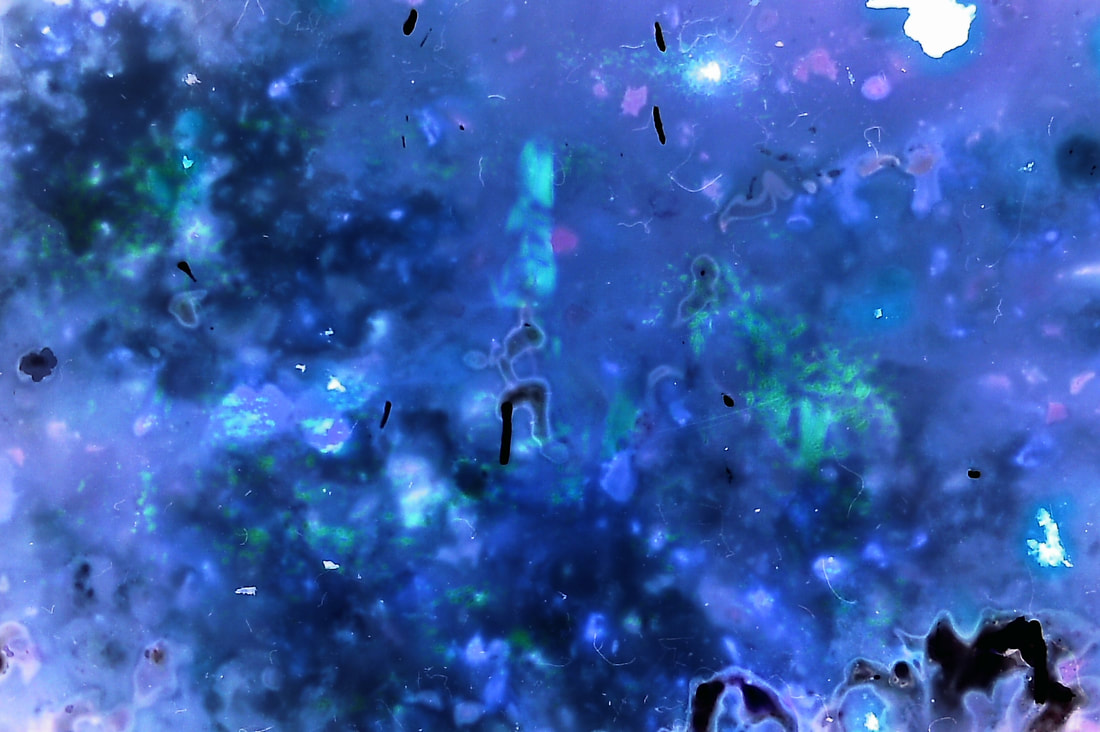
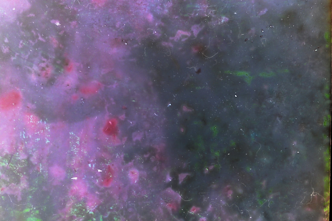
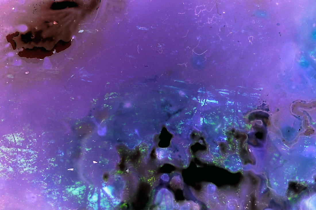
After analysing and looking at what worked best with the images above I decided to wash of all the excess tea leaves so that you are able to see the original photos lying underneath and its less white and more colourful. I also included the edges of the film into the photo as I like the effect it gave of being able to see the negative instead of just the image. Overall I think this was more effective at revelling the ghost like figures as you can see them more, it further highlighted the purple tones.
|
BEFORE
|
AFTER

|


|


|


|


|
Edits:
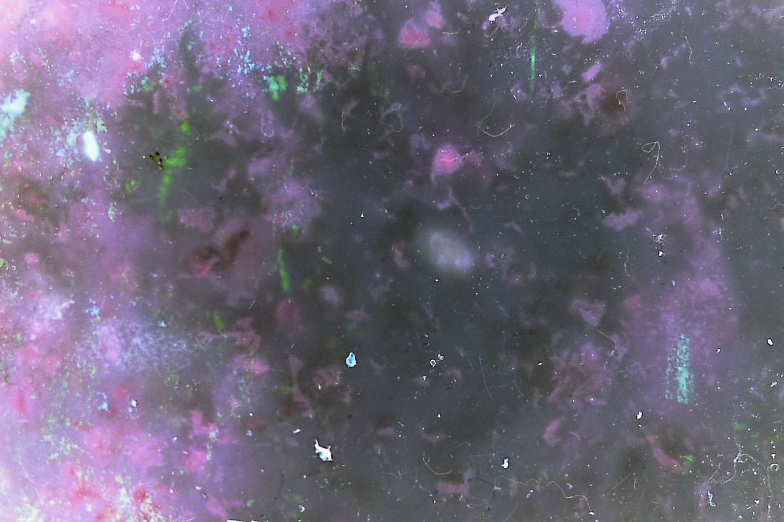
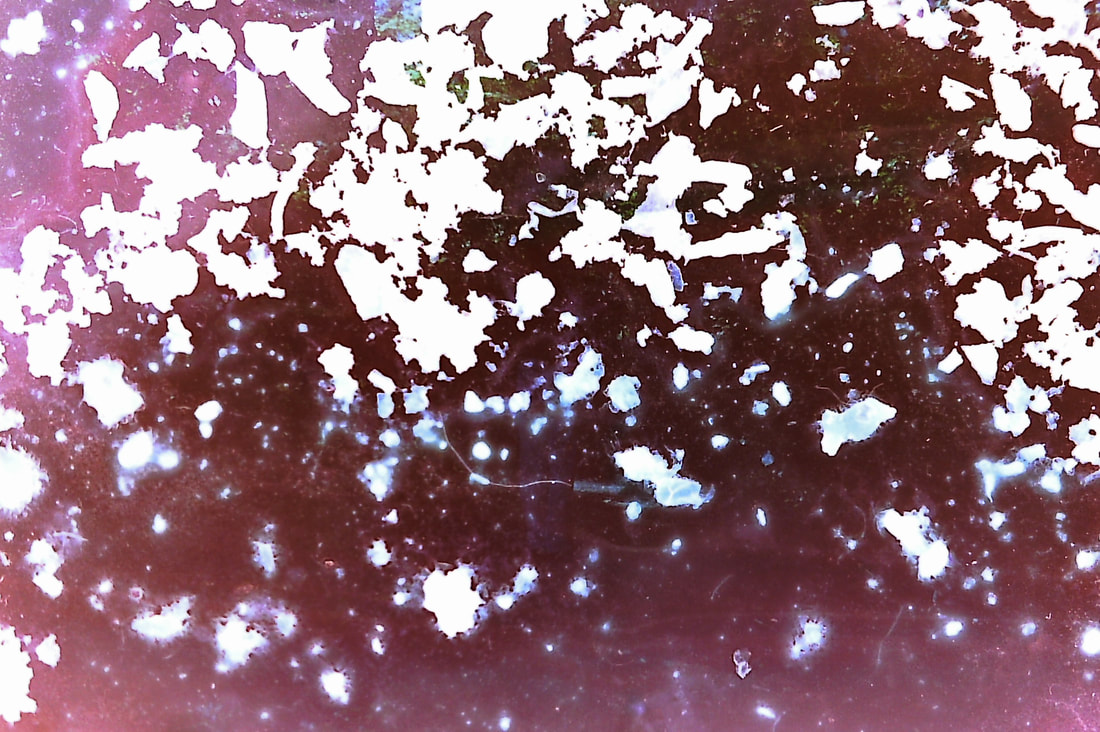
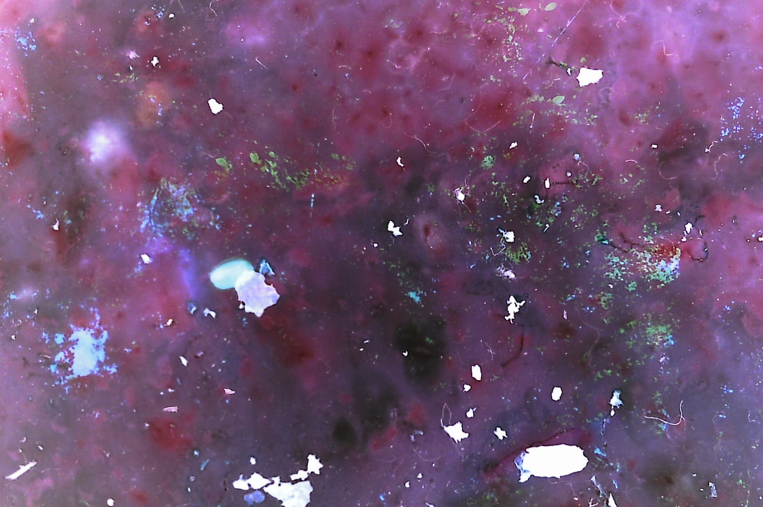
These were the final photos that were the weakest in the previous sets. I edited them to be brighter and washed of all the excess tea bags this made the final image clearer and easier to see and highlighted the ghost like figures. The black dots from the negatives add to the old vintage look of the overall photo.
FINAL IMAGES
|
|
|

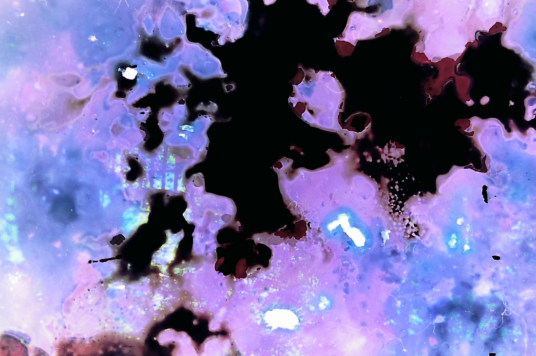
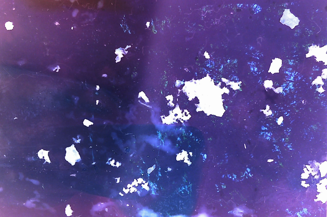
Overall I think these images really highlighted the decayed theme I was trying to get across. I think they were the most successful because where the bleach was on the blue prints it created a smudge that looks slightly like a blur. And the white speckles from the salt make a glitched look as if the photos are really old.
However found that when scanning some of the darker photos all that came out was the colour and none of this images, this was a mix of there being to much liquid and bleach and also that the original photo was to dark, this limited my ability to explore different techniques and how they effect the image. To fix this problem I would only cover the negative until its slightly cover as I found the photos that worked the best all the water had evaporated.
However found that when scanning some of the darker photos all that came out was the colour and none of this images, this was a mix of there being to much liquid and bleach and also that the original photo was to dark, this limited my ability to explore different techniques and how they effect the image. To fix this problem I would only cover the negative until its slightly cover as I found the photos that worked the best all the water had evaporated.
